Web Development
TOP 21 Bad Website Examples
Many studies show that you get less than one second to persuade your new visitor to stay on your site. Imagine that: just one second!
Have you ever come across a site design that has made you LOL for hours willing to share it with your friends? And we don’t mean that the company’s business is funny, or that some website elements are wrong. No, it’s the whole design that looks like it has come from the 90s. That’s the real source of inspiration for bad website design tops like this one.
Our deep research has borne its fruits: check out these 21 bad websites 2021 that will show how you shouldn’t make a website!
Differences Between Good and Bad Web Design
- good navigation (easy to understand)
- good color scheme
- visually appealing interface
- clean layout
Contents
- Bad Website Examples
- Penny Juice – bad design examples
- Blinkee website – bad design example
- Arngren website
- Great Dreams bad designed website
- Pacific Northwest X-Ray Inc.
- Suzanne Collins’ books website
- Bavarian Brathouse ugly web design example
- Bella De Soto’s ugly website design example
- Antique Bottle Collectors Resource
- Patimex ugly web design
- Rudgwick Steam & County Show
- Tag Team Signs – bad website
- Headhunter Hair Styling
- Electrifying Times
- Mednat.org – bad website
- Where To Eat
- Ling’s Cars
- Yale University School of Art
- EFW
- Budgets are sexy
- Historian of the future
Bad Website Examples
Penny Juice – bad design examples
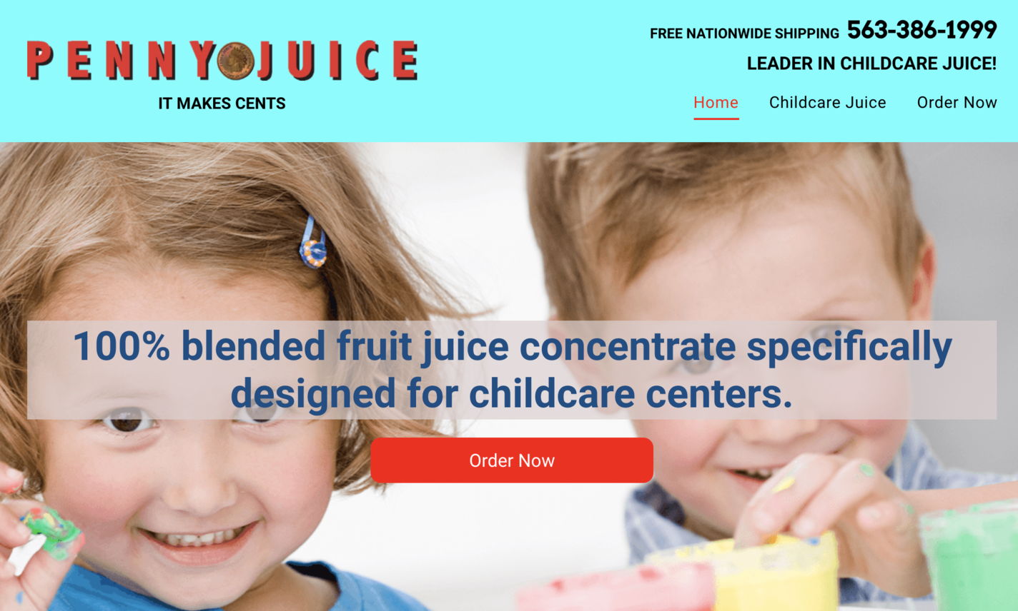
Visit the website: https://www.pennyjuice.com
Penny Juice is the first one in our list of bad interface design examples – a site, that has failed to achieve any website goals, be it intuitive navigation, attractive design, or a clear description of an offered product.
The first shocking thing you notice when you land on the website is a messy rainbow of vivid colors. The layout lacks clear navigation: you cannot get to the other website pages unless you scroll down every page.
Blinkee website – bad design example
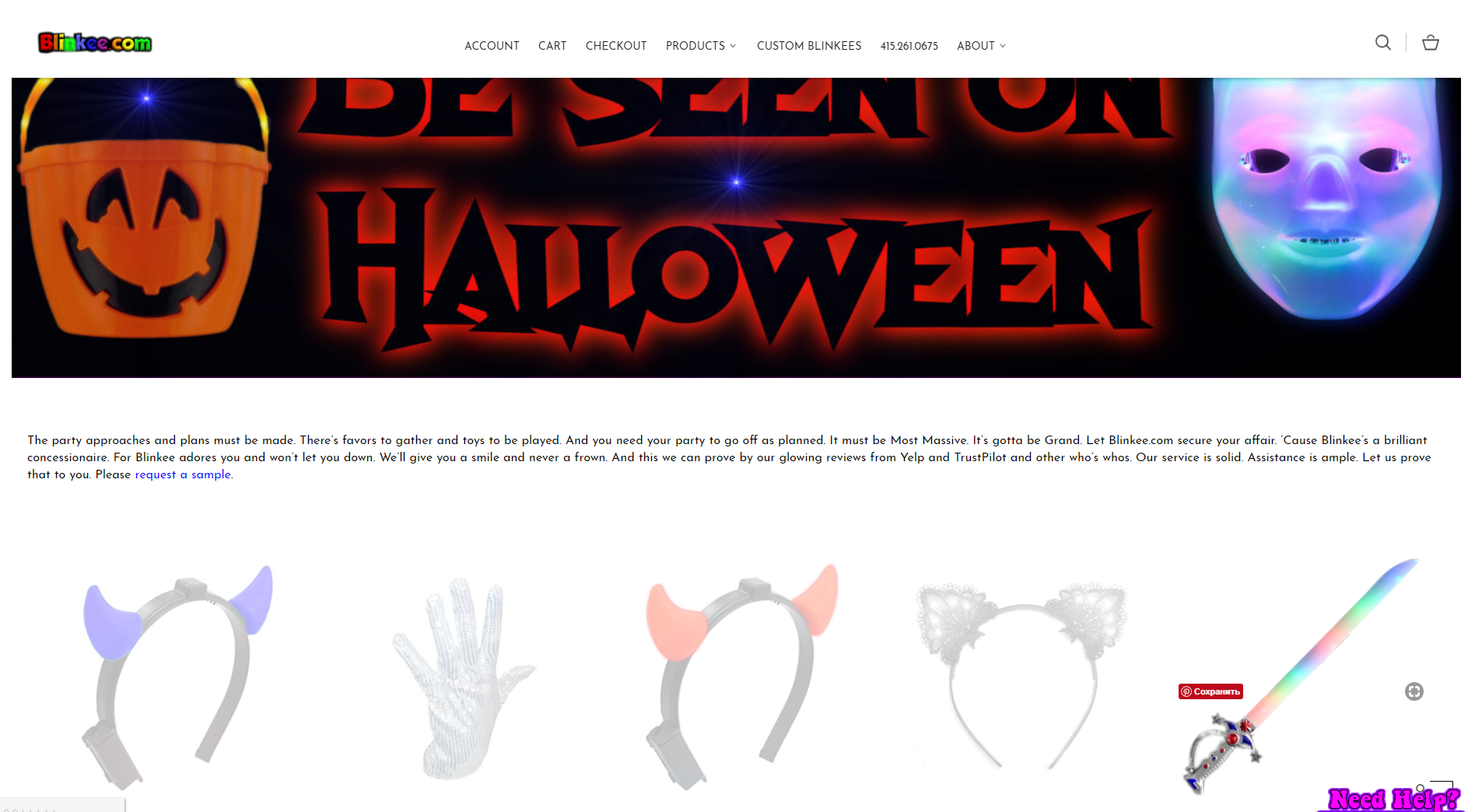
Visit the website: https://blinkee.com
Blinkee is about selling glowing and blinking things – that’s the deal! But, unfortunately, it is the only thing you clearly understand at a glance.
The concept of various things, blinking on the dark background is OK, but the execution is nothing but annoying. All these products are flashing while you are trying hard to find answers.
There are many other crucial issues that make Blinkee website one of the worst websites, so we want to pay attention to these moments:
- The product images are just too small (while they have to be in the focus of the user’s attention).
- Everything is so animated here that the whole design may cause seizures.
- The color scheme is the real problem: you have to read the text against the black background.
- The website frames are also a problem: one on the left encloses the text while the one on the right is just hollow.
You can find all the product categories on the right: when you click on any of them, sometimes you get to another page with the detailed product info, but sometimes you land on another webpage, that encloses all the products from the category, which is pretty user-hostile.
Arngren website
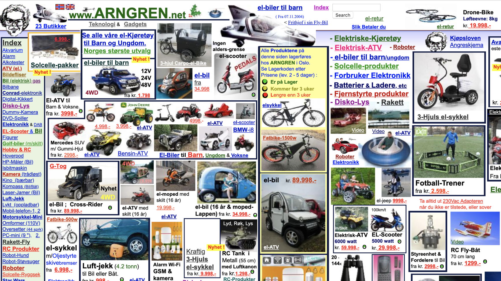

Visit the website: http://arngren.net
Some resources can be good and bad website examples at the same time, but we can’t say that about Arngren website.
This Norwegian classified site denies all the existing rules of contemporary web design! Remember the awful yellow pages that were popular in the 90s, with the ads fighting for tiny space of the page. Now, you see a similar design, brought to life in 2018.
Reasons for listing the website in bad design category:
- Incorrect color usage.
- Poor navigation.
- Tiny and even confusing typography.
- The absence of a clear message about the business.
- Random use of colors.
Great Dreams bad designed website
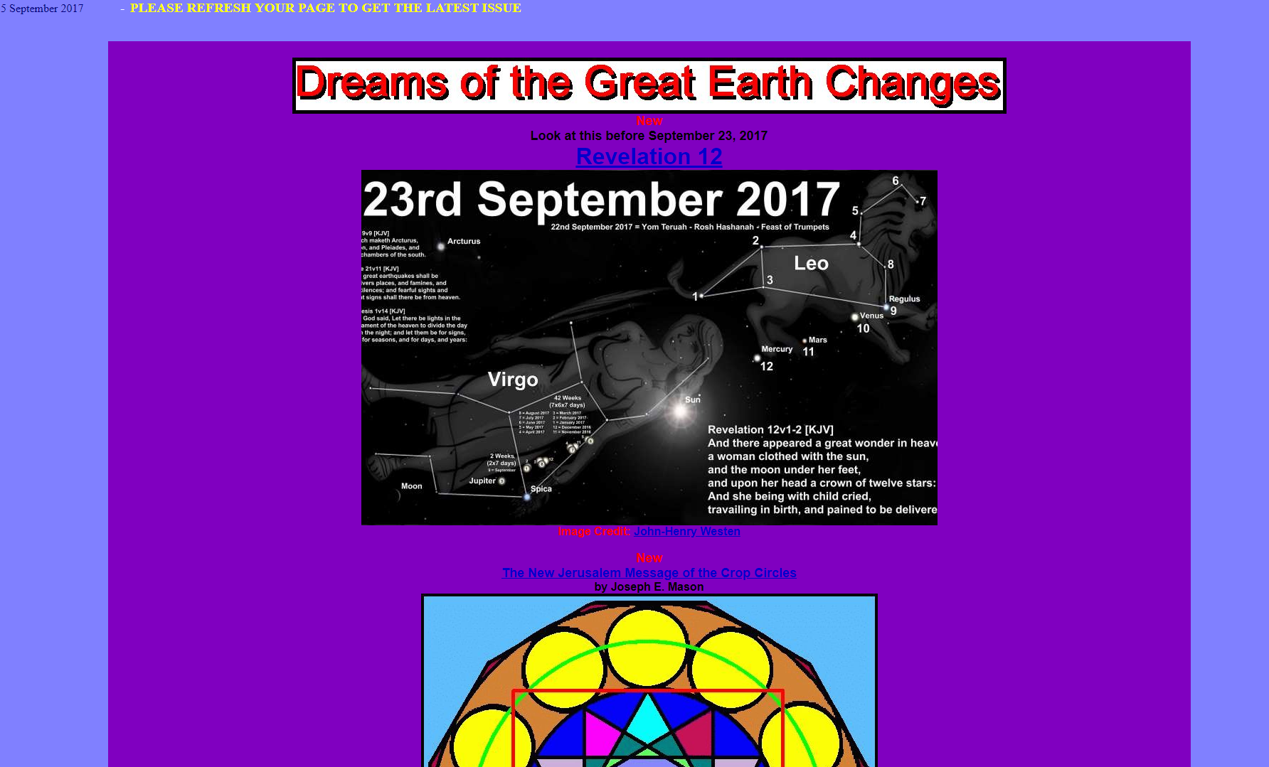
Visit the website: http://www.greatdreams.com
Great Dreams website is a giving you a combo of text color and background and that makes the content nearly unreadable. Especially when the text size is that tiny.
You land on the main page, that is too long and too dull to get to its bottom, reflecting an ugly design. Just look at this weird top message saying: «please refresh your page to get the latest issue»!
But the most important issue is that the website has no clear theme. It looks like this all-in-one site pretends to be an advanced online encyclopedia!
Scroll down and you will notice that the webpage width has changed – this must be the pure magic. So is the mad choice of colors in different parts of this website.
Pacific Northwest X-Ray Inc.
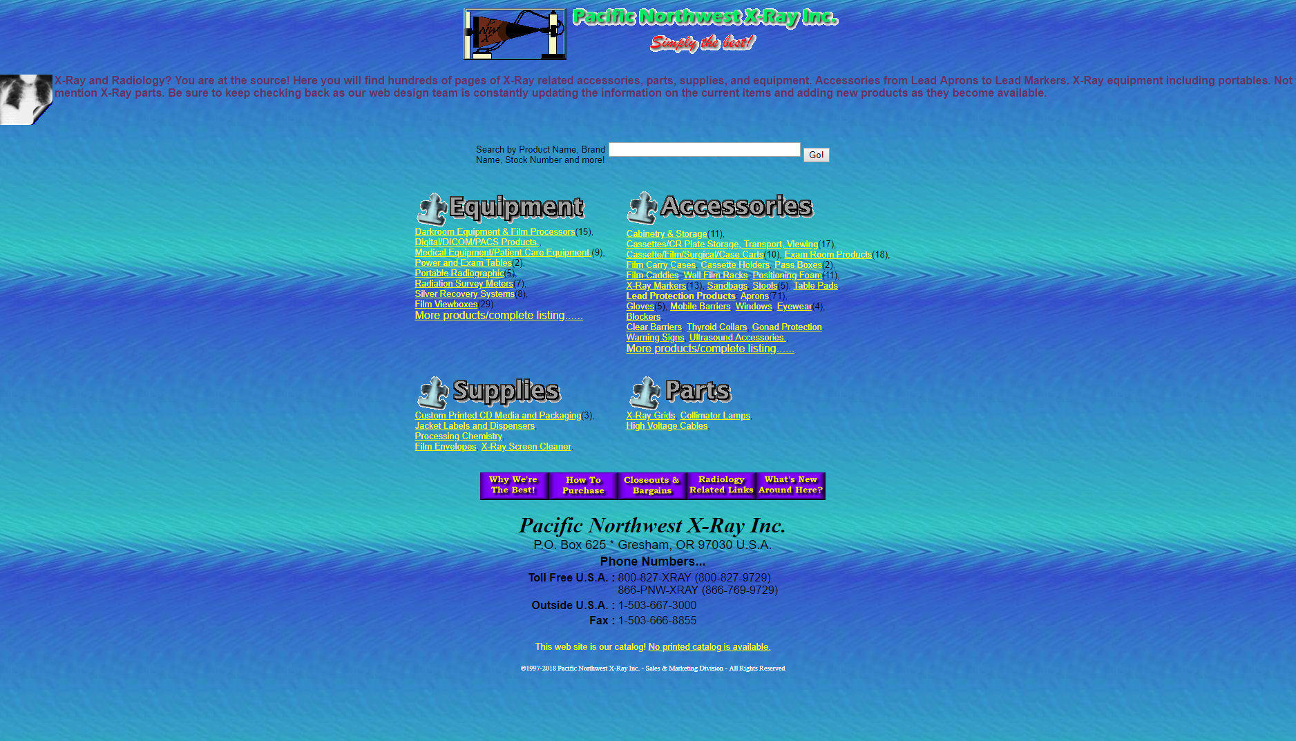
Visit the website: http://www2.pnwx.com
One of the most striking bad websites of 2018, Pacific Northwest hardly explains what their service is – and that’s the first mistake they have made.
The website text and background colors are conflicting. It is really difficult to read the content because of the absence of anti-aliasing, and the web page text has no paddings or appropriate white space.
Reasons for listing the website in bad design category:
- Bad typography with poor readability.
- Font colors don’t match with the website design.
- Lacks proper calls to action. There is only a phone number that too at the bottom.
- Flash is dead.
Suzanne Collins’ books website
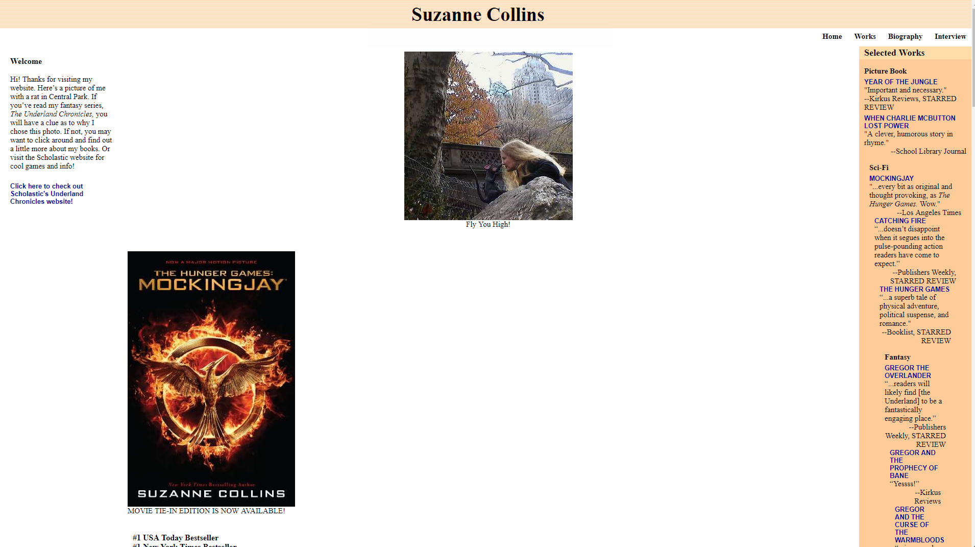
Visit the website: http://www.suzannecollinsbooks.com
Even if you are fond of Suzanne Collins work («Hunger Games» make many people crazy), you will be disappointed with her website.
The first thing is that the user has to zoom in the webpage to 200% to make the content readable. When you zoom it back, you get everything moving to the outer screen edges. That’s how we’re supposed to use white space.
Try clicking on any book, and nothing happens – and that’s the best example of a missed opportunity. Try clicking on «Works» section and you will land on the same screen with the books, awards & reviews, but you will find no descriptions there.
Go down to the bottom of the webpage and you will find the list of online stores for buying the author’s books. But if you hit the link, instead of getting on the author’s webpage with the book you look for, you will land on the store’s home page. Another missed opportunity.
Bavarian Brathouse ugly web design example
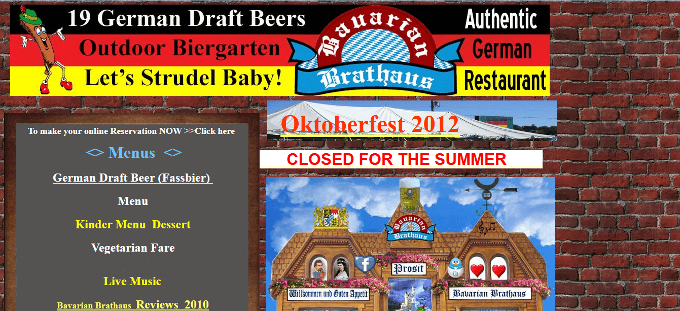
Visit the website: http://bavarianbrathaus.info
Remember your first kid’s drawings? Now you have a chance to see something similar on the website.
The design of this site looks just like the street walls back in the 80s! A brick-like background doesn’t have any parallax effect, and the boring graphics make Bavarian Brathouse website a striking example of bad mobile websites.
Reasons for listing the website in bad design category:
- Lack of a pleasing aesthetic design.
- Poor navigation.
- Overload with left side copy without an adequate, clear message.
- Dull graphics that don’t comply with the company’s business value.
- No CTA!
Bella De Soto’s ugly website design example
Visit the website: http://www.bellads.info
Every time you enter the website, you get a feeling that these guys tried to put everything they had on one page.
What else brings this site to the top of bad websites? Even if you zoom out to 20%, you won’t see the whole huge image below. There are so much different content and so many low-quality images on the main page that you get dizzy.
Besides, the homepage is too long and wide, so you have to scroll it horizontally and vertically to find the info you’re looking for.
Antique Bottle Collectors Resource
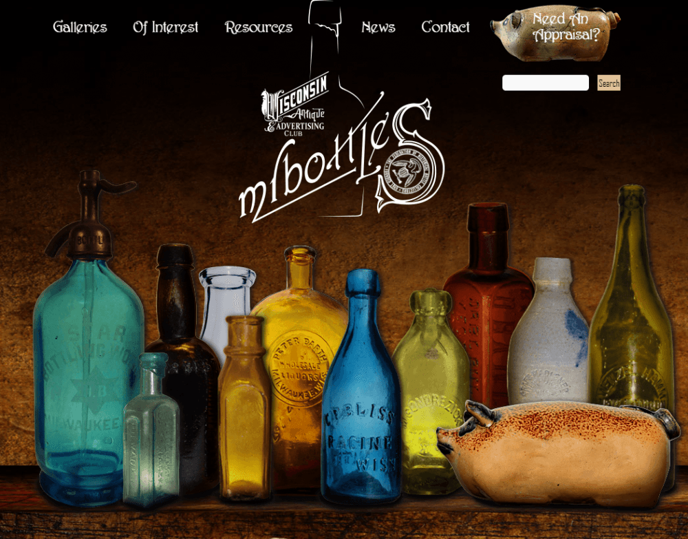
Visit the website: http://www.mrbottles.com
One of the worst websites on the Web, Antique Bottle Collectors has lots of issues…
Reasons for listing the website in bad design category:
- The color of the text constantly changes, making your head spin.
- The images are randomly put in different places without any order or formatting.
- User-hostile navigation.
- Too much content, which you don’t really want to read.
Patimex ugly web design
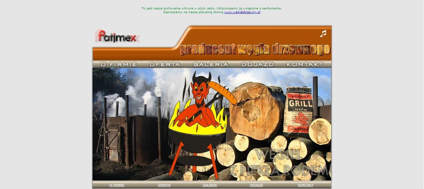
Visit the website: http://www.patimex.com
Patimex is a great addition to our list of ugly websites – at first, you see plenty of jittery graphics that you need to zoom in and out and they always get out of the screen frames.
Reasons for listing the website in bad design category:
- The webpage text is fading in & out, but that’s not the worst thing on this site.
- Then you notice the tiny musical note telling you that there is music playing on the webpage… And this crazy country music, along with the awful animation of a devil grilling his infernal majesty on a BBQ made us feel sorry for human beings.
- The pulsating Patimex logo is another thing that can riddle a web designer: why would a logo attract attention if you can’t even click on it?
The website navigation works fine, and that’s probably the only thing that is OK on the Patimex website.
Rudgwick Steam & County Show
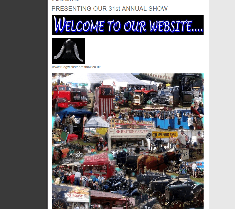
Visit the website: http://www.rudgwicksteamshow.co.uk
This company’s site can stand out even from our top of bad websites. This is the greatest selection of an awful design that you have seen. When you land on the website, you have no idea where to start from, you just get confused.
Reasons for listing the website in bad design category:
- Links on navigation doesn’t work.
- Random use of colors that give negative vibes.
- Lacks a clear picture of the website.
- Large meaningless graphics
The greeting message lacks a clear sense and meaning. The whole site looks like a list!
The lack of user-friendly navigation or readability adds to your bad impression. By the way, the links in the navigation menu do not work!
Tag Team Signs – bad website

Visit the website: http://www.tagteamsigns.net/
If you want to feel irritated, welcome to this website. A lot of annoying elements are here: playing music without your permission; the beginning of the really ugly animation; slow to load; unavailability on mobile devices and finally just boring web design.
Headhunter Hair Styling
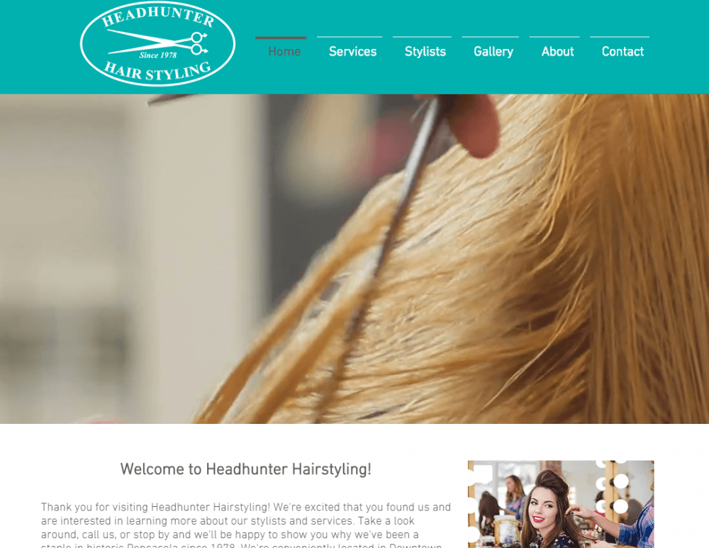
Visit the website: https://www.headhunterhairstyling.com/
What is terrible about this website?
Headhunter Hair Styling is very basic and slow to load like almost all these websites from this list. Hope you understand one important thing about bad websites: not only bad design is responsible for the failure.
First, make your website perfect from the technical side: minimize java scripts and frameworks, compress images, and try not to overload the web code.
Electrifying Times

Visit the website: http://electrifyingtimes.com/
I think this website was made like a doorway. Doorways are sites or pages created to rank high for specific search queries. They are bad for users because they can lead to multiple similar pages in user search results and hinder usability.
Mednat.org – bad website
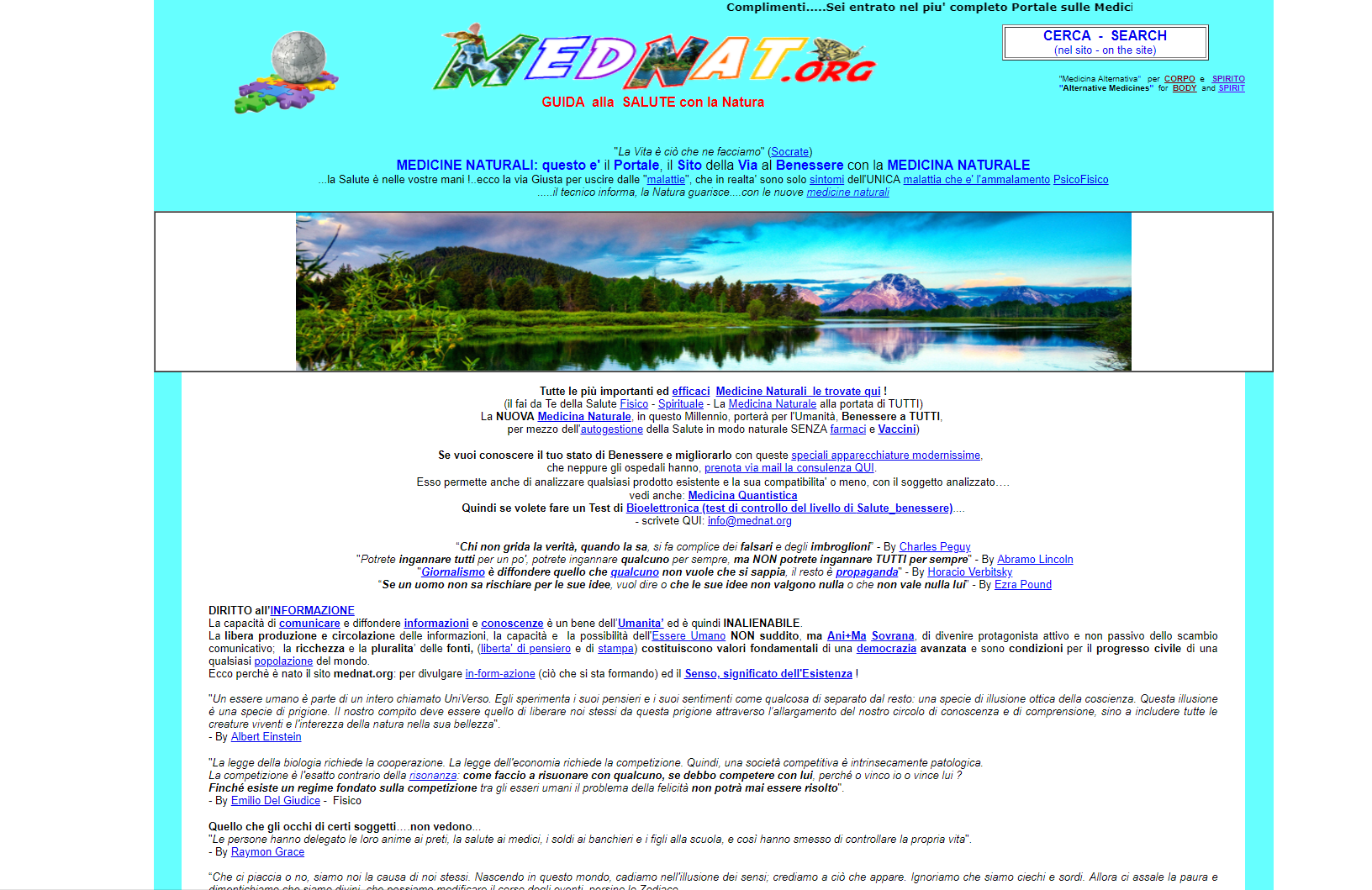
Visit the website: http://www.mednat.org/
Mednat.org website is a hodge-podge of items that don’t really go together. We doubt that you will understand its purpose when you land on it. And that’s only one of the problems.
Main issues of the website:
- small font size,
- no structure (there are no logical website sections),
- wall of content (one page contains enough text to fill 20 pages),
- no mobile responsiveness,
- spam text (numerous links to Wikipedia),
- bad usability.
Where To Eat
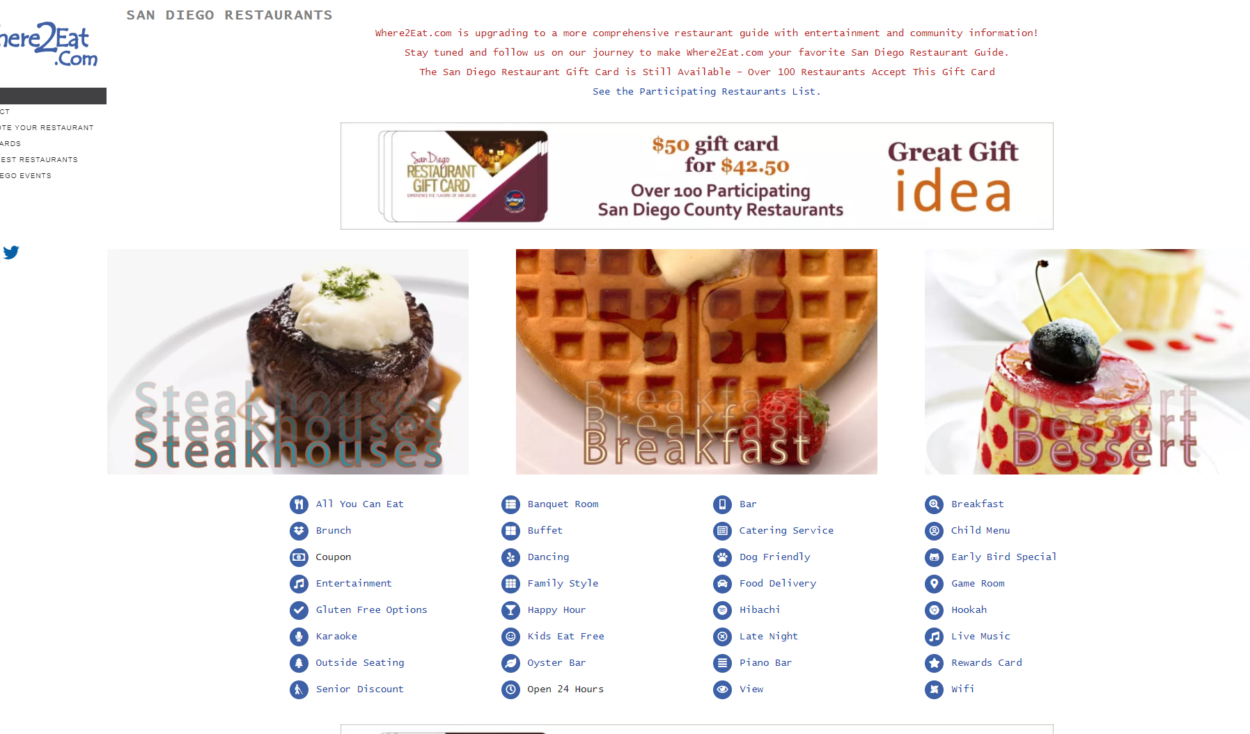
Visit the website: https://www.where2eat.com/
The website shows how the lack of consistency results in poor user experience, thereby dropping conversion. The problems are countless
Ling’s Cars
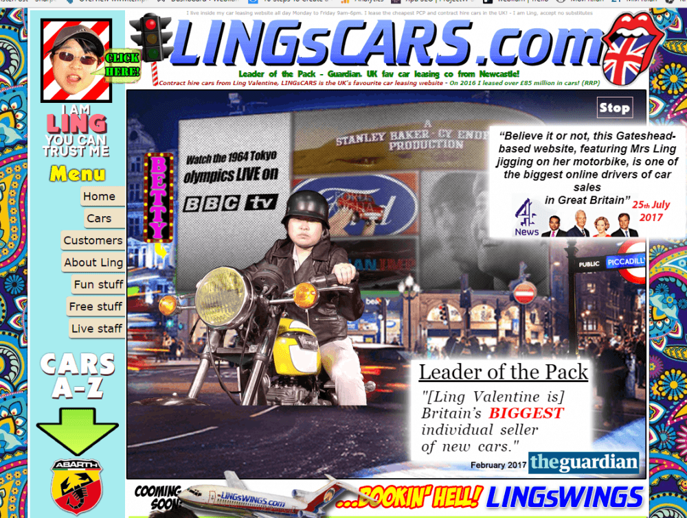
Visit the website: https://www.lingscars.com/
Ling’s Cars website looks a bit weird. It contains a lot of GIFs both with the owner, Mrs. Ling and with her cars and bikes. Her business is oriented for long-term car rents, starting with 9 months of exploitation of a car. She works for the UK and it seems, that she is quite popular. Possibly, this popularity is no merit of the website.
Let’s turn to this website and check how it looks. Well, the color scheme here is psychedelic and bright. For these reasons, it is tough to be on this website for long.
We have to admit, the navigation is fine. It leads to different required pages and doesn’t provoke any difficulties.
The issue is in these colors and content. Brightness makes texts unreadable, the photos mix with GIFs, videos and the offerings. Check this website yourself and find other flaws, to avoid.
Yale University School of Art
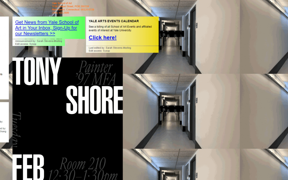
Visit the website: http://art.yale.edu/
The website of the School of Art represents this structure as a whole. We kept an eye on this website, and noticed some differences with it: today it is less psychedelic, but they still have plenty of other work to do.
Need to mind – these corridors are moving inside, like tunnels.
Yale University post here announcements for the future exhibitions, achievements of their professors and students, etc.
The website contains the sign in form and a calendar of events at Yale University. This is useful for students and those who are interested in art and would like to join any discussions.
On the left side, we can see a navigation bar with certain sections. Each one of these pages contains GIFs on the background and texts in the frameі of a different color.
The website doesn’t have a security certificate (the https beginning on the link), although it collects personal data of the students of the faculty (the list of them is in the Current Students tab). Also, it allows you to sign into the news of the faculty, and again your data is not protected.
Responsive design is missing, too. So the students and the others struggle when it comes to using this website on a mobile device or a tablet.
EFW
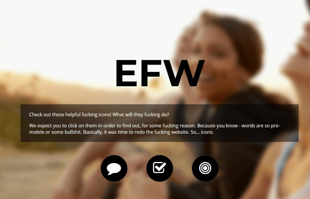
Visit the website: http://www.everyfuckingwebsite.com/
This one-page website is designed to critique and laugh at the ordinary, acceptable and standard ways for organizing space on a website.
It contains the welcome block, about us section, additional info, and sign-up form. These are minimal contents for a website for any purposes, like sells, advertising, portfolio website, etc.
To be honest, this website doesn’t really have any significant flaws, its navigation is flawless because it is a one-pager, and it contains a navigation bar as an adjunct. It also contains social networks buttons, which is great for any website like this.
On another hand, this website represents the owner’s position on website building process and requirements. Thus, we nominate it for a bad website, because it may hurt your feelings:) Be careful.
Budgets are sexy

Visit the website: http://www.budgetsaresexy.com/
This website looks ok. It is not as bad, like some others from our list. But it has certain flaws, which we think are crucial for landing a good website for long and successful interaction with your customers/ clients/ readers.
Reasons for the nomination on bad design category: need to apply some changes to the color scheme, now it looks monotonous, the background of the buttons is disconnected with the color of the text.
Navigation: easy for an experienced user only. For newbies, the website structure is not intuitive
Grey logos of the magazines look like out-of-work URLs
Responsive design – no.
Historian of the future
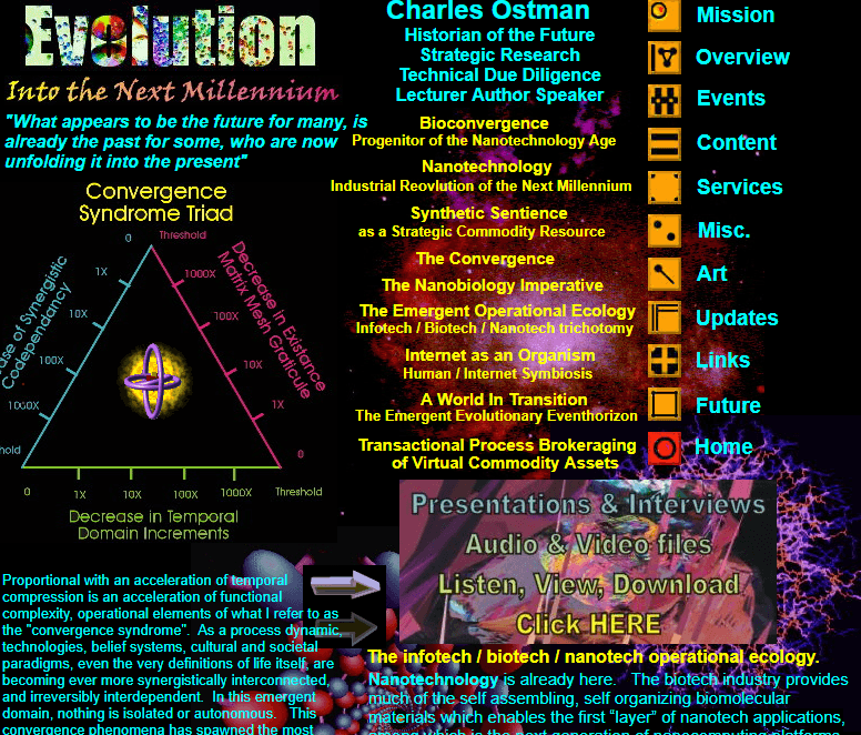
Visit the website: http://www.historianofthefuture.com/
Look at this dark but bright website. Maybe, this historian of the future predicts the new fashion on web-design in the nearest future. Because for now, this turns any attention away. Acid colors, signs, GIFs and photos of low quality are not really connected to each other. They only distract a visitor’s eye.
The website is not even adapted for the desktop screens, it leaves free black space on the right but fills it a little more when moving to the page with the personal achievements of the Historian.
Investigate this website, check what irritates you the most, or you may find some features for sarcastic usage on your pages.
To name a few issues:
- inconsistent font size and style,
- the badly developed color palette, where images and text simply don’t match,
- visuals remind of 90’s web design,
- navigation issues – it takes a lot of effort to get to other pages,
- lists of unrelated items – types of cuisine are mixed with advantages and facilities, while they don’t really go together,
- there’s no clear call-to-action, so a visitor won’t know what to do on the page,
- you don’t understand what a website is for since there’s no proper first screen or cover.

Nudefusion AI App Review

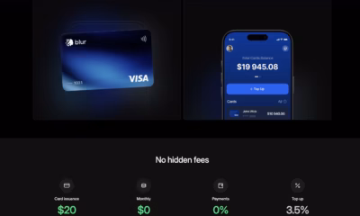
Blur Card – Crypto Cards with Hidden Fees

ControlNet: Revolutionizing Neural Control in AI Image Generation
PayPal Sports Betting Guide for Beginners

Open-Source GPT-3/4 LLM Alternatives to Try in 2026
Nudefusion AI App Review
PayPal Sports Betting Guide for Beginners
ControlNet: Revolutionizing Neural Control in AI Image Generation