UI Design
Common Screen Sizes for Responsive Web Designer
Responsive web design, including adaptive design strategies, plays a crucial role in achieving this objective.
By comprehending common screen sizes and understanding user demographics, designers are able to customize their sites to accommodate the needs of a diverse user base. Factors such as website objectives, target audience, and regional preferences significantly influence these design decisions.
This article examines the principles of responsive web design, highlights the importance of accommodating different screen sizes, and provides practical recommendations for addressing the challenges associated with designing for multiple devices, including the integration of browser stack for testing.
Key Takeaways: Consider your website’s objective, target audience, location, and regional device preferences when choosing common screen sizes for responsive design. The most common screen sizes for responsive design include desktop, laptop, tablet, smartphone, and other devices. Use a grid system, prioritize content, and test with web testing tools like Browser Serling, and adjust for different screen sizes to create a successful responsive design.
Common screen sizes
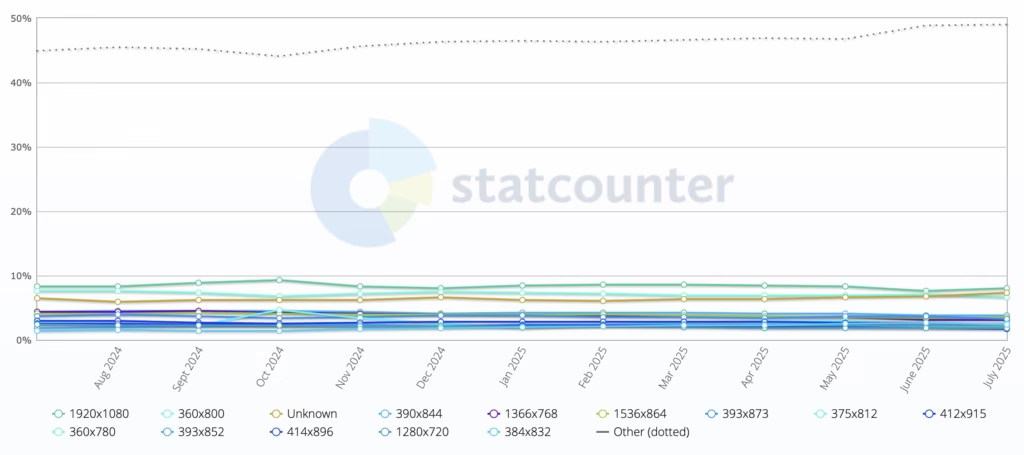
| Screen Resolution | Percentage |
|---|---|
| 1920×1080 | 7.97% |
| 360×800 | 6.57% |
| 390×844 | 3.67% |
| 1366×768 | 3.14% |
| 1536×864 | 3.47% |
| 393×873 | 3.20% |
| 375×812 | 2.56% |
| 412×915 | 2.46% |
| 360×780 | 2.10% |
| 393×852 | 2.38% |
| 414×896 | 1.69% |
| 1280×720 | 1.85% |
| 384×832 | 2.46% |
| Unknown | 7.32% |
1920×1080 (Full HD/1080p) is the most widely used and recommended resolution for desktop website design today.
Mobile Screen Resolution Stats Worldwide
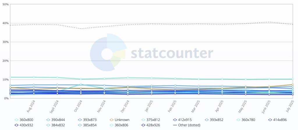
| Resolution | Global Usage* | Primary Devices | Design Priority |
|---|---|---|---|
| 360×800 | ~15% | Samsung Galaxy A/M series | Critical |
| 390×844 | ~12% | Pixel 6/7, iPhone 14/15 (Zoom) | High |
| 414×896 | ~10% | iPhone XR/11, mid-range Androids | High |
| 375×812 | ~9% | iPhone 12/13 Mini | Medium |
| 428×926 | ~7% | iPhone 14/15 Plus/Pro Max | Medium |
| 360×640 | ~6% | Older Androids (2015–2020) | Legacy Support |
360×800 is currently the most widely used mobile resolution globally, making it a critical target for responsive web design. While mobile experiences vary by device, modern websites must prioritize 360×640 to 414×896 ranges to cover ~80% of users, with adaptive scaling for larger screens (e.g., 393×873 or 428×926 on premium phones).
Tablet Screen Resolution Stats Worldwide
| Resolution | % Usage* | Primary Devices | Design Priority |
|---|---|---|---|
| 1024×768 | ~35% | iPad (5th–9th gen), Budget Androids | Critical |
| 1280×800 | ~25% | Amazon Fire, Samsung Tab A | High |
| 2048×1536 | ~15% | iPad Air/Mini | Medium |
| 1920×1200 | ~10% | Premium Android (Tab S-series) | Medium |
| 2560×1600 | ~8% | iPad Pro 11″, Galaxy Tab S9 | Adaptive |
| 2048×2732 | ~5% | iPad Pro 12.9″ | Adaptive |
1024×768 remains the most critical tablet resolution to optimize for, despite newer high-DPI devices. Modern tablet design must balance 1024×768 (iPad standard) and 1280×800 (Android base), while ensuring graceful scaling up to 2048×2732 (12.9″ iPad Pro).
What is Responsive Web Design? (RWD)
.jpg_00.jpeg)
Responsive web design represents a contemporary approach to web development that seeks to deliver seamless user experiences across a diverse range of devices and screen sizes, from mobile phones to desktop computers. This design philosophy guarantees that a website’s layout adapts fluidly to various resolutions, thereby enhancing content readability and overall usability.
Given the increasing prevalence of mobile devices in daily internet usage, the significance of responsive design has escalated, allowing websites to preserve their functionality and aesthetic appeal, irrespective of screen size or resolution.
Prominent examples of effective responsive web design can be observed in major websites such as The New York Times and Amazon, which adeptly engage users through adaptive layouts.
Why Are Common Screen Sizes Important for Responsive Design and Device Compatibility?
Common screen sizes are pivotal in responsive design, as they significantly affect a website’s ability to provide a user-friendly experience across a variety of devices, ensuring that content remains accessible and visually appealing, enhancing content readability.
It is essential for web developers and designers to understand these dimensions, particularly given the growing diversity of devices in use, including smartphones and tablets.
Successful responsive design relies on the capacity to adapt to these prevalent screen sizes, employing testing tools such as Browser Shots and screen resolution statistics to customize experiences that align with user expectations across different platforms.
This alignment has a direct impact on user satisfaction and engagement, which in turn affects the overall performance of the website, highlighting the importance of user-friendly experience.
Factors to Consider when Choosing Common Screen Sizes for Responsive Design and Content Adaptation
When selecting common screen sizes for responsive design, it is essential to consider various factors that enhance user experience and ensure optimal functionality across all devices. These factors include understanding the objectives of the website, recognizing the target audience, and addressing industry-specific requirements that might influence design practices such as navigation examples.
Furthermore, the increasing use of mobile devices alongside traditional desktop versions necessitates that designers meticulously balance layout and content adaptation to accommodate different screen resolutions. This comprehensive approach enables designers to create websites that are not only visually appealing but also effective in meeting user needs and preferences.
Objective of the Website
The objective of the website is a critical factor in determining the appropriate screen sizes for responsive design, as it directly influences the presentation and interaction of content for users.
For example, consider an e-commerce site, which must effectively showcase products across various devices to drive sales. In this context, responsive design may incorporate large, visually appealing images and streamlined navigation to facilitate swift purchasing decisions.
Conversely, an informational website may prioritize readability and accessibility, ensuring that textual content is easily digestible on both mobile and desktop screens.
Entertainment platforms could employ dynamic layouts that adapt based on user engagement, such as enlarging video thumbnails on tablets while reserving space for interactive elements on mobile devices.
Utilizing data-driven insights to tailor these responsive strategies allows website owners to significantly enhance the user experience and plan for future trends towards 2025.
Ultimately, recognizing the primary objective of the website enables developers to implement adaptive design techniques that resonate effectively with their target audience.
Target Audience
Understanding the target audience is fundamental for effective responsive design, as user demographics significantly influence device preferences and screen size usage patterns.
To create user-friendly interfaces, designers must conduct comprehensive analyses of analytics and metrics, such as those from Google Analytics, that elucidate how various groups engage with their content. By utilizing tools such as Google Analytics, they can obtain valuable insights into user behavior, including the devices most commonly used for access, the duration spent on different pages, and typical navigation paths.
- This data informs decisions regarding optimal screen sizes and layout modifications, ensuring a seamless experience across platforms.
- A thorough understanding of user preferences allows for the prioritization of critical elements, thereby enhancing overall engagement.
Ultimately, the emphasis should be on developing a tailored approach that resonates with users, thereby improving satisfaction and retention.
Location
The geographical location of users significantly influences the selection of common screen sizes in responsive design, as regional device preferences can vary considerably and affect how websites are accessed.
In the contemporary digital landscape, it is essential to acknowledge that various factors, including culture, economic development, and technological infrastructure, shape device choices. For example, in urban areas with robust internet connectivity, larger screens are often preferred due to their ability to present detailed content, thereby enhancing the user experience. Conversely, in rural regions where budget smartphones are more common, smaller screen sizes tend to dominate because of considerations related to affordability and availability.
This divergence has significant implications for localized design practices, as designers must take these variations into account to ensure usability and user engagement.
- Urban users typically expect multimedia-rich interfaces, often engaging with video platforms like YouTube.
- Rural users benefit from simpler, more accessible layouts.
- Regional preferences can inform content prioritization and navigation flow.
Regional Device Preferences
.jpg_01.jpeg)
Regional device preferences significantly influence the types of devices that users favor, impacting choices like iPad or iPhone, which subsequently informs the selection of common screen sizes for responsive design.
Understanding how geographical distinctions impact user behavior offers essential insights into effective design strategies. For example, in urban areas with widespread high-speed internet access, desktops and laptops are likely to be predominant, while users in rural regions may gravitate towards mobile devices due to limited connectivity options.
This variation in device usage can result in differing expectations regarding functionality and layout. Additionally, cultural factors may also influence preferences; in certain regions, users might favor tablet devices for their versatility, which affects how designers prioritize different screen formats.
Consequently, adopting a flexible and responsive design strategy is imperative to ensure an optimal user experience across various devices and geographical areas.
Industry-specific Requirements
Industry-specific requirements can significantly influence the selection of common screen sizes for responsive design, as different sectors often present unique needs and standards.
In the e-commerce sector, businesses must ensure that their websites are optimized for a diverse array of device screens to provide a seamless shopping experience, facilitating consumers’ ability to easily browse and purchase products. In contrast, the education sector requires platforms that accommodate both students and educators, offering interfaces that cater to various learning styles and accessibility needs. In the healthcare field, responsive design is critical in patient portals and telemedicine applications, where clear navigation and accessibility can directly impact patient outcomes.
- Responsive design must be user-friendly, fast-loading across all devices, and adaptable to breaking points and fluid designs.
- Industry best practices typically involve meticulous testing and iterative design processes.
- Ensuring compatibility with different operating systems and browsers is vital.
Each of these sectors presents its own set of challenges and opportunities, underscoring the necessity for tailored approaches to responsive design, integrating the mobile-first approach.
User Demographics and Mobile Resolution
User demographics are a critical consideration in responsive design, as they provide valuable insights into the types of devices, such as the iPhone and iPad, and screen sizes that are most frequently utilized by specific user groups.
Understanding these demographics enables designers to create tailored experiences that effectively engage users. By analyzing factors such as age, location, and technological proficiency, developers can identify preferred platforms and design trends that resonate with their target audiences.
For example, younger users may favor minimalistic interfaces optimized for smartphones, while older users might prefer larger text and straightforward navigation on tablets or desktops. This emphasis on user demographics not only aids in optimizing layout and functionality but also enhances overall user satisfaction.
To achieve this, it is recommended to:
- Research user preferences through surveys.
- Monitor usage patterns and device types.
- Adapt designs to meet varying consumer expectations.
By implementing these strategies, organizations can foster a more engaging and personalized user experience.
What are the Most Common Screen Sizes for Responsive Design?
Identifying the most prevalent screen sizes for responsive design is essential for developing visually appealing and functional websites that accommodate a diverse array of devices, including desktop screens, laptops, tablets, and smartphones.
These screen sizes can vary significantly, and understanding their frequency can assist web designers in optimizing layouts for various resolutions. Considering the rapid evolution of technology, it is crucial to remain informed about trends in screen size usage to ensure that designs continue to be user-friendly and effective.
By concentrating on these common dimensions and utilizing tools like Browser Stack and Google Analytics, designers can enhance content adaptation and improve the overall user experience across multiple devices.
Desktop Screens and Desktop Devices
Desktop screens are generally characterized by larger display sizes, which necessitate specific considerations in responsive design to ensure optimal content layout and user experience.
When web designers create layouts for larger displays, they must account for varying screen resolutions, such as 1920×1080, 2560×1440, and even 3840×2160. These resolutions influence how elements are sized, arranged, and displayed, ultimately leading to a more immersive experience for users.
- Employing a grid system can assist developers in arranging content more effectively, allowing for various columns that enhance readability and engagement.
- Utilizing high-resolution images and scalable vector graphics (SVG) ensures that visuals remain sharp and appealing, catering to the high pixel density of modern desktops.
- Strategically integrating whitespace promotes focus and clarity, facilitating easier navigation and information consumption on larger screens.
Ultimately, by leveraging the unique characteristics of desktop screen resolutions, web design can achieve a polished and user-friendly interface that enhances overall interaction.
Optimizing content for larger displays is essential in creating an engaging web experience, as evidenced by platforms like the New York Times and Amazon.
Laptop Screens and Tablet Resolution
Laptop screens, which typically range in size from 11 to 17 inches, necessitate the application of responsive design techniques that effectively adapt content to various screen resolutions.
Given the range of screen resolutions commonly found on laptops—including 1366×768, 1920×1080, and even the advanced 4K displays—it is imperative to implement strategies that ensure optimal display quality and usability. The importance of responsive design is highlighted by its ability to accommodate these diverse resolutions while enhancing the overall user experience.
By employing techniques such as fluid grids, flexible images, and CSS media queries, developers can create interfaces that seamlessly adapt, ensuring users receive the best possible interaction, regardless of the device in use. This adaptability is essential as users increasingly depend on laptops with varied specifications for both professional and personal activities. In this context, responsive design is not merely advisable but rather essential for maintaining accessibility and user satisfaction.
Common Laptop Resolutions:
- 1366×768
- 1920×1080
- 2560×1440
- 3840×2160 (4K)
Tablet Screens
.jpg_10.jpeg)
Tablet screens, typically ranging from 7 to 12 inches, present distinct challenges and opportunities for responsive design due to their intermediate size between smartphones and desktop computers.
These devices often feature resolutions such as 768×1024 or 2048×2732 pixels, facilitating vibrant displays and detailed images. As users increasingly rely on tablets for activities such as browsing, shopping, and content consumption, it is essential to ensure that websites adapt seamlessly to these various screen sizes.
Responsive design practices are pivotal in this optimization, enabling web content to adjust fluidly and ensuring that text remains legible while images are appropriately scaled. The following techniques should be considered for enhancing user experience on tablets:
- Utilize flexible grids and layouts that can adjust based on screen dimensions.
- Implement media queries to apply different CSS styles according to the device’s resolution.
- Optimize images and assets to minimize load times while maintaining quality, adapting to different pixel densities.
Smartphone Screens
Smartphone screens are among the most prevalent devices utilized in contemporary society, with resolutions varying significantly, thereby making responsive design essential for providing a user-friendly experience.
As mobile technology continues to advance, it is imperative to consider the wide range of screen sizes and resolutions that users frequently encounter. The evolution of various smartphone resolutions presents unique challenges and opportunities for developers striving to achieve optimal visual appeal across devices.
To attain this objective, responsive design techniques should be employed to ensure that websites and applications can dynamically adjust to fit screens of diverse shapes and sizes. Key strategies include:
- Utilizing flexible grid layouts
- Incorporating media queries for CSS adjustments
- Adapting images and multimedia elements
Each of these strategies plays a critical role in enhancing usability, enabling mobile users to navigate seamlessly, regardless of their device’s specifications.
Other Devices and ERP PMS
Plus traditional desktops, laptops, tablets, and smartphones, the growing prevalence of devices such as smart TVs and wearables has become increasingly significant in responsive design considerations. This evolution underscores the necessity for developers to implement adaptable strategies that ensure a seamless user experience across a diverse array of platforms.
To effectively address these challenges, it is essential to understand user behavior across different devices. Responsive design must now take into account the following factors:
- Variations in screen size that extend beyond mere dimensions, incorporating considerations for resolutions and pixel density.
- The various types of interactions users may engage in, including touch gestures on smartphones and voice commands on smart assistants.
- Performance elements, where load time and responsiveness are critical to maintaining user engagement.
As a result, the emphasis on developing flexible layouts and media queries has become a fundamental component of contemporary web design strategies.
How to Design for Different Screen Sizes
Designing for various screen sizes necessitates a strategic approach that incorporates a grid system, prioritizes content, and employs continuous testing and adjustments to guarantee an optimal user experience across all devices.
A well-structured grid system is essential for responsive design, as it offers a flexible framework that adapts to different resolutions. Prioritizing content is crucial in delivering essential information without overwhelming users, particularly on smaller screens.
The utilization of testing tools like Browser Shots, Browser Serling, and methodologies is critical in this process, allowing designers to refine their layouts and ensure that every aspect of the design aligns with user needs and preferences.
Use a Grid System
A grid system serves as a foundational element in responsive design, enabling developers to create layouts that adapt seamlessly to a variety of screen sizes, whether viewed on an iPad or iPhone. This ensures that content remains visually appealing and functional across a wide range of devices, from smartphones to large desktop monitors.
The fundamental principle of a grid system involves dividing a page into a series of columns and rows, which facilitates the alignment and organization of content. By employing this structural approach, developers can enhance both readability and aesthetic appeal while ensuring an efficient use of available space.
In the context of responsive design, adaptability is crucial, as it allows the same content to be displayed differently based on the device being utilized.
- Bootstrap: A widely-used open-source framework that employs a 12-column grid layout, facilitating fluid designs.
- Foundation: Another responsive front-end framework recognized for its flexible grid system, which provides greater control over layout.
- CSS Grid Layout: A modern CSS feature that presents a two-dimensional grid-based layout system, granting developers intuitive control over both rows and columns.
By leveraging these grid frameworks, content creators can achieve consistency and efficiency in their designs, ultimately enhancing the user experience across all devices.
Prioritize Content
Prioritizing content is essential in responsive design, as it enables designers to effectively present the most critical information across various screen sizes.
By concentrating on key elements, designers can ensure that users can quickly locate the information they need, resulting in a more satisfactory engagement. In this context, content hierarchy emerges as a pivotal strategy; it involves categorizing content based on its importance and relevance to the user’s journey.
To implement this approach, consider the following strategies, often utilized in ERP PMS and Point of Sale Systems:
- Integrate interactive elements that facilitate quick access to essential content.
- Adopt a simplified layout that emphasizes high-priority information while minimizing distractions.
- Conduct user testing to assess how actual users interact with the site on smaller devices, providing valuable insights into their behaviors and preferences.
These strategies not only enhance the overall user experience but also streamline navigation, making it easier for users to achieve their goals on any device.
Test and Adjust
.jpg_11.jpeg)
Testing and adjusting designs are essential components in the development of responsive websites. These processes ensure that all elements function correctly across a diverse range of devices and screen sizes, ultimately resulting in a more satisfactory user experience. Given the abundance of devices available today—ranging from smartphones to tablets to widescreen monitors—it is imperative for designers to prioritize comprehensive testing methodologies.
To achieve this effectively, several testing tools can be employed:
- BrowserStack: This tool enables developers to test their websites on various browsers and devices in real-time, offering access to a wide range of operating systems, similar to what Browser Shots provides.
- Responsive Design Checker: With its user-friendly interface, this tool allows users to quickly assess how a site appears across multiple screen sizes and resolutions.
- Google Mobile-Friendly Test: This service evaluates not only the visual appeal but also the compliance of a site with mobile usability best practices.
- Sizzy: This innovative tool provides a visual testing experience across multiple devices simultaneously, facilitating the rapid identification of discrepancies.
These tools contribute to iterative testing, allowing for ongoing adjustments that enhance overall functionality and provide users with optimal interactions.
Challenges of Designing for Common Screen Sizes
Designing for common screen sizes presents numerous challenges, including compatibility issues, limited content space, and variations in user experience across different devices, such as those encountered by popular platforms like Amazon and YouTube.
These challenges necessitate careful design practices that address the diverse needs of users engaging with websites on various platforms.
For example, ensuring that a website remains functional and visually appealing on both mobile devices and desktop versions requires meticulous attention to layout, navigation, and content adaptation strategies. Additionally, as technology continues to evolve, designers must remain proactive in addressing emerging device compatibility issues to uphold a seamless user experience.
Compatibility Issues
Compatibility issues occur when a website fails to function optimally across various devices and screen sizes, presenting significant challenges to responsive design. These discrepancies may arise from several factors, making it imperative for developers to comprehend the underlying causes and implement effective solutions to enhance user experience.
Common issues include:
- Outdated browsers: Users may access websites through older versions of browsers that do not support the latest web technologies.
- Inconsistent rendering: Different devices, such as smartphones, tablets, and desktops, may render website elements differently due to variations in screen resolutions and pixel densities.
- CSS and HTML discrepancies: Certain CSS properties and HTML elements may not be uniformly supported across all browsers, resulting in layout inconsistencies.
To address these challenges and ensure device compatibility in responsive design, developers may take the following actions:
- Regularly test websites on multiple devices and browsers to identify rendering issues, using tools such as Browser Serling.
- Utilize modern web frameworks that inherently promote responsive behavior.
- Implement progressive enhancement techniques, whereby basic content remains accessible on all devices, with enhancements available for those with advanced capabilities.
Limited Space for Content
Limited space for content presents a significant challenge in responsive design, particularly when adapting layouts for smaller screens such as smartphones and tablets, impacting smartphone traffic and engagement.
These constraints necessitate innovative approaches to ensure that essential information is communicated effectively without overwhelming users or compromising functionality.
To address this issue, designers often employ various techniques aimed at optimizing content layout and enhancing readability in constrained environments.
- Prioritizing content: By identifying key messages and positioning them prominently, attention can be directed to what matters most.
- Using collapsible menus: This feature enables users to expand sections of interest without cluttering the interface.
- Implementing responsive typography: Adjusting font sizes and line spacing can greatly enhance legibility on smaller displays.
- Utilizing white space: Strategic use of empty space can provide necessary breathing room for content, rendering it more digestible.
By employing these practices, the experience on mobile devices can be both user-friendly and visually appealing, ensuring that critical information remains accessible without compromise.
User Experience Differences
User experience differences can occur when a website is accessed across various devices, highlighting the necessity of effective responsive design.
As users interact with websites on smartphones, tablets, and desktop computers, the layout, functionality, and overall aesthetic can vary significantly. This inconsistency can lead to user frustration if the site does not adapt appropriately to the viewing medium.
To ensure a seamless and cohesive experience that resonates across all platforms, designers must implement key adaptive strategies.
- Fluid grids: Emphasizing a flexible layout that adjusts to different screen sizes guarantees optimal content display.
- Media queries: Utilizing CSS to apply distinct styles based on device capabilities allows for tailoring the experience according to user context.
- Adaptive images: Resizing images to suit various screen resolutions can improve load times and enhance visual clarity.
By prioritizing these adaptive design elements, it becomes feasible to develop an engaging and user-friendly interface that effectively caters to every visitor, regardless of their device choice.
Tips for Creating a Successful Responsive Design
Developing a successful responsive design necessitates the implementation of best practices, including the utilization of media queries, the optimization of images for various resolutions, and the effective prioritization of content, much like the strategies employed by the New York Times.
Media queries play a crucial role in applying distinct styles based on screen size, thereby ensuring that websites maintain visual appeal across a range of devices. Furthermore, optimizing images can greatly enhance loading times and overall performance, positively impacting the user experience.
Prioritizing content is vital, as it ensures that the most critical information is easily accessible, particularly on smaller screens. Collectively, these strategies foster a cohesive and user-friendly experience.
Use Media Queries
Media queries are a fundamental component of responsive design, enabling developers to apply CSS styles based on specific conditions such as screen size and orientation. This adaptability is crucial for ensuring an optimal viewing experience across a diverse array of devices, from smartphones to large desktop monitors. As users increasingly access websites on various platforms, the ability to modify layouts and typography becomes essential in contemporary web design.
To implement media queries effectively, developers can utilize the following common breakpoints:
- Extra Small Devices: Phones (max-width: 575.98px)
- Small Devices: Tablets (min-width: 576px and max-width: 767.98px)
- Medium Devices: Laptops (min-width: 768px and max-width: 991.98px)
- Large Devices: Desktops (min-width: 992px and max-width: 1199.98px)
- Extra Large Devices: Large Desktops (min-width: 1200px)
By targeting these breakpoints, developers can ensure that their websites, much like the New York Times, deliver a consistent user experience, thereby enhancing usability across various devices.
For example, a layout that is easy to navigate on an iPhone may transition into a multi-column format on an iPad or desktop, thereby improving content accessibility and user engagement.
Optimize Images
Optimizing images is an essential practice in responsive design, as it significantly influences loading times and overall website performance across various devices.
For developers and designers, it is imperative to ensure that images are not only visually appealing but also efficient, as seen in ERP PMS, in today’s fast-paced digital landscape. Effective techniques such as image compression can substantially reduce file sizes without compromising quality, which is crucial for enhancing user experience.
Implementing strategies such as responsive image techniques, utilizing next-generation formats like WebP, and employing lazy loading can further optimize performance across all platforms.
By concentrating on these areas, one can achieve faster load times and create a more engaging online presence, similar to how Amazon captures user attention, encourages longer visits, and fosters improved interaction, akin to platforms like YouTube.
Prioritize Content
Prioritizing content is of paramount importance in responsive design, as it enables designers to present the most critical information to users in a clear and accessible manner.
To achieve this objective, one effective approach involves utilizing insights gained from user testing, which provide valuable feedback regarding what resonates most with the audience. By engaging actual users during the development process, designers are able to uncover preferences and behaviors that inform content placement. Additionally, employing design frameworks such as the mobile-first methodology aids in streamlining the presentation, ensuring that essential information is readily available at the outset.
Key strategies include:
- Focusing on user feedback to identify necessary content, as analyzed through Google Analytics
- Implementing wireframes, perhaps using Browser Stack, to visualize priority layout
- Considering accessibility for all users, including those using Point of Sale Systems, while prioritizing content
By integrating these strategies, designers can effectively emphasize key information while ensuring a seamless and responsive user experience. https://www.youtube.com/embed/Sq6Cm4aTHQA
Frequently Asked Questions
What are the most common screen sizes for responsive web design?
The most common screen sizes for responsive web design vary depending on the objective, location, and target audience of the website, perhaps assessed using Browser Shots. However, some standard screen sizes to consider are 320px, 768px, and 1024px.
How do regional device preferences impact common screen sizes for responsive web design?
Regional device preferences can play a significant role in determining the optimal screen sizes for responsive web design. For example, in countries with a high percentage of mobile users, smaller screen sizes may be more important to focus on.
What is the importance of industry-specific requirements in choosing common screen sizes for responsive web design?
The industry in which a website operates can also impact the common screen sizes for responsive web design. For example, a website in the fashion industry may need to cater to a larger range of screen sizes to accommodate for visually-driven content, as with Browser Serling.
Why is it necessary to consider user demographics when determining common screen sizes for responsive web design?
Understanding the demographics of a website’s target audience is crucial in choosing the common screen sizes for responsive web design. Different age groups, for example, may have varying device preferences and screen sizes.
What should be the top priority when choosing common screen sizes for responsive web design?
The primary focus when selecting common screen sizes for responsive web design should be on the main purpose of the website and the user experience. It is important to ensure that the website is easily navigable and visually appealing on all screen sizes.
Are there any standard screen sizes that are recommended for responsive web design?
While there are no set rules for common screen sizes in responsive web design, it is generally recommended to consider common screen sizes such as 320px, 768px, and 1024px. These sizes cater to the majority of devices and offer a good starting point for responsive design.


Preventing Local Malware Injection in AI Apps

Blur Card – Crypto Cards with Hidden Fees

Nudefusion AI App Review

ControlNet: Revolutionizing Neural Control in AI Image Generation
PayPal Sports Betting Guide for Beginners
Nudefusion AI App Review
Blur Card – Crypto Cards with Hidden Fees