Tag: design
The YouTube Logo History and Website Design Changes
The YouTube logo has undergone several changes since its inception in 2005. Here are the main points of its history:
First logo (2005-2011)
The first YouTube logo was designed by co-founder Chad Hurley. It featured the company’s name in a plain black typeface with a red rectangle above it, representing a TV screen. This logo was used for six years and became iconic as YouTube grew in popularity.
- 2005 Red Button Gradient HEX codes: from #ffbabb to #ff2f2f
- 2010 Red Button Gradient HEX codes: from #ffbabb to #c81011
Designer comment: Gradients have been used in logo design since the 2000s. The trend of using gradients in logo design has evolved over the years, with designers experimenting with different types of gradients and color combinations to create unique and visually appealing designs.
Second logo (2012-2013)
In 2012, YouTube updated its logo to a more polished and modern design. The company kept the same black typeface but added a red play button icon to the left of the name. This logo emphasized YouTube’s focus on video content and made the platform’s branding more recognizable.
- 2012 Red Button Gradient HEX codes: from #cc322c to #942420
Third logo (2014-2017)
In 2014, YouTube redesigned its logo again, this time opting for a flatter, simpler design. The font was slightly modified and the red rectangle was removed, leaving just the company’s name and play button icon. This logo was intended to work better across multiple platforms and devices.
- 2014 Red Button Gradient HEX codes: from #e52b28 to #bf161c
- 2016 Red Button Color HEX code: #e52116
Designer comment: Flat design became popular in the early 2010s, and has continued to be a popular trend in website design throughout the 2010s and into the 2020s.
Fourth logo (2017-2018)
In 2017, YouTube made another update to its logo, this time refining the font and making the play button icon more prominent. The new design also added a black border around the logo, which made it stand out more against different backgrounds.
- New Red in Logo color HEX code: #ff0101
Designer comment: The use of negative space in logo design has been around for many years, but has become increasingly popular in recent years, with many brands incorporating this technique into their logos from around 2015 onwards.
Fifth logo (2018-present)
In 2018, YouTube unveiled its current logo, which is a more radical departure from previous designs. The font is a custom design called YouTube Sans, which was created to be more legible across different screen sizes. The play button icon is now a bright red rectangle with a white triangle inside, symbolizing the platform’s focus on video content. The black border around the logo was removed, giving the logo a more open and modern feel.
- Red Color in Logo HEX code: #ff0000
Designer comment: Hand-drawn trend started to gain momentum in the mid-2010s, and has become increasingly popular in recent years, as brands look for ways to create a more personal and authentic connection with their audience.
What is the birthday of YouTube?
The official birthday of YouTube is February 14, 2005. This is the day when the domain name “youtube.com” was registered and the website was officially launched. The co-founders, Steve Chen, Chad Hurley, and Jawed Karim, initially created YouTube as a video-sharing platform for individuals to upload and share their videos with the world.
Since then, it has grown into one of the largest social media platforms in the world, with over 2 billion monthly active users and over 1 billion hours of video watched daily.
How much cost is Canva Pro? Do not buy this before reading!
The pricing for Canva starts at $9.99 per month. Canva has 2 different plans:
- Pro at $12.99 per month / $119.99 per year.
- Enterprise at $29.99 per user per month.
What are the Most Affordable Design Software Options for Beginners?
Design software is a must-have for any graphic designer or someone who wants to start their career in the field. There are various design software available in the market, some of them being more affordable than others.
In this article, we will talk about some of the most affordable design software options for beginners which you can use to get started with your projects.
DALL-E: Creating Images from Text – Try Online
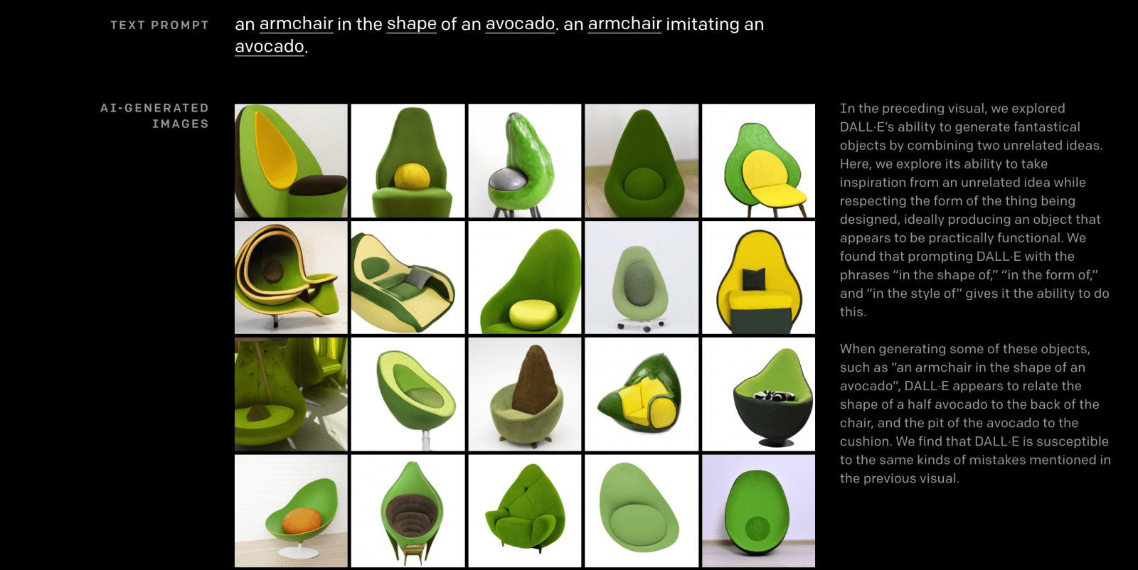
Craiyon to try for free online – https://huggingface.co/spaces/dalle-mini/dalle-mini
Open AI Company shared the results of their research, which I can not call anything other than magic – DALL · E, a new neuron, a continuation of the GPT-3 idea on transformers, but this time for generating images from text.
Generative Pre-trained Transformer 3 is an autoregressive language model released in 2020 that uses deep learning to produce human-like text. Initial release date: June 11, 2020. Number of parameters: 175 billion
I often write here about fantasy, they say, I fed Harry Potter to the neuron and received illustrations of all the scenes of the book – it seems this is no longer a fantasy, but they still don’t give me anything to dig deeper.
DALL · E neuron with 12 billion parameters, trained in picture-text pairs, its tasks:
- Synthesize pictures by text description
- Draw pictures with a part at the input, taking into account the text description
Open AI has already teased some things in this area before, and finally it has reached such a level that the jaw is falling off, look at the examples that I have attached, at the top of the text that was given at the input.
I’m sure she won’t be allowed to play for everyone yet.
I foresee this research will greatly affect many areas and industries, as the applications are endless.
- More details here: https://openai.com/blog/dall-e/
- Try Craiyon (ex Dalle-mini) online here https://www.craiyon.com/
Your Own AI Designer in 1 click
A fiction that has already become a reality. You tell the computer (in words!) what you want to see in a picture, and it draws it.
One more small step for GPT-3 and a huge leap for the design industry. You describe a photo/illustration in words and voila (so far 256×256). In short, there will be more good design around in the next 10-15 years. Designer’s work will become much more interesting (a lot of routine will go away).
This is the client’s paradise: “play with fonts”, “enlarge the logo”, “highlight in red” – all this is readily done by a mentally balanced machine.
On the other hand, unusual illustrations for children’s books, for example, are also welcome.
What profession to master in order not to be left behind in 10 years?
Read here our Free Guide how to use Dall-e tool.
7 Steps to create the perfect Pop Up Ad: learn how to get your popup ad launched quickly and easily
Many users claim that pop-up windows usually irritate them. Some even assert that they simply despise them. Due to this unfavorable audience attitude, many businesses no longer use pop-ups while developing their marketing strategies.
Don’t dismiss them right away, though. With the right PopUp software, you can get all the advantages of using popup ads. When implemented correctly, they increase the number of website visitors who become qualified leads and customers without degrading the user experience.
7 Steps to make cool Pop Up Ad
This article will explain why pop-ups are essential for conversion and provide you with some inspiring examples of pop-ups.
- Take care of the convenience
Ensure that it is easy for your customers and website visitors to sign up for your newsletter via a pop-up form. Consider your visitors’ comfort as you develop and create your form:
Produce legible writing. A person wants to know what he is signing up for before spending time filling out a form. To explain the purpose of the subscription, specify the rewards that customers can receive after registration, or indicate the frequency of your emails, provide a brief note on the form.
Make sure your pop-up is mobile-friendly. Smartphone usage is growing every day, so the registration form should look amazing on all of them. Popup forms should be mobile by default for good services.
Select the appropriate subscription confirmation procedure. A single or double subscription confirmation technique may be available to customers when creating a pop-up form. While the two-step procedure requires subscription confirmation, the single approach allows for a quick subscription (by clicking on the link in the confirmation email).
- Offer Rewards
Offering specific benefits can increase website traffic and encourage visitors to join your mailing list. To ensure that all visitors are aware of any active deals, provide a short message in the popup.
You may provide new subscribers with a unique one-time promo code. It can be used for free delivery or a discount on their first purchase. Other audiences will value the opportunity to receive special product updates or additional useful information. Several incentives can be provided to new subscribers. Just make sure they fit your company.
- Play Around With Time
Controlling when a popup appears on your website is one of its advantages. To understand what helps you obtain the most conversions, experiment with different time frames or triggers on your website.
- Examining the spawn delay.
When a user navigates to a page on a website, a pop-up window may be displayed. Such a method is helpful for companies who find that website visitors do not spend the required time browsing a web page. Thus, it’s preferable to set a window to open 5 or 20 seconds after logging in. - Run a scroll trigger.
Consider using a scroll-based trigger if you want to give visitors the option to stay on the page longer before displaying the registration form, or if you simply want to prioritize certain content on your website. When a visitor scrolls to the center of the page, being ready to leave your site, a form can be displayed.
- Create a Strong Brand Identity
Create a cohesive identity for your popup form by branding it similarly to your landing page. Try including your company’s logo or a great background image to your popup form. Create an engaging call-to-action button that entices visitors to complete the registration process by using calligraphic fonts and color schemes that compliment your brand.
- Make Attractive Visuals
The design of your popup ad is the first thing people pay attention to when they see it. However, this does not imply that you should use bright colors and large fonts. Be careful in your approach to the pop design; don’t separate it from the overall aesthetic of the site, but experiment with a focus to make the window less intrusive and irritating.
- Create a Strategy for Attracting New Customers
The pop-up form will add new users to your list of registered users, but it’s crucial to prepare the material you’ll give them in advance. For instance:
Send a welcoming email. Create an email that will automatically be sent to new subscribers to express your gratitude. Offer new subscribers a discount or access to unique information, highlight your best-selling products and latest releases, or just express appreciation for their interest in your company. To assist new subscribers to get to know your company, goods, and services better, provide them with hints, tools, or lessons.
Segmentation may be used to tailor your message. Distribute different content to each of your subscribers. Utilize the data you gather from your popup form to segment your audience, tailor your marketing, and improve the relevance of your communications.
- Give Visitors a Choice
Provide your potential customers with an option to shut the popup ad if they choose not to interact with it. Make the cross visible and clickable, but avoid annoying customers by bringing up even more pop-ups after they’ve closed the previous form.
Conclusion
Despite the often negative perception of popup ads, they continue to be a crucial tool for turning website visitors into leads. Leads who might otherwise leave the site permanently are kept with pop-ups that promote a product without irritating consumers. When developing a conversion popup, every detail is significant — the page on which you place it, the place and time of its appearance, design, the number of fields in the form, and the color and text of the target action button.
Find Out Who Are Your Future Customers by UX research in 2023
No business can survive without customers. Whether you’re just starting out or you’ve been in business for years, it’s essential to always look for new customers. But how do you find them?
One way is to use UX research. UX research is a method of studying how people interact with products and services.
By understanding the needs and wants of your target audience, you can create a product or service that they will love. And when your customers are happy, they’ll keep coming back for more.
So if you’re looking for new customers, start by doing UX research. It could be the most significant thing you ever do for your business.
Keep reading to learn more about how to use UX research to find new customers.
What is UX research, and why should we do it.
UX research investigates how people interact with a particular product or service to improve the user experience. It helps businesses understand their customers’ needs and wants and design products and services that meet those needs.
UX research can take many forms, from surveys and interviews to focus groups and observation. The most important thing is that it provides valuable insights that can be used to improve the user experience.
Why should we do UX research? There are many good reasons.
It helps us to understand our users better.
It allows us to see things from their perspective and understand what they need and wants from our products and services.
It helps us to design better products and services.
By understanding the needs of our users, we can design products and services that are more likely to meet those needs. This leads to satisfied customers and more sales.
It helps us to identify areas where the user experience can be improved.
We can identify areas where our products or services are falling short by conducting UX research. We can then take steps to improve the user experience in those areas.
It helps us to stay ahead of the competition.
By understanding the needs of our users, we can design products and services that are better than those of our competitors.
It helps us avoid making design decisions based on Guesswork or personal preferences.
Businesses often make design decisions based on Guesswork or personal preferences. This can lead to products and services that don’t meet the users’ needs. UX research helps us avoid this by providing insights based on accurate data.
It helps us make relevant decisions about which features to include in a product or service and how best to implement them.
Limited resources are always available, so it’s essential to use them wisely. UX research can help us ensure that we’re including the features that our users really need and that we’re implementing them in the best way possible.
In short, UX research is an essential tool for anyone who wants to create great user experiences. And when you create great user experiences, you’re more likely to find and keep happy customers.
How to identify your target market.
Your target market is the people most likely to buy your product or use your service. You need to understand your product or service and its benefits to identify your target market. Then, you need to identify who would most likely need or want that benefit.
For example, if you offer a new type of health insurance, your target market might be self-employed people or the ones working for small businesses. Once you’ve identified your target market, you need to research them to learn more about their needs, wants, and purchasing habits.
Only then can you develop marketing strategies to reach and appeal to them.
There are many different ways to research your target market.
Surveys: You can use surveys to collect data about your target market’s demographics, needs, wants, and purchasing habits.
Interviews: You can conduct interviews with members of your target market to learn more about their needs, wants, and purchasing habits.
Focus groups: You can bring together a group of people from your target market and ask them about their needs, wants, and purchasing habits.
Observation: You can observe your target market to learn more about their needs, wants, and purchasing habits.
And of course:
UX Research: You can use UX research methods to collect data about your target market’s demographics, needs, wants, and purchasing habits.
Once you’ve collected this data, you can use it to develop marketing strategies to reach and appeal to your target market.
How to use UX research to create user personas.
Creating user personas is a vital part of UX research. To create a persona, start by collecting data on your target users. This can include demographic information, behaviors, motivations, and needs.
With this data, you can create a fictional character representing your target user. Don’t forget to give your persona a name and a back story; consider adding a photo or other visual elements to help bring the persona to life.
Once you have created your persona, you can use it to inform the design of your product or service. For instance, you can use the persona to help decide what features to include in your product or how to word your marketing materials.
Ultimately, by taking the time to create user personas, you can ensure that your product or service meets the needs of your target users.
How to use UX research to understand customer needs.
Understanding customer needs is essential for any business that wants to stay relevant and successful. And while there are many methods for gathering this information, UX research is one of the most effective.
UX research involves studying how customers interact with a product or service and then using that data to improve the user experience. Do this with the help of surveys, interviews, focus groups, and other methods.
By understanding what customers want and need, businesses can create products and services that better meet those needs. As a result, UX research can play a vital role in helping businesses stay ahead of the competition.
Find out who are your future customers.
Grand-Studio UX consulting services can help you understand your target market and what they need from you. They can also help you create user personas and UX research to improve your products and services.
So if you want to better understand your customers and create a superior user experience, contact Grand-Studio today.
UX research is essential for any business that wants to create a great user experience. By understanding your target market and customer needs, you can create products and services that meet those needs. And when you do, you’ll be well on your way to success.
The Secrets of Portrait Photography
A common question often arises: how can we make the model in the picture look really good and attractive? The art of photography holds a lot of secrets! And it’s not just about technical issues. For example, do you know how to dress in order to look great in the picture? And what kind of makeup creates a great-looking portrait? What type of lighting is preferable to use? Luminar Neo is a photo editor which is one of the best for post-processing. Try it today and make your photo masterpieces!
Getting Ready for the Shoot: Clothing and Makeup
When you choose clothing before taking photos, remember the most important thing: don’t let the outfit distract the viewer’s attention! If your costume is bright, garish, or extravagant, the photo will turn from a portrait into a picture from a fashion magazine or a catalog of an online store. The viewer won’t pay attention to you but will consider only your clothes. That’s why an outfit with a bright and large pattern is the least suitable.
Makeup is also very important for a photo portrait. To make your face look perfect in the photo, it would be good to consult an expert in this field. Here are some tips that can help you:
- The most important thing in makeup for a photo portrait is the model’s eyes. In any situation, in any light, the makeup will look a little weaker than it was in reality. That’s why you should make your eyelashes a little bit thicker than you usually do. The eye contour can be emphasized with a pencil. But do not forget to shade it a bit.
- In the makeup for the photo, there is no way to do without powder. It is good if it has a matte effect, so it can help to avoid the problem of shiny skin.
- Give preference to matte lipstick. And preferably it should be a light shade. If you want to make a look more alluring in the photo, makeup artists recommend applying a little gloss to the middle of the lower lip.
The Camera Technique
Any camera is good for taking portraits. The advantage of a DSLR camera is interchangeable optics, which allows you to vary the modes of photography, the ability to shoot in manual mode, which means that you have many opportunities to solve your artistic tasks, and the ability to shoot in difficult conditions.
For DSLR cameras, it is recommended to use lenses with a focal length of 50-80mm. With a focus distance of less than 50 cm, you will get distorted proportions of the model.
To equalize brightness in the frame and highlight shadows, you sometimes need to apply a flash or reflector.
Light
To prevent the face in the picture from looking flat, it is better to use light coming in from the front and from the sides (front-diagonal lighting). Good results can also be achieved with side lighting, but it is better to use a reflector (which can be a white wall at home, for example) or an external flash. Outdoors is the best shot in the morning or early evening. If you take your pictures at noon, when the sun is in its highest setting, the overhead light will give deep shadows and a very sharp contrast.
With backlighting, you can get a silhouette if you shoot for example in the evening. If you want to illuminate the face, a reflector or an external flash is also needed. Frontal lighting will make the face look flat and should be avoided.
At home, it’s best to shoot with light from a window. Transparent curtains will help make it diffuse and softer.
Working With a Model
Very often we see tense faces and strained smiling people in pictures. A good portrait photographer should be able to reveal a person’s inner world, and this is only possible when the model is relaxed and naturally at ease.
It is best to start shooting with a casual conversation. When the person is relaxed, the shooting can be started.
In the beginning, you can say that you are not shooting yet, but just choosing a shooting point and adjusting your gear, trying out a new lens, in other words, taking test shots. Often you can get the best photos at that time. Interesting frames come out during the breaks, too, when the model is tired, stops “posing” and relaxes. Here again, you can say that while the model is relaxing, you are testing your technique again and choosing an angle for further shooting.
All this, of course, does not apply to professional models who know how to work in front of the camera.
Conclusion
Photography takes practice and requires concentration and persistence to succeed. That’s why it’s good to try taking portraits with someone you know who is willing to be photographed. Learn your camera, and don’t be afraid to experiment! Also, don’t forget about post-processing your shots, this is the step that helps bring them to perfection. If you still don’t know which photo editor to choose, try Luminar Neo. Let your portraits be incredible!
Why should we use WordPress over Blogger (Pros and Cons)
This guide shows you why wordpress is the best platform for blogging in comparison with blogger and why we should use it.
Overview – WordPress vs Blogger
Both WordPress and Blogger are good and appropriate at their places. Here, we will get to know why we use WordPress over Blogger.
It is never too late to fulfil your dreams. It is never too late to start anything new. Blog writing or having your website is one of them. People who love to write have their websites or blog. So, it is also necessary to know what is the best for a website or blog? Blogger or WordPress.
On a hand, having a blog or website gives you fame. It also helps you to earn a lot. Many Bloggers do this full time nowadays. Being a WordPress development company, we can help you have one.
There is a normal tendency of human beings. If they go to buy something, first they analyse many times about the product. Product can be anything. It can be electronic items. They may be clothes. It can be any type.
So, when it comes to websites or blogs, they also want to buy the best. But sometimes, they cannot analyse those two platforms completely by themselves. As a WordPress web development company, we are here to help you. To find out why WordPress is better than Blogger.
First, have a little knowledge about WordPress and Blogger.
What is WordPress?
WordPress is a CMS platform. It provides a broad range of so many features, essential for any website. There are facts that will surprise you. Almost 38.3 percent of websites are powered by WordPress.
WordPress is a platform where anyone can manage all his data on the website. Even without having much knowledge of any programming language. We have so many tools in WordPress that can help us create our website.
And if you use WordPress for your website, you’re in good company. These famous sites all use WordPress, too:
- TechCrunch
- New York Post
- TIME.com
- New York Observer
- TED
- Thought Catalog
- Fortune.com
- National Post
- Spotify
It’s no wonder. WordPress is awesome.
What is a Blogger?
Blogger is an American blog-publishing service. It Permits multi-user blogs with time-stamped entries. The Pyra Labs developed it. It was bought by google later on. The blogs are hosted by Google in the Blogger. It gave a sub-domain of blogspot.com.
Now, let us come to our key point of discussion. Why should we use WordPress over Blogger?
We, a WordPress development service, would like to tell you one thing. On what parameters, we are finding the superiority of WordPress of Blogger.
#1 Functioning
The functioning of Blogger is too basic. You cannot do too much with your post and content. You have thousands of themes with WordPress, which you can use in your WordPress account. You can customize your blog easily with WordPress.
#2 Appearance and Customization
We all heard a famous quote, “First impression is the last impression.” What is your first impression? Your look. Your appearance. If your first impression is not good, no one will try you.
The same thing applies to the blog or website. It needs to be good in appearance. When someone opens your site, he must have a good feel.
With the help of WordPress, we can improve our website in appearance compared to Blogger. Blogger is restricted to some tools while WordPress does not. We have more tools and WordPress themes for website designers to make our website more appealing.
We have a wide range of plugins as well in WordPress compared to Bloggers to customize our blog or website. Being a Best WordPress development company, we can help you make your website good in appearance. We can also figure out which plug-in suits your blog post.
Every website and blog needs a specific plug-in. For example, a service website will need a booking plugin. The same thing applies to the theme. It is mandatory to use a specific and suitable plug-in and theme with the website. Which is completely based on the purpose of the website?
For example, if you want to have a news website. You need to put a specific theme and plug-in for the same. They are specially designed for the news website. The same applies to an e-commerce website. As an E-commerce development company, we can do that for you.
If you are looking for a larger website, you have to go with WordPress.
#3 Flexibility
Which platform should we use? The answer will surely be in question. I.e., which is more flexible? And WordPress is more flexible than Blogger. It is something like customization. As we already discussed, WordPress gives us more customization benefits. It provides us with more themes. It means it is more flexible.
#4 Ownership
The one major disadvantage with the Blogger is, you have not owned your content. While not such issues are there with the WordPress. If google shut down their services, then Bloggers may shut down automatically. And google can also shut down your services.
So, if you are looking for ownership of your content. You are going to create any shopping or e-commerce website. Our ecommerce website development company is here to help you.
#5 Reliability and Support
It is another most important aspect while the selection of anything. Just think, if you will go to buy some property, what do you look into first? Reliability. When you are there for an outing and need to take a hotel. What do you ensure first? Reliability. So same as with the website, Reliability is an important phenomenon.
If you will not be taking care of this, you will lose your data. Not only you will lose your data, but also you will lose all your hard work. The hard work you had done for your website or blog. The hard work which you had done to brand yourself or your company.
Conclusion: Blogger vs WordPress – Which One Is Better?
So being a WordPress development company, we suggest going with WordPress. Why are we saying this? Because Blogger fully depends on google. If a Blogger goes shut down, your site too. And if google suspended your account although you had done nothing wrong, what you can do? Nothing.
WordPress is a self-hosted solution. There will not be such types of issues that will occur. You can recover your data easily.
The support system of Bloggers is also not as good in the comparison of WordPress. WordPress also has an active community for any support needed.
As a renowned WordPress development service, we can say that in many aspects WordPress is better than Blogger. And we can help you have one on WordPress.
At last, we would like to show you trends of searches of WordPress and Blogger for the past five years.
Author’s Bio:
Yashraj is the Digital Marketing Manager in a Best WordPress Development Company, he has a passion for Digital Marketing and web design, and when not in the gym enjoys playing cricket. In free time, he publishes some articles on his blog.
Outsource Website Design in 2023: Benefits, Process, Cost
For businesses that want to get their website design project done quickly and efficiently, outsourcing is the way to go. By working with a team of developers who are experts in the field, businesses can save time and money while still getting a high-quality end product. Here are some of the benefits and process of outsourcing website design.
Why outsource website design?
When you outsource website design, you can focus on your core competencies and leave the design work to experts. This can save you time and money, and it can also ensure that your website is designed to meet the latest standards and best practices.
In addition, by outsourcing website design you can tap into a global pool of talent to get the best possible results. And because outsourced designers are usually paid on a project basis, you don’t have to worry about the overhead costs associated with hiring in-house staff.
If you’re thinking about outsourcing website design, here are some things to keep in mind:
1. Define your project scope and objectives. Before you start looking for designers, take some time to think about what you want to achieve with your website. Do you need a simple informational site, or do you need something more complex, like an e-commerce site? Once you have a clear idea of your goals, you can start looking for designers who have experience with projects of similar scope and complexity.
2. Do your research. When you’re looking for potential designers, it’s important to do your homework and make sure they have a good reputation. You can read online reviews, check out their portfolio of past work, and even ask for referrals from people you know who have used their services.
3. Get quotes from multiple designers. Once you’ve found a few designers who seem like they might be a good fit for your project, it’s time to get quotes from each of them. Be sure to ask about their process, timeline, and pricing so that you can compare apples to apples before making a decision.
4. Ask for revisions and edits along the way. Once the initial design is complete, be sure to ask for revisions and edits until you’re happy with the results. Many designers offer unlimited revisions as part of their service, so be sure to take advantage of this if it’s offered.
Outsourcing website design can save you time and money while ensuring that your site is designed by experts. By doing your research and asking for revisions along the way, you can be sure that you’ll end up with a finished product that meets all of your expectations
The process of outsourcing website design.
Assuming you have decided to take the plunge and outsource your website design, the next step is to determine what kind of design services you need. This can be tricky, as there are so many different types of designers out there, all with their own specialties and skillsets.
There are a few key questions you should ask yourself before contacting any designers:
- What is the purpose of my website?
- Who is my target audience?
- What kind of look and feel do I want for my website?
- What functionality do I need on my website?
- How much am I willing to budget for this project?
Answering these questions will help you determine what kind of designer you need to be looking for. Do you need a comprehensive service that covers everything from strategy to implementation, or are you looking for someone to simply build out a design that you already have in mind? Once you know what you need, your next step is to find the right designer for the job.
There are a few different ways to go about this. You can use online directories or job boards that allow you to post your project and receive bids from interested designers. Or, you can take a more personal approach and reach out to designers whose work you admire and see if they would be interested in working on your project. Whichever route you choose, be sure to take some time to review portfolios and get a sense of each designer’s style before making your decision.
The benefits of outsourcing website design
There are many benefits of outsourcing website design, including cost savings, access to skilled labor, and increased efficiency.
Outsourcing website design can be a great way to save money on your project. You can often find designers who are willing to work for less than you would pay for in-house staff. In addition, you may be able to find discounts or special rates when you outsource website design.
Outsourcing also gives you access to skilled labor that you might not be able to find in-house. When you outsource website design, you can choose from a pool of designers with different skills and experience levels. This allows you to find the right designer for your project, and it also allows you to get more bang for your buck.
Finally, outsourcing website design can increase the efficiency of your project. When you outsource, you can often get the project done faster than if you were to do it in-house. This is because the designers who work for outsourcing companies are usually more experienced and familiar with the process of designing websites. As a result, they can often get the job done quicker and with fewer errors.
The Total Cost of outsourcing website design.
Many businesses are outsourcing their website design to save money. But how much does it really cost to outsource website design? Here are some factors to consider:
1. The size of your website: The more pages and features your website has, the more it will cost to outsource design.
2. The complexity of your website: If your website is complex, with many features or a custom design, it will cost more to outsource than a simple website.
3. The experience of the designer: More experienced designers will charge more for their services. However, you may be able to get a discount if you use a less experienced designer.
4. The location of the designer: Designers in developed countries will charge more than designers in developing countries. However, you may be able to get a lower price if you are willing to work with a designer in a developing country.
Average total cost is: $1 500 to $35 000 on Design Stage.
The best website design outsourcing companies.
There are many reasons to choose an outsourcing company for your website design needs. Maybe you don’t have the in-house resources to tackle a large project. Maybe you need a team of experts to handle a complex eCommerce redesign. Or maybe you simply want to free up your time so you can focus on running your business.
There are a lot of website design outsourcing companies to choose from, but not all of them are created equal. To help you choose the right partner for your next project, we’ve compiled a list of the best website design outsourcing companies.
The best website design outsourcing developers.
The best website design outsourcing developers are those who have a proven track record in delivering high quality websites. They should also be able to work quickly and efficiently, so that your project can be completed on time and within budget.
There are many website design outsourcing companies to choose from, so it is important to do your research before selecting one. Make sure to ask for client references and check out the company’s portfolio to get an idea of their work.
Once you have selected a few website design outsourcing companies, contact them and discuss your project in detail. Get quotes from each company and compare them before making a final decision.
How to outsource website design effectively.
Websites are a crucial part of any business in the modern world, and an effective website can make all the difference to your bottom line. However, many businesses find the process of designing and building a website to be complex and overwhelming. The good news is that there are now plenty of options available for businesses who want to outsource website design.
When it comes to outsourcing website design, there are a few key things to keep in mind in order to make the process as smooth and effective as possible:
- Define your goals: What do you want your website to achieve? Make sure you have a clear idea of your goals before you start working with any outside designers or agencies.
- Do your research: Not all web design firms are created equal. Take some time to research different firms and find one that matches your needs and budget.
- Set a budget: Website design can be costly, so it’s important to set a realistic budget before you start working with anyone. Get quotes from multiple firms before making a final decision.
- Be clear about your vision: Once you have found a firm or designer you want to work with, be clear about your vision for the project. The more specific you can be, the better chance you have of ending up with a website you love.
FAQs about outsourcing website design.
What are the benefits of outsourcing website design?
There are many benefits to outsourcing website design, including cost savings, access to skilled workers, and flexibility.
How much does it cost to outsource website design?
Outsourcing website design can save you up to 50% on the cost of designing and building a new website.
What are the risks of outsourcing website design?
There are some risks associated with outsourcing website design, including quality control and intellectual property concerns. However, these risks can be mitigated by working with a reputable outsourcing partner.
TOP 6 Growing Web Design Trends for 2023
It’s needless to say how crucial web design is for achieving business goals. Just look at these impressive stats:
- 50% of consumers believe that website design is crucial to a business’s overall brand.
- 75% of consumers admit judging a company’s credibility based on the company’s website design
Web design trends are recurring, but trends for 2022-2023 will stand out for several reasons, including the impact of the pandemic, recession and a shift to mobile-first technologies. The latest website design trends also focus on a personalized and minimalist interface.
In this article, we listed the latest tendencies that will shape the future of web design.
Let’s get started!
Why is Web Design Important for Business?
Website design and development are essential for business transformation. It is often the very first step of interaction with potential clients. So your website should be a part of your overall strategy and align with your objectives.
Keep in mind that the website design also depends on the business area and customer type. A website of a B2B company has different goals and user models from retail platforms.
Make sure the ideas offered by your designers are applicable and relevant for your sphere.
Top 6 Innovative Web Design Trends for 2023
Elements like navigation, content, and graphic design will remain essential for building an outstanding website design. However, they will be shaped by the upcoming tendencies.
The following trends are going to dominate in the web design sector in 2022 and beyond. Please note that it is not necessary to follow all the trends at once. You can use only some of the trends for your projects to make them better and more efficient. Well, let’s get started!
1. Content Personalization and AI
Salesforce’s “State of the Connected Customer 2020” report found that 66% of customers say they expect companies to understand their needs and expectations. This pertains to business aspects. With personalization ruling the game in digital marketing and sales, it’s hard to overlook this trend in web design. Personalized content helps establish trustworthy relationships between the client and the brand.
2. Light and Dark Modes
This is a great web design element to consider in 2022, as this feature plays a crucial role in enhancing the user experience. Develop a color scheme that would fit both dark and light modes without harming visibility. Most users enjoy such options that give them more control.
3. One-page Websites
Why make multiple website pages when only one page can be informative enough. They work best if they are dedicated to a narrow topic. This new concept is most popular for websites-portfolios or presentations of a single product. Users don’t need to search multiple pages to find what they need. Hence, this is a top option to ensure they read till the end.
One-page websites don’t distract users with menus and navigation elements. While creating a one-page website, pay attention to the amount of text placed there and the number of screens. Check out web design inspirations for single-page websites to see how they work.
4. Minimalism
This is not a brand new web design trend. This strategy has been around for many years. Yet, designers have brought innovation to a conventional minimalist style. According to Goodfirms, 84.6% of web designers believe crowded web design is the most common mistake made by small businesses. Modern web design trends dictate that there should be minimum interactions before the users make the final step. Simple, clear, and airy websites don’t overload their users.
“Less is more” – is an essential web and graphic design principle. Less text, pastel colors, catchy CTAs, and a clear user experience are the key rules for website pages. Instead of overwhelming your users, encourage them to learn more and explore other pages. Use enough space between different website scrolls to prevent overloading users. Many designers have modified the traditional concept of white space. Minimalist design can also be colorful. The message should be simple not to lose potential leads.
5. Large and Playful Text
Text may replace images and play their role, becoming as interactive, meaningful, and attention-grabbing as images are. While experimenting with innovative fonts, pay attention to how it displays on mobile and tablet devices. Find out how to boost their effect on website visitors and adjust them to the whole company image. Animate your text to create a more interactive experience and boost user flow.
While adding such an attention-grabbing text, consider how other elements look. Ensure that the CTAs and buttons are visible and the smaller text and images are balanced.
6. Human-like Chatbots
Apart from design matters, growing web design trends also include user experience. AI-based bots make interactions with potential customers more convenient and fast.
According to a report by Drift, 55% of businesses that use chatbots generate more high-quality leads. Human-like chatbots use advanced algorithms to communicate with users like real people. They collect user contact information 24/7. Such bots can predict user intents and give efficient responses.
- Tips on how to build bot for reddit.
Ending Note about Web Design Trends
Remember that website design should convey your business values to users. The focus of modern web design is lightness, conciseness, and minimalism. While working with web designers, focus on essential elements that deliver the most sense. Hopefully, our overview of the latest trends in web designing helped you come up with outstanding and efficient decisions.
7 Design Trends for Web Designers to adhere in 2022
It’s 2022! So, brands should take their website design strategies seriously! A website is usually the initial reference point for online users, who’ve come across a new brand. If they like navigating a website, then they will follow the brand’s social media profiles as a natural fall out. On the other hand, if they don’t like the navigation experience, they will bounce off from the website at the earliest.
As 2022 is settling in, it is bringing new web design trends and goals that brands need to stay aware of. There have been some remarkable advancements in display technology for most devices that online users use for browsing through web content. And if today, web designers want to go a little more prominent on colors and loud on text, they would succeed than fail. In fact, it is a time when web designers can enjoy interesting tweaks in web design strategy.
Next to read post https://outsourceit.today/website-carousel-design/
The Best Web Design Trends of 2022
Some of the trends, for instance, gradients, are back again. And now it’s all about dynamic gradients. So, if the flat design takes a backseat, then in 2020, it will have no future. Dynamic gradients have the potential to occupy the entire space, at least in 2020, and even in 2021.
On the other hand, we have pioneers like Apple and Google, that supports flat design. And that might result in an interesting blend of colors and depth in 2020, in a minimalistic way. In the past few months, it became evident that flat design accommodates more energetic and deeper color tones. One can get experimental with it when there’s a need for it.
The eCommerce websites are gaining popularity
Today, eCommerce is a huge section, and eCommerce websites are becoming highly popular! Website designers here are trying to give the online customers precisely what they need when it comes to interface and user experience. They also provide apt visual appeal. The best eCommerce design patterns for 2021 and 2022 are mostly to concentrate on simplicity, navigation ease, speed, and usability. The faster a customer can browse through an eCommerce website, make a purchase, pay, and leave the website, the better it is for the website and the customer. So, web designers can tweak as many trends they want, but it is necessary to cater to the basic requirements.
The other essential web design trends to watch out for are:
Simple design and bold colors
Today, the brands are trying their best to emerge visible and prominent amongst a sea of other market players. Hence, more websites are keen on using bright colors and bold characters. One can mull about supersaturation. The deep and brilliant colors are immersive. They also grab maximum attention, and that’s what most online brands want.
Today, most of the brands have safe web designs! So, to go against the trend suggests a brand is keen to experiment. It also shows that a brand is progressive and is completely comfortable in portraying a different, distinguished, and an eccentric personality. And this distinctive element, along with the quirkiness, results in an increased brand loyalty. Today, the majority of device screens are embracing the IPS technology. And that is a huge step towards making bold colors stand out impressively, for the world to enjoy the same.
Animations, dynamic illustrations, and integrated GIFS
The trend of video content became popular in 2017. However, the sluggish page load issues are creating a hindrance. Slow page loading often makes a website lose its users. Motion graphics are highly popular with readers all over the world. Is there anything that is replacing videos? Yes, and it’s getting replaced by animation. There are a few ways in which animation technology can bite, such as:
- There can be the mouseover effects.
- There could also be a transition between the parallax and page scrolling.
- Mobile animation.
The motion graphics can take much lesser time to load in comparison to the motion graphics. These motion graphics go a long way in adding the desired jazz and persona to a brand’s entire look and feel. Also, when web designers execute this correctly with custom illustrations and GIFs, it can assist in demonstrating the brand’s story in a better way. The brand storytelling evolves significantly. The brand looks more confident to the audience.
Mobile animation takes center stage here! The mobile-first was a web design trend for some time. And right after the mobile technology boom, today, it has the chance to carry on the drive for mobile animation in 2020. The trend is all set to see a new paradigm in the years to follow. On the other hand, illustration can make it simpler for brands to explain the ways to use their brand easily to customers. Also, the eCommerce sites can make use of the custom illustrations for helping the online shoppers move through each product page and check the way the product works. They can also figure out the way to use shopping carts and filters.
Also, the more serious brands can opt-in for custom illustration and animation for adding a little bit of fun to the website. It also helps to retain the reader’s attention on the webpage. With several advancements in the AI, web-based, as well as the big-data technologies, 3D effects, and animation, the data visualization is less bland and stringent. One of the significant stipulations with animation is that one has to get careful about the mobile site visitors. Based on the nature and size of the device, it might get complicated and sometimes impossible to offer a similar experience for mobile customers. Web designers can come up with various ways to make use of the animation technologies to make the brand and customer bond stronger.
The asymmetric layouts
Today, the majority of the website have neat bland fields and grids. They are playing it safe. Well-arranged webpages are useful. However, in 2021 the asymmetrical trend is gaining prominence as it gives the website the required percentage of enthusiasm, fun, and character.
Personalized websites are leveraging this trend to a great extent. The broken grid-format is much popular and appealing because of its innate uniqueness and assertiveness. However, it is necessary to use this trend in your favor very carefully.
If your brand has ample live content, then the asymmetric layout might not work for you! It can result in chaotic user experience, and you might lose users. Hence, if your website has more live content, say yes to a more well-defined, customized design. That is what will keep the users happy and content.
The trick to have a great website design is to get the symmetry in balance! And if you want the asymmetric layout to be in balance, it is necessary to make sure that the web pages aren’t heavy in any way or any section. Making use of big and high-definition images is perfectly fine. But you must balance it correctly with space, text, and various other aspects.
Regardless of the complexity of the website design, the viewer always looks at the more prominent on-page elements right at the start. After that, they shift their attention to various other allied parts.
CSS Grids
It is one of the essential trends that web designers need to delve in! Recently, online brands need to decide if they want a desktop-only or a mobile-only website. And the website designs must get the sites configured. It will help them to know about the device which users are resorting to. Hence, the user can get directed to a single website version that caters to their device size.
The fact that people use their mobile more for browsing became official in 2017. But people were using their mobile devices, even before that. Hence, an intelligent CSS grid provides a stunning choice for flexing one’s website in various versions to cater to a person’s device screen size. And if you think from the end-user’s point of view, it is one of the essential responsive design trends recently.
The mobile traffic rates today outshine desktop traffic volumes. It is the same across the globe. It is interesting to note that Google carries on explaining its bias towards mobile-friendly websites, and that explains why the mobile-first website is essential.
The CSS grid is one of the recent developments in responsive web design. It makes sure that an online visitor has a high-end user experience while navigating a website, regardless of the type and size of the computing device they are using. This layout enables the website owners to manage the content in columns and rows which complement the user screen size. It ensures that there is maximum user engagement as well.
These are some of the essential trends in website design technology in 2020. Web designers can abide by these trends and come up with the best strategies. It will help the websites to rank better and also offer a pleasant user experience.
7 Best Modelling Audition Tips for Newbies
Modeling sounds and seems to be one of the most glamorous fields. People look at models and wonder in awe to walk on that ramp. But let us tell you that this is a challenging task. From being an absolute newbie to becoming a pro model where people know you, you’ll have to come a long way.
And that’s all possible when you’ll meticulously follow some of the tips that we’re going to talk about below. Following them will make your entire process much easier and smooth. So, without further ado, let’s look at the top modeling audition tips we’ve jotted down.
1. Narrow Out The Genre You Like!
Models are different, and you must ensure you’ve narrowed down your genre to become a good one. And that’s all possible when you look at the different models and understand your strength. For this, taking help from experts can be a great option too.
For example, people in Melbourne are trying to look out for a good agency, and one of them is Modelling and Talent Agency Melbourne. Working in this agency can be helpful, as they not only groom you but advise on what suits you best.
2. Wear What You Can Carry
We often don’t understand what looks best on us. But it’s essential that you, aspiring models, understand what suits your clothing. Wearing something that doesn’t suit you is not what you would want to do. So, make sure that you’re confidently carrying your clothing. And that’s going to affect and reflect on your entire personality.
3. Look Out For Prospects
Since the modeling career is highly competitive, you must understand what suits you and how you carry yourself. More than just simply looking to attend competitions or visiting production houses will be needed. You’ll have to be out there, attend parties, and meet new people. Looking out for every little prospect is important to ensure you have a successful career as a model.
4. Create A Portfolio
Even though you’re a newbie, you know the power of having a solid portfolio. And for that, people from the prospective agency you choose can help. So, make sure that you have a beautiful portfolio.
In that case, you can even look at other people’s portfolios to understand what your portfolio should look like.
5. Shortlist Your Role Model
To ace your career, it’s always essential to understand your strong points. And that’s all possible when you look at role models, understand their strengths, and adapt to some of the things you like. Developing a personal touch is crucial. However, you always need to start and admire some of the models you want.
6. Change Base If Necessary
Being an aspiring model, it’s always important that you understand what your strengths are and, most importantly, understand your prospects. And while doing that, you’d understand the need to change base. For example, if you’re staying in Victoria or Perth, you’d think shifting to Melbourne could be a better prospect. Doing this will open out more opportunities for you to explore. So, if you think that changing your place would help, don’t hesitate to do it.
7. Look After Yourself
Another vital thing is to look after your appearance. We often ignore this part, but when you think of yourself as part of the big screen, you have to care about how you look. Groom yourself well and try to remain healthy. Good looks matter a lot in the modeling career.
Final Thoughts
Modeling can be a glamorous job, but you’ll have to do it with the utmost skill and dedication. Putting in your effort and struggling to get your position is essential. And that can be done when you collaborate with the right people, understand your strengths, and adopt a new signature style for yourself. All of this will be simply impeccable.
As we end our blog today, we hope you know quite a few things to go ahead as a newbie to explore the vast industry as a model. Do follow the tips, and don’t forget to comment on what you think of the specially handpicked things we’ve spoken of!
Landingfolio Tool Review
The original Landingfolio was built on a WordPress template. Everything was basically a spaghetti program. The website would crash every time I tried to add a new feature. It was now at twilight. Is Landingfolio on the horizon?
The site has received over 800.000 pageviews in the past 12 months. This is insane considering that this was a side project from 2015. These numbers and so many words about the project from others convinced me to double down.
Go all in
September 2019, I decided that Landingfolio needed to be taken to the next level. No more breaking WordPress. It’s no longer about inspiration. It’s time to create something more. I learned how to program for four days per week, weekends included.
Nuxt was the tool I used to create Landingfolio. Vue.js framework. Vue.js is a framework.
The website you are viewing is the latest version of Landingfolio. It was completed six months ago and took over 500 hours to create. I had to add a lot of features to the “later section.” Many indie hackers fear launching their products. This was something I didn’t intend to allow, so I determined what the minimum viable product for Landingfolio.
So, what’s new?
The Landingfolio used to be a common design gallery. Although my favorite designs were included, that was it. The New Landingfolio was my vision. Only curated designs would be allowed on the platform. There are no fancy examples like Dribbble. Instead, real examples.
A platform can have many features. Below, I’ll list all new features, beginning with the most obvious.
Inspiration
You can still find all the old landing pages. However, I have added eight new categories of inspiration.
Login, Pricing, Signup and About. Logos, 404, and Logos. You can use this information to find inspiration for your next design project.
Landingfolio currently has over 4000 designs. It can be difficult to find the right one, so I added some cool new features!
Filter-based colors
You can see the colors at the bottom of each inspiration. These links are clickable. They will only show you landing pages with the exact same color as the one that you clicked. You can also use color filters located in the menu under the header.
Mobile and desktop designs are shown
These days responsive designs are essential. All designs on Landingfolio are now compatible with both mobile and desktop designs. To switch between designs, simply click on the toggle button in the filter menu.
Collections
Do you still use Google Docs to gather URLs for designs you like? You can now stop using Google Docs to collect URLs of designs you like. With the introduction collection, you can create and store your favorite inspirations in the correct collection.
There are endless possibilities for creating collections. The best part?
You can share your collections with friends and clients.
It is difficult to share examples with clients, as designers know. I have been sharing links to Google Docs. This doesn’t look professional.
Look in the upper right corner for the share button. You can now share your collection. The link will take you to a personal collection page that includes all of the designs. Send the link to your clients, and they will choose which design they want for their redesign.
The new Landingfolio Pro plan allows you to share collections. This plan will allow me to create even more features and concentrate full-time on Landingfolio.
Components
You are faced with the dilemma of creating a footer on your website. You would normally have to open each new website, scroll down to the bottom, and then look at their footer, which can sometimes be mediocre.
These days are long with Components. Landingfolio now has a new addition! Over 1500+ components have been collected from various websites. The menu at the top will help you find the right components. There are currently over 20 categories. More will be added. The best thing? The best part? You can filter them by colors.
All examples of component parts can be saved to your custom collection.
Templates and Resources
Also, the template and resource sections of the website have been given some attention. Each item now displays the technology and tool for which it was built. This allows you to quickly filter your tech-stack and find the right template or resource for your needs.
Next steps
The New Landingfolio was released and I had to add many features. There are many functions that I would like to add. These are my favorites and they will all be available on the site very soon.
- Conversion Optimized Landing Page templates.
- Landing page Teardowns. Get inspired by the best examples of what to do.
- Designer Profile. Create your portfolio and get new clients with Landingfolio.
- Drag and drop the Inspiration Builder. You can create your own example landing pages using the best elements from different websites. This can be used as a base for your own custom design.
Are you a Landingfolio expert? You can send it to the bottom of the page and you might be able use it soon!
The all-new Landingfolio is now available
I hope you enjoy the new redesign as much as I do. Remember, the website has been run for free for 5 years. Landingfolio Pro is a subscription that allows you to support me in building this amazing platform, and all the cool new features.
25 Ugly Websites That Make You Want to Laugh or Cry
Sometimes websites are just so darn ugly. You have to wonder what they were thinking about when they slapped it together. However, if you want users to take an interest in your website you can learn from all the mistakes of previous website admins.
While it might be a bit ugly below, every website is a goldmine of information on how not to design a website. When you put together the lessons, you can determine the best way to design your own site.
List of 25 Ugly Websites
“Grand Pri” has Craiglist
1. The Big Ugly Website
This site was designed by a web designer to show you exactly what not to do in a website. Start by looking at all of the funky motion graphics. They make you want to leave the site the instant you get there.
Next, examine the atrocious yellow background mixed in with a lot of red text. This is a classic no-no for websites. This combination makes it harder to see the text.
Finally, evaluate the mismatched boxes that overlap each other and the nonsensical content. Put it all together, and as the website url states you have a big, ugly website.
2. The World’s Worst Website
Another site created to emphasize the worst design traits. Notice the beautiful stars in the yellow highlighted section that make you feel like 1994 is back.
The block text is another nice add-on for people who might struggle to read what you have on your website.
Next, you have to appreciate the useless purple box on the right hand side. A good reminder that you can remove content on your site that does not serve a purpose. Especially if distracts from your goals.
Finally, look at the background. The image was not large enough for the site dimensions, so they made it a tiled background. That makes it seem like they have no clue how to design their website.
3. DesignZ23
When a website design site is this ugly you just need to wonder.
How in the world can they sell themes and website designs to their clients? It is bad enough that many of the sites listed here are just plain ugly. However, when someone packages that ugliness for other websites to buy, DesignZ23 takes it to another level.
4. Thorn Ford Dental Laboratory
When your website has nothing below the navigation tab, it is not a good sign. A large obnoxious Facebook button above the fold is not necessary either.
Finally, saying “Welcome to” is a waste of website space. Use that instead to talk about the benefits of the website.
5. Bone & Joint Center
Perhaps they could add an uglier flash header. You might not be able to tell from the image, but the flashing header may cause seizures before the repair your bones and joints.
Plus, not exactly sure what the benefit is of having an image of cafeteria at the top of the page.
Finally, the website has too much information to figure out what your next steps should be on the site.
6. Arngren
The benefit of an ecommerce site is you can display a number of different products to customers. However, stuffing as many products as possible on a page screams we just want your money.
Not something you want to convey in an age where 90% of consumers check reviews of your website before purchasing.
From a conversion standpoint this website is a disaster. Consider the famous study by Columbia University on how buyers purchase different flavors of jam through a tasting.
This was done live to two separate groups. One group was shown 24 flavors of jam. Another presented with 6 flavors. At the end of the sample, they were asked if they wanted to purchase. Only 3% of people presented with 24 flavors purchased.
Conversely, those presented with only 6 flavors converted at a rate of 30%. Sometimes too much choice can be detrimental to your closing rate.
To put this in context, there are close to 50 products listed on this ecommerce site. If 24 flavors converted at 3%, how much poorer is the conversion rate for Arngren?
7. Internet Archeology
Random flashing images with the no purpose, navigation, and very little text. Load the page from the start to see the worthless scroll of images. You gotta love the stars and spinning crosses.
8. Jamilin
If it were just the multi-colored navigation bar than this site might not be that bad. However, add in a header that is all over the place and you start to see the problem with the site.
Keep in mind this site helps people keep harmony in their life through Feng Shui. Yet, the owners feel cluttering the header conveys that message?
9. Rudgwick Steamshow
The animated gif with the highlighting circles is a great touch. The fact that this is for an engineering show makes you wonder what type of engineering tools are displayed at the 30th Rudgwick Country Show.
10. Penny Juice
What could be better than comic sans fonts, multi-colored rainbows tabs, and a worn penny that has nothing to do with the rest of the website.
Still not sure what Penny Juice is exactly.
11. Gates N Fences
While they do have a few images, Gates N Fences is way too text heavy.
Visuals are processed 60,000x faster than text in your brain. The sheer volume of text displayed here makes it hard to process any of that information.
12. Ugly Tub
Not sure what a crazed woman screaming has to do with bath tubs, but heck! Let’s go with it! It is not as if the website is as ugly as the tubs. Hm!
Side note: The guy falling in the tub is a great visual for bath safety.
13. Mortimer Lumber
Nothing says quality lumber like an overcrowded website portal. Even better, click on the website link to see how the box on the left flashes and distracts you from the products they sell.
14. Media Tek
While not the ugliest site on the list, what exactly do they do? Their parallax site does not explain the services they provide until halfway down the page.
15. Serene Naturist
Do beautiful animated butterflies make you have a craving for a massage?
If not, what about a naked roman statue? Serene-Naturist is for a massage parlor, so I am not sure if naked women is the correct message for your prospective clients.
16. Super Video
If ugly moving graphics and stroke inducing backgrounds are your cup of tea, then you should check out Super Video.
Based on the text on the website, they provide valuable information…I think! That is part of the problem with this website. No clear value to the site.
17. P&M computers, Inc
Do you remember the pointless intro screens a lot of websites used to use. Meet the most pointless intro screen ever designed.
The load time here is extremely slow, and when it finally does load you basically see their logo. Why not put that in the header, and get rid of this page altogether.
18. Richards Brothers Seafoods
When you think of purchasing fish products, do you look for a navigation bar that blocks your product images? Hopefully not!
19. Rush Biddies
Nothing attracts college girls looking to rush for a sorority like an outdated website that is not even mobile optimized. Text heavy websites for a generation growing up on YouTube, Instagram, and Snapchat is not going to pass muster.
20. Imprint Technologies
Technology companies that have a mismatched scrolling feature, and out of place backgrounds generally inspire confidence.
Next add in some really ugly colors. A little green mixed with yellow with a background of silver is far from ideal.
Finally, just want to bring up the scrolling feature one more time. Unlike most websites where the scrolling feature is on the side of the website, the scrolling feature here covers the middle of the page.
That indicates a few things. First of all, the website is not optimized for mobile devices. Second, the site is not oriented right. Over time, this could mean the website can break down. Third, it looks unprofessional.
21. Centre for Interdisciplinary Artefact Studies
Looking to show off your archeological finds to the world? Then you might want to consider not using a flash website that moves around as you look at the items.
Google officially stated that flash websites do not get indexed. Therefore, this is a perfectly good waste of a site. Secondly, it is annoying to look at the artefacts as that move while you look at them.
On a positive note, at least the background has a lot of white (black) space.
22. Chester Tourist
Another example of a navigation bar that gone wrong. Your navigation bars should be one line, and one line only. Otherwise, they are off-putting.
Plus, if you are marketing a tourist spot, then you need to ensure your website is visually appealing.
23. Bear Springs Blossom
This is a non-profit website to encourage environmental change. While the website is clear in their intent, the oval image of the smokestack with a thermometer does not inspire climate change.
24. The Register
We mentioned earlier how too much text can be overwhelming. Welcome to another example of this. The other problem is that the text is so tightly packed together it makes it hard to distinguish specific articles.
While the content on the website might be great, breaking up content into smaller pieces can make it more readable. This is cram it down your throat obnoxious.
25. The Slide Rule Universe
Do you remember when slide rules were cool? It must have been a time well before Slide Rule Universe created this dreadful website.
While you can almost forgive a site for creating an outdated website design when selling an archaic tool, this site is just not user-friendly. The ecommerce design below the image is hard to follow. You do not get a good sense of what you are purchasing.
Plus, the addition of the Twitter button looks like they just stuck it into the middle of the website without caring how it would look.
Finally, the scariest thing is that they last updated the website on August 16, 2015. Based on the look, you would think that would be August 16, 1995.
Final Thoughts
Why do we show you ugly websites? Is it to make your eyes hurt?
No! As we mentioned earlier, ugly websites are lessons in what you can do differently to ensure your website looks better and works better than the ones shown above.
Look at the elements of each website, and how they negatively impact their ability to drive traffic and sales. Then start creating a plan to make your website without any of these nagging elements.
You know, I’m something of a scientist myself
About
“I’m Somewhat of a Scientist Myself” was a memorable line that Norman Osborn (played in 2002 superhero film Spider-Man) uttered. Online A screen-capture of the scene was used in Image Macros containing the quote as a punchline for various jokes about scientific expertise.
Origin
The Spider-Man movie was released in 2002. However, the meme did not appear until June 20, 2017. Reddit user U/MildlyFrustrating uploaded the image macro to the subreddit R/raimimemes and added the caption “When my computer successfully connects to the wifi” to collect more than 1,100 upvotes.
The image macro spread quickly from there and was uploaded to reddit in many variations.
The original format was popularized and modified over time. Users may blacken out text or replace a few words with “scientist” to make the captions more interesting. This is an example of how it works. An image with the caption “When your maths instructor teaches you about sin(x), but you already know sin from church”, has the word “scientist” in the caption replaced by “mathematician”.
Significance
This format allows one to brag about their own knowledge on a topic, claiming to be “scientist”. There are some variations, but they can be considered serious statements. The format is usually used to mock people who claim to know more than they actually know.
The meaning of variations with altered captions may be different, depending on the new caption.
Checklist for Designing a Good Hookup Website
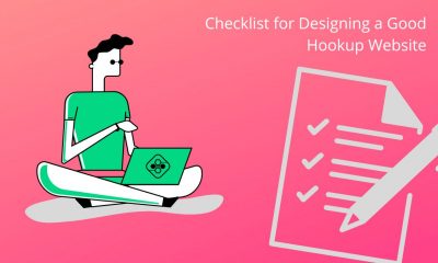
The online dating industry is growing like a mushroom by the forest creek. New hookup platforms pop out of nowhere. Everybody thinks building and scaling a dating site for casual hookups is simple, so they start the journey. However, many never get to see their sites shine. The reason for that is either being too general (we’ll explain in a minute). Or having a bad design (we’ll explain in 3 minutes).
The Importance of Picking a Niche in 2022 and Beyond
Online dating industry is huge. The majority of single people have looked for dates online at least once. Most are doing it regularly. And while some companies think that targeting everybody makes more sense, that strategy simply doesn’t work. Don’t get us wrong, it can work. But for that to happen, the owner must be ready to invest a lot of money. Not just in the design and features. Marketing is vital. The best platform in the world is useless if no one knows it exists. So, if you don’t want to compete with industry giants, pick a niche.
Do you think singles seeking hookups thrive on a dating platform for serious relationships or the one made only to find a hookup for a couple of nights? Of course, it’s a niche hookup site with decent features, even though some general platforms have more users. Competition isn’t as massive in niche sites.
Now you know why it makes sense to build a site only for singles looking for a hookup. However, don’t stop picking at the wide niche. Go deeper. Decide if you want to focus on straight or gay hookups, adult or senior dating, etc. Do that before you start designing and writing your website. Why? Because your target market and their desires shape your business, not the other way around. Let’s put that into an example.
Clear, Attractive, and Crisp Homepage
The homepage is the icebreaker of your hookup site. If it’s good, singles will join. If your home page isn’t good, visitors bounce back to SERP. And we all know how Google treats pages with a high bounce rate. To prevent that, you need to give the package of info on the homepage. And you must do it in an eye-pleasing way.
Here is the checklist you can use to see if your hookup site homepage (or any other page) has potential:
- does it grab attention
- does it answer what’s in it for me quickly (for your audience)
- does it show pain points and solutions
- is it conversational
- is there a story
- how about a clear CTA
We’ll explain each in a couple of sentences. Nail all of them (by combining design and copy), and you can be sure you have a good homepage.
Attention Grabbing
If you build a casual dating site, the best way to grab attention is to include attractive photos. Put them above the fold (the part of your site they see without scrolling). If the first thing they see after landing on your home page is a stunning lady or a flirting couple – you have their attention. Then you need to keep it. And that’s the tricky part.
What’s in It for Me
Your headline, usually next to the attractive photo, is crucial. It must give men and women seeking hookups the reason to join your site. The more specific it is, the more singles it converts. So, if you’re building a hookup site, say they can meet girls seeking casual flings quickly.
Pain Points and Solutions
You can tease this in the headline but focus on it in the body text of your homepage. The more objections you discover and solve, the more members you get. Just don’t forget to think about market saturation. Many sites focus on the wrong pain points. They compare themselves to offline dating. Instead, they should focus on the pain points of online dating and the solutions they offer. When it comes to design, if you can get nice icons that show before and after each pain point and put it under, let’s say, 150 words of body copy… Some might call that art.
Conversational
In other words, does it read like you’re talking to someone? The simplest way to achieve that in your copy is by using contractions (you’re instead of you are).
Story
Storytelling doesn’t fit in the design of the hookup site homepage, but you can still include stories. Use testimonials and reviews from current members. That’s strong social proof and gives a chance to see what happens after they join.
Clear CTA
Clear CTA doesn’t just mean you should use a different color to make the button visible. You should give them clear instructions on what they should do next. If you want X, then do Y now.
When it comes to design, you want to have 2 CTAs. One at the top by the picture and headline. And one at the bottom of the site. You can add one or two in the middle, but most hookup sites don’t have long homepages, so that’s not a must.
Also, remember to keep the same text in every CTA button.
The Tone of Voice (Terms and Language)
Now when you know how the homepage of a hookup site should look, you have to master something else. It’s related more to copywriting, but it affects design too. Nailing the tone on your site makes more impact than people think. Using the correct language is the line between:
- “God, this site must be fake.”
and
- “I have to try this cool site.”
To figure out the language of your audience, research. Become addicted to Quora, Reddit, and reviews on AppStore. Become addicted to anything that gives you insight into the exact words your target audience uses. And then you use those words to show them they can trust you.
Do deep research for design too. If the whole niche uses bright colors and big pictures, do the same. That’s been tested and proven to work. So, save yourself time and money and lean (not plagiarize) on things already crushing it.
Great UX (Easy to Navigate and Use the Site)
We won’t talk about the importance of safety on a hookup site. If you don’t plan to have SSL or email verification, don’t build the site in the first place. But don’t neglect the importance of simplicity. User experience makes the difference when two sites are similar in features.
Ensure that your site is easy to use on the mobile phone too. Some platforms invest a lot in websites only to figure out they’re useless on smartphones. Remember, your goal is to give singles a smooth hookup experience. To achieve that, you should pave as many bumps as possible. If your design confuses them, they fall into the pit. And the only way out is, well, out of your site.
Mild or Vivid Colors
Our senses are receptors through which we feel the world. That means it’s possible to affect how someone feels by tickling their senses. In design, you have only one sense to hit – vision. You do it by using shapes and colors. Different colors spark different emotions, so read about the color you decide to use before you paint the whole site.
Relevant Ads
Hookup sites earn money by selling memberships or advertisement space. Most new and small niche hookup sites can’t afford to follow the first strategy because you need a good reputation. To get a good reputation – you need time (and a good product).
So, most new hookup sites finance themselves by selling ad space. If you’re going to do that, don’t be too aggressive. Don’t include 13 popup ads on every page. And if you don’t want to annoy your members, show them only relevant ads. That directly affects UX, and UX directly affects your reputation.
Best day to launch a website [Research]
Launching a website can be difficult, especially if it is replacing an existing one.
This was my most stressful day when I started my agency. There are many points of failure: editing DNS records, changing domains and installing SSL certificates.
Make backup!
You will eventually realize that something was missed when it is finally live. It’s often the obvious things you don’t know how you missed.
To solve the problem, I first scheduled the launch day in advance and had a repeatable process in place so that everything was in order.
However, no plan can be foolproof. The best thing you can do is to analyze all options and make the best decisions based on what you know. Recent polls gave us ample data. I believe we can resolve this issue.
Which day is best to launch a website in a week? According to web developers, Tuesday is the best day for launching a website. It’s Tuesday. Launching a website on Tuesday will give you the energy of Monday and plenty of weekdays to fix any bugs or issues.
Ask web developers for their top launch days
Research by Rich Deane has shown that web developers all over the world voted for the best day of the year to launch a site.
Tuesday was the clear favorite and received more votes than Saturday, Sunday, Thursday, Friday, Saturday, or Sunday!
Tuesday | 44% |
Monday | 17% |
Wednesday | 15% |
All other days combined | 24% |
The data was somewhat blurred by the inclusion of other options in the responses. This experiment was limited to the data that I took from the seven days of the week.
No other day of week is as close.
Tuesday’s dominating lead was so convincing that I knew there had to be truth behind it (and a reasonable explanation).
Before we get into the reasons Tuesday is so popular with web professionals, let us take a look at other days that aren’t as great.
? Many people say that you should never launch on Fridays.
Fridays are now known to be the worst day for launching a website. In fact, “any day other than Friday” was one of the options in the poll. This option garnered many votes.
Web agencies tend to take weekends off. With all the uncertainty surrounding every website launch, it is easy for your website to be published on Friday.
Even though things seem fine immediately after launch, it is almost certain that someone will find an issue, whether it be you, your customer or their visitors.
Bug fixes and other changes can easily interrupt your weekend if there is a serious issue. Customers won’t care if you aren’t available for work on weekends if the multi-thousand-dollar project you were paid for “doesn’t work”.
This could not only ruin your weekend plans, but it can also damage your relationship with your client.
We know that we want Saturday and Sunday off so we can leave Saturday and Sunday alone.
? Mondays are stressful.
Despite Monday coming in second (likely due the lengthy buffer before the next weekend), Mondays are stressful.
After two days of not thinking about websites, you’re now out of the office routine. It might not be the best way to start your week.
A pile of voicemails, emails and other requests from people who were absent while you were away almost always welcomes you to work on Monday morning. A Monday launch can mean delaying your responses or getting a late start due to the fires you are putting out.
Launching a website can be mentally demanding and time-consuming. Monday may not allow you to have the time or brainpower necessary to make it a success.
Keep in mind, however, that Monday is the most common day for people to call home sick. Launch day can be difficult if there are multiple people involved.
? Wednesday and Thursday also have their issues.
You start to dream about the weekend, rather than the beginning of the week. You are more likely to make mistakes if you feel low in the middle of the week.
Your energy levels decrease as you move closer to your last weekend off. You might feel excited for the week ahead on Monday, but by Wednesday your energy levels have dropped significantly.
Your ever-growing to-do-list should be considered, as it tends to grow longer each week. Your to-do list will be full by mid-week, so you need to make sure you get everything done before Friday.
You should launch on Wednesday or Thursday if you don’t have any other work.
Tuesday is the best day for launching a website
Tuesday is a great day to get rid of the stress of going back to work on Monday, and to have energy to last the week.
Three reasons made Tuesday such an appealing candidate for me…
Plenty of buffer
You have plenty of time between your Friday launch and the weekend, unlike a Friday launch.
If you launch on Tuesday but are still fixing major bugs three or four days later, it is likely that something has gone horribly wrong.
Most cases will see the website up and running with major bugs fixed. You’ll still have plenty of time to work on other tasks during the week.
Energy levels high
Studies show that Tuesday is the most productive day for Monday-Friday workers.
You’ll be back in the rhythm of work Monday and Tuesday, having put the weekend behind you.
You still have plenty of gas in the tank. This means that you have the energy and motivation to get the week started right.
You are not too busy yet
Your to-do list will grow as your week progresses. Wednesday and Thursday aren’t preferred because you have the most demands on your schedule by mid-week.
However, Tuesday is a good day to be ahead of the rest of the week.
You have put the Monday chaos behind you and are now free to focus on Tuesday.
Does this mean that you should always launch on Tuesdays?
There are chances that the stars will not align for you to launch every Tuesday on a Tuesday. But, you can do it any time.
One person reminded me it was worth considering your website’s specific audience and needs.
It all depends on the website. It doesn’t matter if it’s brand new. I usually do a domain re-design on Friday night, particularly for heavy e-comm sites with a lot of traffic. I usually do this on Friday because that is the lowest traffic day.
Google Analytics can help you determine what days and times are most busy. Avoid peak hours to minimize disruptions caused by a website launch. It’s important to consider each website individually before making a blanket decision.
Before I wrote the article and analyzed the poll results, I had not really thought about which day was best. Other than knowing that Friday wasn’t my ideal launch date.
Even though Tuesday is a great day, it doesn’t necessarily mean that you have to launch your website on Tuesday. But it’s worth considering why so many developers prefer Tuesday. You can argue that Tuesday is the best day to launch a website.
While opinions and circumstances may differ, one commenter reminded us of the most important point:
Not before pay day.
How to launch a successful website?
Whatever day of the week it is, preparation will make your website launch a success.
It is easy to forget about the open graph/social share image or turn off the no index (we’ve all been there).
A checklist for website launches can help you avoid making mistakes, save time, and give confidence to your customers that you are well-informed.
Purpose-Driven UX Design for Fintech & Banking Products
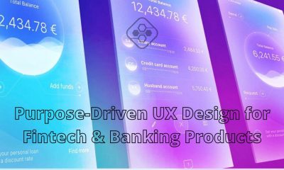
Digital products used to focus on business revenue and functionality, omitting the end-user in the app success formula. The modern business reality dictates different rules of the game. Customer-centricity is the cornerstone of banking app design services today, and web designers need to place the user in the focus when developing relevant, valuable digital products.
Here is a quick guide to developing a purpose-driven web product with full regard to usability principles. Use our tips to create an outstanding UX built around your end-user needs and pain points.
Customer Experience Rules the Market
Today, people are flooded with many apps, websites, and digital services. They have so much to choose from, but in many cases, their expectations are betrayed. Choosing an app without a brand identity and story wastes user time and energy. Thus, the new philosophy of digital product creation – purpose-driven UX – has emerged to close the gap and give users a completely new digital experience.
The financial industry is the most vulnerable to poor UX problems, as it’s deeply technical. Users may find it hard to navigate through complex interfaces and pick individually suited financial services. Luckily, the purpose-driven UX approach also has much in store for financial apps. Here’s how you can breathe life into a seemingly boring, complicated financial product.
How to Apply Purpose-Driven UX Design in Your Products?
The idea behind purpose-driven UX is to give people more than a product. It favors providing a stellar customer experience that adds value to a seemingly standard product and arouses end-user interest in it. Such products are socially responsible, sustainable, and comply with the human pursuit of mindful living. This way, they integrate seamlessly into the human routines and add meaning to their rituals, such as sending money to one’s family or paying off financial debt.
Here are some practical UX tips for transforming a regular FinTech product or app into a purpose-driven one.
#1 Make Them Humane
People still treat innovative technology with suspicion and distrust because they feel it has no soul. Concerns about the loss of jobs worldwide, the absence of human-like interaction, and other fears stain tech innovation’s reputation and slow its adoption.
However, there’s always a way to make digital apps more humane; you must show that you value every customer. Take care of customers, build a community, and integrate the app into a real-life context. This way, you can show the human side of your business, sharing your target users’ concerns and participating in their lives.
#2 Share a Sense of Purpose
Your app should be not only customer-centric; it should communicate a broader purpose your brand is pursuing. It should focus on a positive social change, a pain point of your community you’re trying to address. Once your users capture this purpose, they start perceiving your business as a meaningful brand. Using your app, they join the struggle for a better future.
To make your financial product purpose-driven, you need to focus on a progressive social purpose and promote financial innovation in a certain way. For instance, some FinTech products strive to make banking products more accessible for underbanked populations. Others target financial education in developing countries. A separate category of financial apps focuses on bringing investment closer to individuals. So, choose a niche where you want to make a positive change and engage customers with that shared purpose.
#3 Create Meaningful Connections
Digitization has transformed the world into a single digital village. Still, the level of perceived isolation gets high every year. People are connected by technology but isolated in traditional communicative terms. Thus, you can make your product more appealing and meaningful by drawing emotional connections with the end-users. Treat your consumers as friends or family members; show that you’re trying to give them the best possible service. These efforts are sure to pay off with stronger connections on a personal level, resulting in greater brand loyalty.
#4 Tell Your Brand’s Story
A brand without a story is boring and empty. Users can’t connect emotionally to something they don’t understand. Thus, your task is to connect the dots between your user values and needs and the company’s story. For example, your app aims to make algo-trading more accessible to retail traders. Thus, the story behind your brand is a struggle with high entry barriers and access to advanced algo-trading tools for elite institutional investors only.
#5 Develop a Brand Personality
Your brand’s personality is a unique mix of functions and properties it can deliver to the customers. This mix delivers a particular UX and arouses a particular emotional response in those who try your product. Thus, you need to set users in a specific mood and give them an intended feel of the digital product with the help of UX design tools, color choices, and the overall design tone.
#6 Create the App with Passion
Passion about your business idea is what fuels user interest and stimulates the product’s adoption. If your team is passionate about the social change and service you deliver, so will the customers. An emotional component is vital for building your own tribe of fellow thinkers around your product, using your app not because of basic functionality but because of a shared philosophy and passion for change.
#7 Keep the Product Focused
Generic services are built with no target audience in mind. Make your digital product narrowly focused on a single goal and a specific target group of users. This way, you will reach out to people with relevant, meaningful messages, urging them to adopt your app because it meets their needs and addresses their unique pain points.
You Can Give Your Users a Stellar Experience
The quick evolution of the digital services market is relentless; it ensures that only forward-looking, customer-centric businesses survive. Modern customers are very picky. They are ready to pay extra if the brand delivers a stellar UX and abandon the brand very quickly if they experience poor UX.
Thus, the focus on UX becomes a critical aspect of the broader marketing strategy and web design processes. Don’t remove the end-user from the design equation; your UX optimization efforts and delivery of purpose-driven UX will pay off with customer loyalty and trust.
All you need to know about Basketball Hoops
Our company provides service to install inground basketball hoops and portable basketball hoops. The difference between them is very simple. Portable is a non-stationary object that can be moved to another location. It is equipped with wheels for easy transportation. Water, antifreeze or sand is poured into the base for stability. As a rule, the height of the ring is adjustable.
Portable Basketball hoops
The cost of assembly work rarely exceeds $150-200 . These rings make a great addition to small yards and are good for those who move from place to place. You can place it in any place convenient for the game. Unlike the portable one, the inground basketball hoop is mounted into a concrete base and cannot be moved.
The choice of location should be considered before. You also need to keep in mind that it should be installed next to a flat area so that a ball bounces perfectly and at least a couple of people can play. Such a hoop is comparable to a professional ring in size and capabilities. A fairly large number of accessories are sold for it, you will not get bored in the game.
Hoop assembly time
A portable hoop assembly time does not take more than 1.5-2 hours. As for the Inground hoop, installation is done in 2 steps. The first is concrete work and fastening j bolts and a plate. The second stage is assembly of the frame and backboard. In general, total time for assembly and installation takes about 5-7 hours. If the installation is carried out on concrete or asphalt, additional time is required to cut off its layer.
Handyman is very easy to find and at the same time very difficult to find a good one. There are plenty of ads on the Internet with service offers, but in our opinion, you should take into account some points in order to find a real professional at an affordable price. It is necessary to find out how many years a person has been in business. More is the better. Having insurance and a license means he is doing business legally. The price per hour indicates how much a professional values himself as a specialist. Possibility to give a flat rate price for a small project.
Q: Should I use antifreeze in a Lifetime portable base during the winter months?
A: No, antifreeze is not necessary. Lifetime bases are made out of high-density polyethylene plastic that is flexible enough to expand with the water when it freezes.
And…
Experienced specialists know how long the work takes and how much material is needed, so they are ready to give a flat rate. An important point is the reviews on google. They summarize everything that has been said and say how much the service was in general and whether it is worth working with such a person or company. A handyman can work both for himself and for a company. It does not matter much, it is important to understand the experience and qualifications of the one who will come to you to do the work. It is always possible to find a common language with a good specialist, he understands how to do it faster and cheaper for the client.
Most popular services during spring and summer
Grill assembly service
Grill assembly service is one of the most popular services during spring and summer. Most homeowners enjoy spending weekends with family and friends. Of course, fried sausages, vegetables complement this time with pleasant taste memories. Basically, there are 2 types of grills – pellet and gas. They differ in the fuel. In a pellet grill the product is fried on burning wood pellets. Pellets can have their own unique aroma, which is transferred to products during frying. A gas grill is the standard cooking option. It assembles within an hour. As a rule, if you follow the instructions and have experience, there are no problems during the assembly process. You can connect the grill to both the gas line and a gas tank. As a reminder, the state of New Jersey requires a plumber license to connect the grill to your gas line.
The homeowner should also have a line ready to connect this appliance. Therefore, if you want to connect to the gas line, you need to know the location of the grill in advance. In the case of a gas tank, the grill can be installed anywhere in the yard. Do not forget to service and clean your appliance at least once a year for safety purposes. Fat and parts of food can get inside, making it difficult to turn on and use.
If you follow these simple recommendations, then using the grill will be a pleasure, in any case, the service is nearby and ready to help you.
To choose an inground basketball hoop, you need to understand the level of your involvement in the game. For us as installers it takes two times to visit a customer to complete installation. On the first day we pour concrete and wait for 3-4 days to dry. After we come and do the frame and the backboard installation. If you are going to make professional jumps with hovering on a shield, then you need to take the most professional equipment.
The size of the shield and the material from which it is made is of great importance. Better material means better bounce. Shield height adjustment is present on all hoops as a standard option.
Think about the location
Once you have decided on the choice of equipment, you should think about the location. At a minimum, the playground should be comfortable for 2-3 people to play. It should be level for the ball to bounce correctly. It is advisable not to have structures, lawns, or shrubs nearby. Special adherents of the game paint the court like professionals. Installation of additional equipment like nettings and lighting are the most popular. Nets keep the ball from flying off the court, and backlighting allows you to make accurate throws in the dark.
4 Easy Ways to Digitise Your Drawings
Many artists spend a significant period of time learning not only how to draw, but practicing drawing well. So what happens when you’ve put in the time to do this, come up with a cool hand-drawn concept, and are happy with the finished product? Time.
If you’re an artist who wants to make more money, or a creative person looking for ways to share your art on Instagram – digitising your work is a great idea. Here are 4 easy ways to do it.
1. Adobe Capture
Adobe Capture is a handy mobile/tablet app for laptops which links up to Adobe programs like Illustrator and Photoshop. You can use it to take pictures of drawings and adjust its settings so that you can get a vectorised digital copy of your artwork.
Vectorising work can be helpful if you want to adjust the size and make the original look as good. This however can be challenging to do when your drawing is made on paper instead of on a screen. If you just want to post an image to social media, then vectorising your work quite isn’t as necessary – it really all depends on your artistic style!
The new Adobe Capture CC is a powerful and intuitive app that allows you to easily create and edit images on your phone. With this program, you can select colours, add text, crop an image and more.
Load on android here https://play.google.com/store/apps/details?id=com.adobe.creativeapps.gather&hl=en&gl=US
2. Image Trace on Adobe Illustrator
The image trace tool on the Adobe Illustrator is another way you can vectorize your artwork with the help of Adobe Capture.
Begin by taking a high-quality photo of your drawing, or otherwise scan it into your computer. I would recommend editing the image so that the tool can more easily identify parts of your drawing, as well as distinguish it from the background (I often increase the brightness and up the contrast).
After this, open up the image in Illustrator. Navigate to Window > Image Trace to bring up the advanced toolbar. Make sure your photo is selected, then click ‘Trace’. Select ‘Preview’ to see what different settings look like as you adjust them. Your image will automatically turn black and white once it’s traced, however you can change the settings to incorporate colour as well. I usually have to play around with the threshold and advanced setting sliders until I find something that works.
Once you are happy, press ‘expand’ on the top toolbar to turn your image into lots of little paths and anchor points you can edit!
3. Procreate for iPad
Graphic designers have been struggling with the evolution of technology and Procreate has given them a way to stay relevant and competitive. This app is especially great for illustrators as it allows them to work in a detailed and artistic way.
The program features layers like in all other Adobe programs, so you can place an image and create a new layer over it to draw on top of it.
I personally find Procreate to be an amazing tool for digitising my drawings. While it’s a big investment to buy an iPad, Apple pencil, and the app itself which costs $14.99, I use it enough both for fun and at work to justify it. The app includes features such as a symmetry tool (which is the most visually pleasing thing to use ever), along with a library of different brushes where you can also import extra ones if you want to buy more.
Once you have drawn up your work in Procreate, there are a few different ways you might like to export it. If you want to continue working with your illustration on your computer, you can export it as a PNG with a transparent background. If you have a Mac you can airdrop it straight to your computer, otherwise email it to yourself!
If you want to use the artwork as it is, you can export it as a JPG and upload it to the socials right away. I sometimes use a combination of drawing in Procreate, then image tracing it on Adobe Illustrator if I need it vectorised to use how I please!
4. Remove the background from a photograph
For some drawings that don’t require much editing, you can simply take a high-quality photo and let Photoshop remove the background. There are some styles of art that have yet to be properly represented by AI such as dot-work, where vectorisation may not pick up all the details.
You can either use the ‘Magic Eraser’ tool if the background is plain and easy to remove, or create a mask. A quick way to select at least most of the illustration is to navigate to Select > Subject and add a layer mask to the image. You can then use the brush tool to add or subtract parts of the image in this layer.
This method is perfect for small-scale social posts. You could add text, a coloured background, or even make a collage with other drawings. Just be aware that the image won’t be made in vector format so it might not have the same quality as your other creations.
With so many different options of how to go about digitising your artwork, there’s no single correct way to do it. Have fun experimenting with the different methods that are out there and find the one that best suits your personal artistic style!
How to Create a Website like Reddit?
How to create a website like Reddit? This idea might have struck you while going through the website. If you wish to know about it, we can help you.
Before that Let’s have a look at Reddit and why it has become famous.
Reddit has become the world’s most successful social bookmarking website explosive with millions of users across the globe. The website is buzzing with lots of activities and page views per day.
Reddit basks in the glory due to its rich community of people that comes together with common interests. Its unique approach has users sharing links and content that receive upvotes based on how engaging it is.
Reddit contains Subreddits of trending topics such as Video Games, Movies, NBA, Football, etc.
If your content is strong enough to earn maximum upvotes, it goes viral (like YouTube videos) across Reddit platform and appears on the homepage.
The Reddit’s success is knitted with expanding number of users who run a riotous lot of activities on its platform. This is what you should focus on while building a website like Reddit.
So if you are wondering what it takes to create a website like Reddit with a growing social bookmarking community, follow these steps:
Pick a Short Yet Stunning Domain Name
Acquiring your own domain is the first step towards building a website like Reddit.
For your website to be successful enough to grab attention, choose a domain name that is short, memorable and appealing.
Make a list of a few potential domain names, discuss with others and pick one that you can convert into a news and content brand like Reddit.
While you are still planning for domain names, you can focus on the following aspects:
- Short in length
- Catchy and easy-to-remember
- Brandable qualities
- .COM extension for global appearance
- .co.(country name) for Country-specific domain
You can also go online to scour suggestions and ideas for selecting a powerful domain name.
GoDaddy, Namestation, BigRock are great options to satiate your domain needs. These domain services guarantee handy dashboard, flexible plans and 24/7 customer support.
Shorter the domain name, the increased are the chances for your social bookmarking site to be popular. Use maximum 8 characters to define a name like what is done by hit socials such as YouTube, Quora, Facebook, Twitter and Reddit itself.
Opt For Web Hosting Services
After you have bought a perfect domain name, it is time to move on to web hosting services.
You will find a pool of options floating online when you search for affordable web hosting providers. A few great names in this category are:
They are your best choice because it provides simple and friendly environment to build and launch a new professional looking website in no time.
Beginners can also get started with hosting their website even without prior technical knowledge to build a website.
Their pricing varies depending on the functionality, space and support you seek while hosting the site. They each provide:
- Unlimited Domain Hosting
- Custom Site Builder
- Unlimited Email Accounts
- Unlimited Hosting Space
- Wide range of templates
- Unlimited File Transfer
- 24/7 Customer Support.
Choose a good Website Script
After you have ensured a good domain name and perfect hosting, your social bookmarking sites where content is king need a robust script solution.
WordPress emerges as a powerful blogging platform. Though WordPress makes for an obvious choice and offers various themes, it does not essentially support web structures challenged by massive MySQL database activities.
Therefore, for the efficiency and performance of ambitiously large websites with ample daily traffic, PHP custom scripts are found suitable.
To build an excellent Reddit alternative with WordPress, you can rely on the following plugins:
- WPeddit
- Bunchy
- UpVote
- Rank it (for submit, vote and comment)
To leverage PHP Scripts, consider the following:
- Gentile Ninja
- Ncrpyted
- Bookit
Reddit’s Source Code For Developers
To build a strong Reddit alternative, why not go for Reddit’s own source code.
You can refer to its GitHub page to study its regularly updated open-source codebase enough to figure out how it all works and develop from it.
This saves a lot of time for web development experts as they won’t have to pull off everything from scratch.
Partner, Collaborate & Hire Your own Squad
If developing a social bookmarking and content-sharing website like Reddit is too overwhelming for you, you can always choose to partner with specialized web developers and hire their dedicated squad of developers.
Reddit might seem simple, but the process of building a fully functioning website with engaging functionality still takes efforts of skilled, technically sound developers.
Content Management Tactics
Beginnings are always tough. It is common to see not many users when you launch the website. But the best way to create the buzz is to build spurious profiles by developers and feed some content to make it look active. That is what Reddit did initially to get the momentum going.
Users will not prefer to stay on your website unless it has some existing users. You can tell your cluster of creators, associates or your partners to pose as active users and content frequently.
This will grow it from empty to busy. Aim at reaching at least 100 users and a thousand of posts before expecting organic traffic. Try variety in content types such as articles, queries, personal stories and status and Gif videos, etc.
Gather Volumes of Users
Upon making sure your domain name is fascinating and your content looks compelling, you can switch your focus on marketing it and tempt more traffic to your website. Basically, there are three ways you can possibly acquire more viewers.
SEO
From meta description and URL to most entered keywords and backlinks, there are different ways to optimize your website for SEO on search engines.
Get all the basics right and engage a technical team who possesses thorough knowledge about SEO website marketing including organic elements such as precise backlinks, long-tailed keywords, page URLs with post titles.
Read also: How Apps Can Help You to Grow Your Personal Brand
Your homepage is a star performer in SEO optimization efforts for Google, Yahoo and Bing. So load the website homepage with lots of trending search-worthy content.
If you are not good at SEO marketing, it is judicious to collaborate with an SEO marketing agency along with a web development company.
Social Media
It is undeniable that social media platforms help drive boost in popularity and thrust your social bookmarking website in limelight. Weave social activities in your marketing strategy to gain more leverage.
Facebook, Pinterest and Twitter are main players in the business with Facebook offering great tools and community to spread a word. Your major target market is captured by Facebook.
Stretch your budget enough to integrate Facebook ads if possible. Attach a link to your website on your Facebook page. As a user hit the Like, their friends can also view the activity.
Word of Mouth
Word of mouth, of all marketing tactics, is important one since it is inexpensive yet effective. You can start by interesting the people in your network in visiting your reddit-like website. If they like it, they will propel it further among their circle.
Another trick is to arrange a pleasant giveaway on your website for existing community.
If the website users find value and goodness in your offerings, they will share their experience with their friends and encourage then to create accounts.
Create a Reliable Monetization Stream
Generating revenue from websites like Reddit is a tricky game where being smart is the difference between being desperate and being generous.
As for Reddit creators, they gain revenue mainly from advertising and sponsored links of their partners.
However, they also have a tertiary unique feature called Reddit Gold accounts that encourage users to buy additional features. The best monetization is to create a stream that involves multiple sources.
Read also: Best Websites To Find Remote Work
When you concoct a blend of several monetization tactics, you will never have to rely heavily on a single source and you will be at the advantage of accelerating the revenues.
Try to incorporate sponsored links within the website content. Like Reddit, you can also afford users special membership perks such as being an active part of community.
If your website content drives value to users, they will feel naturally motivated to contribute some monetary donation.
Replicate Reddit by Building its Alternative
The steps described above will boost your knowledge for developing a successful website like Reddit. It is important to note that having your community website on well-hosted, perfectly managed server is utmost necessity you can’t compromise on.
Best 360 Camera Apps for iPhone and Android: Secrets of Development
Nowadays we are surrounded by content. We scroll newsfeed, we browse websites, we see ads on the streets, we listen to the radio and watch TV. Our brain gets used to processing the enormous amount of information and it “smoothes” the majority of things we see otherwise our heads would become overloaded.
It’s hard to capture someone’s attention in this madness. But quick-witted marketers don’t give up and invent new types of content each day.
So, the new engaging technology of 360 videos and photo is finally here! Of course, special tools are required to create such content, so we can see the splash of new apps and cameras for panoramic images.
Top 3 best 360 panorama apps for iOS and Android
We don’t need to buy an expensive camera and learn how to use special software to make 360 photos anymore. Now we can create all-round panoramic pictures using our smartphone just in a few taps! 3D photos can be used in marketing, tourism, education, medicine and many other industries. Or, you can make one just for fun and post it on Facebook!
So, we made a shortlist of the best photosphere apps. Choose the one and start creating!
Panorama 360 Camera (HD+) + VR video by TeliportMe
Let’s start with the Panorama 360 Camera app available on both Android and iOS. We put it first thanks to intuitive design, and the possibility to capture 360 panoramas and videos. There are 3 models: normal, manual and real-time. How it works: hold your smartphone in a vertical position, tap the shooting button and start moving the phone around you to capture an image. When you stop shooting the app will build panorama automatically.
Panorama 360 Camera app uses 2 monetization models at the same time: ads and in-app purchases. You can buy such premium features as:
- Stitch later – you can delay the panorama building to save time for more images.
- Facebook sharing
- Dropbox sync
- HD capture
- Remove watermarks for Instagram share
- Remove Ads
- Unlimited video download in .mp4 format
Alongside with the cool functionality, an app has a huge community to share your masterpieces with.
Fyuse – 3D Photos
An unusual app that is also available on Google Play and App Store. It allows creating “fyuses” or spatial images. How it works: point your smartphone to an object you are going to film, tap the capture button and walk around this object so the Fyuse can be recorded. As a result, an app captures the interactive 3D image of an object, so you can move and oversee it from different angles.
The ready-made 3D images can be shared via social media or you can be added to the feed of an app. And know what? This app is absolutely free and doesn’t have any in-app purchases.
FOV – 360 photo app
This app is designed in Paris and encourages everyone to change the Field Of View. Sound romantic, right?
FOV is a free app, available for iPhones only. It allows shooting amazing pictures up to 360 degrees with ease. How it works: when you start shooting, the small dots and a target appear on the screen. You have to move your phone in such a way that dots get into the target, so the panoramic photo can be made. Then push the “done” button to finish shooting. The results can be saved to your iPhone or sent via social media.
With the Samsung Gear 360 (New) app, you can create, view, and share 360 content on your smartphone, and enjoy various features by connecting Gear 360.
How to develop 360-degree photo app for iPhone and Android
As you can see, each company has its own technical approach to creating panoramic photos. They also differ in monetization methods, and some of them are even completely free. Nevertheless, there is always room for improvement, so it’s never late to start your own business in the industry.
But how to develop the best 360 panorama app for iOS and Android and conquer the market?
Fortunately, such giants as Facebook and Google have already opened the development tools for capturing 360 media.
360 Capture SDK by Facebook
Previously, the 360 photos could be made by capturing the pieces and stitching them together into one image. Developers had to use game engines to produce high-quality content.
But later Facebook announced the 360 Capture SDK allowing to capture three-dimension images and upload them directly to the news feed or view with the VR headset.
Facebook managed to create the totally new experience by changing the approach to making 360 photos. The basic technology used in 360 Capture SDK is cube mapping rather than traditional stitching.
Now user can create stunning 3D images using their smartphones rather than powerful computers or cameras. That means the technology became more affordable for users. On the other hand, SDK is compatible with such game engines like Unity or Unreal.
Moreover, cube mapping allows delivering VR-quality 360 video at 30 fps in a single second. Images are posted in 1080p to the news feed and uploaded in 4K for VR.
360° Media tools by Google
Google has also launched Google VR SDK compatible with both Android and iOS devices. This tool allows mobile app developers to enhance their products with the new 360-degree content. The 360-degree media captured with apps build on Google VR SDK can be viewed from any kind of devices starting with Google Cardboard and ending up with desktop browsers and mobile apps.
Users can capture both 360-degree images and videos in various dimensions. Afterward, they can be stored whenever you like, for example, videos can be hosted on YouTube. And it’s no wonder since Google bought YouTube.
360° Cameras Solution
#1 Meeting Owl Pro is a 360° smart video conferencing camera designed to be set up on the go to make any space a video conferencing room.
#2 Insta360 cameras help you capture the magic in every moment.
Conclusion
360-degree media is still trendy and desirable. This digital technology can be used not only for entertainment but also for business growth and marketing. Tech giants like Facebook and Google have even launched their SDK to help developers create apps for panoramic photos or VR videos. All you need is a fresh idea and an app development company that will bring it to life. For example, GBKSOFT.
Things to Consider When Sizing Up a New Dog Bed
When your dog seems to be more irritable and worn out each day, it’s hard to determine what’s wrong. Or maybe it’s simply been acting a little oddly around the home lately. There’s a good chance your dog isn’t sleeping well, but there’s no way for him to tell you. It is detrimental to your pet if you choose the improper bed size.
Because there isn’t enough room to extend or support your joints, the most typical side effects are painful muscles and joints. Because of their bigger bones, larger breeds are more prone to have back and hip issues. In the end, your dog deserves a decent night’s sleep, and that can only be provided with a high-quality bed.
Consider the following variables while choosing a dog bed’s size:
How mature and how big is your dog
If you don’t know your dog’s breed, you won’t be able to forecast how big it will become in the future. It’s not needed to worry about the dimensions of the dog-beds for smaller dogs since the bed is already going to be bigger than your pet.
However, with the correct padding and stuffing, you could help your pooch stay calm even if in a bigger bed. However, as it expands, you’ll need to be certain the dog is never wider or longer than the bed by more than 12 inches. Your dog should be able to stretch out and even stand up without touching the borders of their bed, so make sure there is adequate room.
Orthopedic mattresses are necessary for older dogs since their spines might be more easily damaged by a regular mattress. The mattress has to be able to move with the dog’s body while it sleeps, which helps to avoid bone and hip problems.
Aesthetics and personal cleanliness for dogs
Dogs should be taught to regard their beds as though they were their own, just as you do. In the morning, your dog should be able to observe you making your bed and cleaning it as frequently as possible. This practice will teach your dog that the bed is not a play area and that it has to be kept clean at all times.
The best way to keep your pet’s habitat clean is to use the correct cloth. Although washable fabrics are simple to care for, there are also antibacterial and hypoallergenic varieties available. Allergies and infections are kept at bay by them. You should be able to clean the whole bed with either a hand wash or a machine wash.
Some dog beds feature totally removable pieces that can be machine washed, which will offer you the best hygiene and extend the life of the bed at the same time.
Is your dog comfortable?
Your dog’s comfort is also aided by the contour of your dog bed. Forms may vary widely, but the most common shapes are-sided vs un-sided, which determine if your pup can tumble over through the mattress or is confined in a crib-like structure. Regardless of the choice you choose, you should always keep an eye on your dog’s comfort level to see if it needs a total revamp.
Clean and maintain your dog’s bed with ease!
For humans and dogs alike, flea and dust mite infestations may cause a variety of ailments, including allergies and skin irritations. As such, you need to maintain your dog’s bed free of these bugs and allergies by keeping it clean. A canine bed is one of the greatest dog accessories you can acquire online. If you buy from the correct pet store, you may provide your dog a cozy area to rest at any time of day.
Why You Should Use Instagram Templates and How To Get Started
Using stunning visuals is one of the strategies to engage your social media followers. However, creating the perfect content is a time-consuming process. If you still want to provide refined content for your network, there are still ways to do it. With so many instagram templates free, creating a solid social media presence is pretty straightforward. Why should you rely on Instagram templates, and what are the benefits? In this post, we share everything you need to know!
Instagram templates
Engaging through stories is one of the most common ways to build an audience. Instagram templates leave plenty of space for sharing information in a statically pleasing way. The templates contain amusing questions, letting your audience get to know you better. You can share your answers in the form of text, emoticons, or gifs for a better visual experience.
You will create a customized template using free Instagram templates. Then you can watermark the visuals with your branded logo. Your followers will be happy to share the content of their stories and answer the questions. You can also add the templates to your highlights for easy aces.
The benefits
As we already explained, you can easily customize the templates with a branded logo. What does this mean for your business? First, the step will enhance your online presence and increase brand awareness. Also, this practice will engage users and make them want to share the content. With this, you will get more tags and increase your exposure. Thus this is an excellent practice to gain new followers and expand your network.
Many would agree that Instagram feels rather one-sided. Influencers can share their thoughts and tips in the form of photos and posts, but the followers have limited options for participation. The Instagram templates emphasize the follower and their opinions. The result is enhanced interaction and establishing a stable relationship with the followers.
In addition, creating content in line with your feed aesthetics can be challenging. However, keep in mind that your followers will love to see more of your signature style. That’s why Instagram templates are available in so many options. Whether your feed is moody and dark, bright and lively, refined and muted, there is a fit for every style. The Instagram templates allow you to create stories in line with your brand identity as an influencer.
The popularity of Instagram templates
The polls and questions are one of the ways to engage with your followers. However, these will only reach your current followers and not new ones. Templates allow you to engage with your current followers and gain new ones.
The traditional Instagram posts might not get the exposure you wanted. With stories, it is more likely that your content will reach more people. Connecting in real-time with your flowers is very simple with this feature. Since stories disappear in 24 hours, followers will urge you to check yours before it vanishes.
Strengthen your brand
Every successful Instagram influencer knows that consistency is the key. Keeping all of your content within your defined aesthetics will strengthen your brand. With templates, sharing your signature aesthetics is very simple. You don’t need to use any other tools to create visuals. Also, you don’t need to have any graphic design experience to have attractive templates. Although there are tools that make it easy for you, opting for free templates is a better solution.
With the Instagram story templates being the hottest social media trend now, influencers shouldn’t overlook this trend. It makes sharing information easy and fun, allowing your followers to get to know you better and share their thoughts.
Why You Should Incorporate AI in Your Logo Design
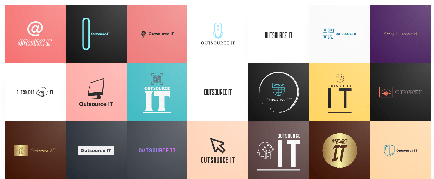
A logo defines your business, and your brand will only be as strong as the logo you create to represent it. The more unique your logo is, the better. But with so many brands in need of logos, how do you come up with something original and eye-catching?
For centuries, designers have relied on their own ability to create the perfect logo design and brand identity. This was faced with several disadvantages, including possible copyright issues. Currently, AI has become more sophisticated, allowing anyone interested in creating logos to come up with perfect results.
Here are some reasons why you should use AI to create a logo.
Faster Design
Designing a logo can be a time-consuming process. Typically, designers will create at least ten different concepts before settling on the one they feel confident with.
However, using artificial intelligence to create logos has drastically decreased that number by over 50%. AI saves you time and frees up space in your head so you can focus on more important tasks within your business or brand. If you are a designer working for different clients, faster designs help you fulfill their expectations on time.
More Types of Designs to Choose From
Every graphic designer has a different creative process that can be limited by various conditions. However, AI relies on intelligent algorithms to create several unique designs.
You can look at different fonts, layouts, color schemes, and textures when you have more options to choose from, depending on what you want in your logo. In fact, more and more designers are turning to AI for inspiration and ways to improve their creativity.
Saves Time on Revisions
One of the most time-consuming parts of creating a logo is revising it. Many designers charge an extra fee for revisions because it can take hours or even days to make significant changes.
However, with artificial intelligence at your disposal, clients will not need to worry about paying for those pricey revisions. Instead, they can focus on choosing a design they like. The results? Less money spent and less frustration for everyone involved.
Improved Design Quality Due to Automation
One of the most labor-intensive parts of being a designer is crafting unique designs yet still consistent with a brand’s identity. The good news is that artificial intelligence makes it easy to automate repetitive tasks.
Automation creates more time for other tasks that require real skill, such as developing relationships with clients and devising new strategies for selling their products. AI can also help you expand into different markets by quickly creating designs tailored to specific countries or regions.
AI is Not a Competitor, But an Enhancer
When someone says AI, most people’s minds will jump to robots or artificial intelligence systems. But when you start looking into it, you notice that they’re pretty different from other technology advancements.
In terms of logo design AI, it is not a replacement for artists or designers. It can be used as part of your creative process and help you create bolder, better designs than ever before.
Cost-Effective
Logo design can be expensive, especially for startups. Top-rated designers charge between $25 and $75 an hour on most freelance sites. While you might find an up-and-coming designer eager to take on your project at a lower rate, they will likely compromise quality for the price.
However, AI makes it possible to process thousands of ideas quickly and on-demand. This gives you access to an endless stream of logos that would have been too expensive to find a few years ago.
Additionally, since there is no middleman needed, you can save money by paying for what you need only when you need it. No longer will you have wasted cash tied up in designs that never materialize.
AI Can Keep Up with Market Trends
More and more, companies are finding it necessary to create products that will serve a particular niche. To appeal to these different groups, they need logos that are uniquely tailored toward each audience’s tastes.
An advantage that AI has over many humans is its ability to understand market trends and how they affect logo design. In fact, some AIs are already capable of learning from their experiences and observing those trends from a unique perspective.
Makes it Simple for Anyone to Create a Custom Logo
Custom designs and complex logos were once reserved for only experts with a lot of time on their hands. This meant that most companies were spending a lot of resources hiring graphic designers. But with the help of AI and machine learning, anyone can create a custom logo in minutes without any experience or special skills.
The Takeaway
No matter what type of business you are in, a logo is critical for success. Before you even open your doors or go live with an online store, people need to know that they can trust you. Your brand identity will set you apart from competitors and win you, new clients. When creating a new logo, using artificial intelligence could be what you need to keep up with today’s competitive environment.
AI Nudifier Online: How it works?
Nudifier Online is a free online photo editor that allows you to remove unwanted clothing from any photo. It is a great alternative to Photoshop for those who don’t have the budget for it or are not skilled enough in Photoshop.
The main difference between Nudifier Online and Photoshop is that Nudifier Online can only remove clothing while Photoshop can edit the entire image.
Introduction: What is the AI Nudifier & Why It is Beneficial
Nudifier is a free AI-powered app that automatically applies the best effects to your photos. It also provides you with a range of filters, presets, and effects to choose from.
Nudifier takes all the hassle out of photo editing for you and all you have to do is pick a filter or effect that suits your needs.
Nudifier FAQs Answered
Nudifier is an AI-powered tool that can transform any image into a nude version. It is a free online service that has gained popularity in recent years.
Nudifier has been designed to be used by anyone and everyone, as long as they are over 18 years old. However, it may not be legal in some countries to use nudifier for this purpose.
The legality of nudifying images online is still unclear.
Some countries have banned the usage of this AI-powered tool, while others have not yet taken any action on it.
How to Use AI Nudifer?
Nudifier is an AI-powered app that uses machine learning to detect nudity in images.
Nudifier’s algorithm can detect nudity in images. It can also identify the parts of the body that are naked and blur them out.
Nudifier is available for free on Android and iOS devices and can be found by Browser on the Website https://nudify.net/.
Step 1: Go to website.
Step 2: Upload photo.
Step 3: Waiting up to 5 min.
Step 4: Check to Result or just Fail.
Other Deepnude AI App we reviewed in this post.
Is Nudify Online AI tool Legal?
Nudify is a free online AI tool that can help you to create an image of your favorite celebrity nude. It is a free online application that uses artificial intelligence to generate images of celebrities nude. The AI software has been designed to detect the face and body of the celebrity and then generates a photorealistic representation of their naked body.
The legality of Nudify is not clear, but it does not seem like it is illegal or against any laws or regulations because it does not require any personal information from the user.
Nudify is not Spotify!
Conclusion: Why AI Nudifiers are the Future of Content Creation
The last section I want to talk about is the conclusion. This is where you summarize what you have talked about in the previous sections, and make a call to action for your readers. Your conclusion should be short and sweet, and it should remind your readers of all the points that were made in the paper.
Thank You Coronavirus Helpers
Many people are suffering from an ongoing cough and fever caused by the coronavirus. Coronaviruses are typically spread through contact with someone who has it, or touching something they have coughed or sneezed on. Luckily, there are a few things you can do to avoid getting sick, and provide much-needed assistance to those who have been diagnosed.
It’s not always easy to thank all the people who give of themselves during an emergency; in the case of COVID-19, it includes not just doctors and health care workers but also gas station owners, truck drivers, grocery store owners and more.
Printing Samples
Proudly express your appreciation by downloading, printing and displaying the “Thank you to the helpers” sign below in the window of your home, business or vehicle. Other signs:
A great way to raise awareness is by posting a photo of the sign with the hashtag #helpers. Be sure to tag @tidelandshealth on Facebook and Twitter.
Mister Rogers says: “When I was a boy and I would see scary things in the news, my mother would say to me, ‘Look for the helpers. You will always find people who are helping.’”
These challenging times require the commitment and skill of everyone. Folks like first responders, farmers, mail carriers, grocery store employees, pharmacists, factory workers, health care providers and service providers make all our lives easier. That’s why it’s important that we support them with our time or money to keep their communities going strong. Our safety, our health, our information and the ability to lead normal lives are all dependent on the work of people like you.
It’s a great day to thank our writers and let them know how much they mean to us!
Google Doodle thanks health workers and researchers
How to Produce a DeepFake Video with Putin in 5 Minutes
Everybody can make DeepFakes to support ukrainians without writing a single line of code.
In this story, we see how image animation technology is now ridiculously easy to use, and how you can animate almost anything you can think of.
Top Methods To Create A DeepFake Video
Deepfakes are videos that are created using an AI software which makes the person in the video look like they’re saying something that they didn’t say. They often involve celebrities and politicians.
In 2018, deepfakes became a popular topic on social media when it was revealed that one of the best deepfake creators, a Reddit user who goes by “deepfakes,” had used their skills to create a fake video of former president Barack Obama.
This video was made using an AI software called FakeApp which is free to use for non-commercial purposes.
Deep Fakes Are Here and Nobody Knows How to Deal with Them Yet!
Deep fakes are a new kind of media that is being used to manipulate videos and images. They are created by combining different pieces of media and recreating them with deep learning algorithms. Deep fakes have the potential to cause a lot of harm but they can also be used for good.
This article will explore the ways in which deep fakes can be used for both good and bad.
Methodology and Approach
Before creating our own sequences, let us explore this approach a bit further. First, the training data set is a large collection of videos. During training, the authors extract frame pairs from the same video and feed them to the model. The model tries to reconstruct the video by somehow learning what are the key points in the pairs and how to represent the motion between them.
To this end, the framework consists of two models: the motion estimator and the video generator. Initially, the motion estimator tries to learn a latent representation of the motion in the video. This is encoded as motion-specific key point displacements (where key points can be the position of eyes or mouth) and local affine transformations. This combination can model a larger family of transformations instead of only using the key point displacements. The output of the model is two-fold: a dense motion field and an occlusion mask. This mask defines which parts of the driving video can be reconstructed by warping the source image, and which parts should be inferred by the context because they are not present in the source image (e.g. the back of the head). For instance, consider the fashion GIF below. The back of each model is not present in the source picture, thus, it should be inferred by the model.
Next, the video generator takes as input the output of the motion detector and the source image and animates it according to the driving video; it warps that source image in ways that resemble the driving video and inpatient the parts that are occluded. Figure 1 depicts the framework architecture.
Code Example
The source code of this paper is on GitHub. What I did is create a simple shell script, a thin wrapper, that utilizes the source code and can be used easily by everyone for quick experimentation.
To use it, first, you need to install the module. Run pip install deep-animator
to install the library in your environment. Then, we need four items:
- The model weights; of course, we do not want to train the model from scratch. Thus, we need the weights to load a pre-trained model.
- A YAML configuration file for our model.
- A source image; this could be for example a portrait.
- A driving video; best to download a video with a clearly visible face for start.
To get some results quickly and test the performance of the algorithm you can use this source image and this driving video. The model weights can be found here. A simple YAML configuration file is given below. Open a text editor, copy and paste the following lines and save it as conf.yml
.
model_params:
common_params:
num_kp: 10
num_channels: 3
estimate_jacobian: True
kp_detector_params:
temperature: 0.1
block_expansion: 32
max_features: 1024
scale_factor: 0.25
num_blocks: 5
generator_params:
block_expansion: 64
max_features: 512
num_down_blocks: 2
num_bottleneck_blocks: 6
estimate_occlusion_map: True
dense_motion_params:
block_expansion: 64
max_features: 1024
num_blocks: 5
scale_factor: 0.25
discriminator_params:
scales: [1]
block_expansion: 32
max_features: 512
num_blocks: 4
Now, we are ready to have a statue mimic Leonardo DiCaprio! To get your results just run the following command.
deep_animate <path_to_the_source_image> <path_to_the_driving_video> <path_to_yaml_conf> <path_to_model_weights>
For example, if you have downloaded everything in the same folder, cd
to that folder and run:
deep_animate 00.png 00.mp4 conf.yml deep_animator_model.pth.tar
On my CPU, it takes around five minutes to get the generated video. This will be saved into the same folder unless specified otherwise by the --dest
option. Also, you can use GPU acceleration with the --device cuda
option. Finally, we are ready to see the result. Pretty awesome!
Conclusion
I this story, we presented the work done by A. Siarohin et al. and how to use it to obtain great results with no effort. Finally, we used deep-animator
, a thin wrapper, to animate a statue.
Picuki, the Instagram Editor to Simplify Your Content Creation Process
Website – https://www.picuki.com/
Introduction: The need for a better Instagram editor is real
It’s no secret that Instagram is a powerful social media platform. It has been the go-to place for many people to share their lives with others.
But, one of the major complaints from users is the lack of editing tools on the app. Instagram limits what you can do to enhance your images and videos.
This means that you have to use third party apps, but it also means that you have to pay for them too.
How can Picuki Help You Edit your Instagram Photos?
Picuki is a free iphone app for editing photos. It is a great tool for anyone who wants to create beautiful and professional looking pictures.
Picuki has all the tools that you need to edit your photos with just a few taps of your finger. It also has a ton of filters that will help you create the perfect photo every time.
You can use Picuki to edit your Instagram photos, or even your Facebook profile picture if you want to. You can also use it to make funny memes, or just change up the colors on an old picture so it looks more modernized.
What are the Features of Picuki’s Instagram Editor Software?
Picuki is a photo editing app for Instagram that has all the features of an Instagram editor software.
Picuki is a photo editing app for Instagram that has all the features of an Instagram editor software. It lets you edit your photos in-app before uploading them to your Instagram account. The app also provides you with full control over every aspect of your photo’s appearance, including color, contrast, brightness, and more.
There are many other features that Picuki offers that are not available in other apps like cropping, rotating, text overlay and more.
Picukis Top Four Features That Make it a Better Photo Editing App for Instagram Than Other Similar Apps on the Market today.
Picuki is a new app on the market that has been designed to offer a better experience for users. The four features that make it a better application than other similar apps on the market are:
- It offers an easy and quick way to edit photos
- It is available in both Android and iOS platforms
- It has a user-friendly interface
- It offers various editing tools for enhancing your photos
The Picuki app is the best photo editing application you can get for your Instagram account.
9 Picuki alternative Instagram Viewers
Many people are looking for the best Picuki alternatives on the Instagram viewer market. With so many choices, it can be difficult to find the perfect one.
The most popular one is Instapic, but it has a monthly fee of $4.99 and doesn’t offer a lot of features. It is also not very user-friendly and doesn’t have a lot of customization options.
Another option is InstaViewer which does not have any monthly fees and offers more features than Instapic, but it does not have as many downloads as Instapic.
There are also some other Picuki like sites such as AppyPic which has an in-app purchase for $9.99 and allows you to download the pictures you want in high quality without any water.
- Inflact
- SmiHub
- StoriesDown
- Gramhir
- Instaxyz
- Fullinsta
- IGLookup
- Watchinsta
- InstaDP
Resume Design: The Do’s and Don’ts
Making a resume can be distressing to many, but it doesn’t have to be that way. There are numerous resume examples available to help you achieve ultimate success. With the amount of technology and resources at your disposal, it’s essential to work smarter, not harder.
This article will provide resume design do’s and don’ts to keep in mind when creating the perfect resume.
What tool do you need?
There are several tools that you can use to create a resume. Here are a few options:
- Word Processors: Word processors like Microsoft Word, Google Docs, and LibreOffice Writer all have built-in resume templates that you can use to create a professional-looking resume.
- Recommended Google Docs with easy sharing way.
- Online Resume Builders: There are many online resume builders available that offer pre-designed templates, customizations, and additional features to help you create a resume quickly and easily. Examples include Zety, Resume.com, and Canva.
- Paid Resume Writing Services: If you would like assistance in creating a resume, there are several resume writing services available that offer professional resume writing, editing, and formatting services for a fee.
- Design Apps: There are also several design apps available that you can use to create a resume on the go. Examples include Canva, Figma.
- Canva tool has many free prepared resume examples.
Ultimately, the best tool for creating a resume will depend on your personal preferences, skills, and needs. I suggest exploring each option to determine which tool best suits your needs.
The Do’s
When you begin designing your resume, seek out reputable resume examples. Not only will this simplify your resume creation process, but you will also feel more confident knowing you are using an example with proven success.
Choose your fonts wisely. It is recommended to use font sizes between 11 and 13, nothing smaller and nothing larger. You don’t want it to be so small the hiring manager can’t decipher what you’ve written, but you also don’t want your font size to be over the top, either.
As you are arranging the different sections of your resume, it is crucial to keep everything symmetrical and balanced. Divide your content into columns with equal margins and spacing. Consistency is key when designing your resume.
Do not be afraid of white space in your resume design. Quality over quantity is absolutely imperative, and it’s important to remember that sometimes, less is more. Using less bullets with significant impact, and leftover white space, will take you much farther than a resume with empty words.
Make sure you are creating a visual emphasis on the contact portion of your resume. Using icons, color and leaving white space will draw the attention of the hiring manager within the six seconds they averagely spend looking at a resume. It also shows you dedicated your time to create a clean, polished, noteworthy resume.
The Don’ts
As you are designing your resume, it is vital not to make your resume longer than it needs to be. Your resume should be skimmable, including all of the necessary information for the position you are applying for, and nothing more.
Do not use the same resume design for each position you are applying for. Each industry and job has different requirements, and it is essential to adapt to each individual role.
Never submit your resume as anything other than a PDF. If your resume is not submitted in PDF format, you run the risk of there being severe formatting issues when it is opened by different hiring managers. Using a PDF ensures a safe, reliable format and not removing you from consideration by having a wonky resume.
When you are seeking out a reputable resume example, do not go for the most complex version you can find. Having a consistent color scheme throughout the entirety of your resume, and designing it following the current industry norms will help you stand out from the other applicants.
Key Takeaways
Remember, take the proper time to design a clean, powerful, and effective resume. Designing easy-to-read, bold headers, having a clean outline, equal margins, and overall consistency will deliver a direct impact to the hiring manager. Creating a resume doesn’t have to be overly complicated as long as you are intentional with your resume design.
Beat Saber maps
Beat Saber is a music-based virtual reality game where players use their hands and feet to slash blocks that correspond with the beat of the music.
Beat Saber is a rhythm-based virtual reality game where players use their hands and feet to slash blocks that correspond with the beat of the music. The player’s goal is to cut as many blocks as possible in time to the song’s rhythm. The more accurate you are, the higher your score will be.
The gameplay has been described as a mix between Guitar Hero and Fruit Ninja, but with lightsabers instead of guitars or fruit.
Beat Saber was released on Steam Early Access on November 20, 2018 for HTC Vive and Oculus Rift, and was released for PlayStation VR on December 11, 2018
Best Beat Saber maps Review Video
Drippy outfits
A drippy outfit is another type of dressing in which tight clothes are make. And that is also known as the fashional dressing. Now the days the Drippy outfits are make the fashion every men, women, and kid are like to wear drippy clothes. To wear the drippy outfits the people like the gentlemen and when we wear it looks attractive.
The drippy outfits cloth only wear those people who are perfect in the body means if you are fit and perfect weight so you are perfect to wear the dippy outfits. If you weight max and you wear the dirrpy clothes you will not be like good. This is not the normal meaning of the word like most terms.
In any case, it is a casual word that ideally focuses on the importance and significance of doubles which will help our clients increase their expressive power.
Drippy outfits start and famous
Nowadays the drippy outfits made the fashion and it used fastly and people liked it. So the many people made it the business. Some people who have money invest the Drippy outfits clothes. They buy the drippy outfits clothe from different countries and cities. They import and export the cloth and sell in their country. Due to fashion, they were sell easily and it gave a lot of profits to them. Due to increasing its sale many shops and online plates form are saling the drips clothes now you can buy your drippy cloth their according to you baged.
But the most color are used to sale and made the fashion that’s is dark color for men and lighr colors for women and the end of the famous and the mostly likely to wear that’s is high light color like that pink color and red color.
How to work Nude Filters and Porn Detector Software?
The following instructions might be helpful for those of you who have never worked with the program:
- Download the software (either by clicking the link below or on the right side of this page).
- Install it to a folder.
- Open the folder and run the executable file to start the program.
- Enter your email address, then click “Register.”
- Enter your password and click “Create Password.”
- Click
Replacement for MacDraw: All Solutions
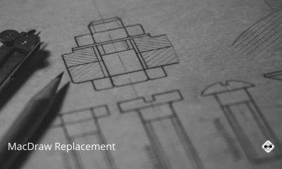
About MacDraw:
MacDraw was a vector graphic drawing application released along with the first Apple Macintosh systems in 1984. MacDraw was one of the first WYSIWYG drawing programs that could be used in collaboration with MacWrite. MacDraw was useful for drawing technical diagrams and floorplans. @Wikipedia
The Problem:
I have recently changed from an old 68k Mac to a G4. I have a lot of drawings (mainly building floor plans) that I did using MacDraw Pro that I want to display on my G4. I’ve copied the application across and it runs OK in Classic mode. However I’d prefer to use an OSX native version if possible. As MacDraw is no longer available, can anyone suggest a suitable alternative?
I know there are plenty of high-end drawing (and even CAD) programs out there, but what I’m after is something quite basic that I can use for drawing room layouts, floor plans, etc. (i.e. mostly circles, rectangles and lines). One of the features I like about Mac Draw is being able to set up the scaling on drawings e.g 5mm = 1m, and then use autosize lines to show the room dimensions on a drawing.
Brian Beaven
Does anyone know of a simple program that has these features? I’ve tried CAD programs like PowerDraw, but I prefer the simplicity of a drawing program.
Mac Draw and ClarisDraw Import
Apple Works:
Apple has dropped support for AppleWorks, a great classic application whose time has passed. Apple’s new proprietary workflow offering is the iWork suite. These Apps do not provide a drawing application. Many users migrating to iWork have found EazyDraw to be the perfect solution for their drawing needs. In response to this trend, EazyDraw now offers a full import of AppleWorks 6 drawings. Since the iWork applications and EazyDraw are founded on the Cocoa technology, EazyDraw works as a full fledged team player, finishing out the Dream Workflow of the future. More Info: AppleWorks Import .
Import the Classic Mac Drawing Files:
EazyDraw now supports full import of AppleWorks 6, Claris Draw, MacDrawII, MacDrawPro and PICT files. All vector information, patterns, colors, gradients, groups, layers and rotated object, are supported by the import.
Full support is provided for import and editing of PICT images and files. PICT content may be converted to EazyDraw vector graphics. The conversion conserves vector information, fully attributed text, as well as embedded bitmap images.
ClarisDraw Libraries:
ClarisDraw libraries are fully supported by EazyDraw. A ClarisDraw library is opened directly into EazyDraw. The Claris Library becomes an EazyDraw library with support for all the EazyDraw library modes: Name, Button, Element, with main menu access.
References
- Mac Draw and ClarisDraw Import, Dekorra Optics LLC. Accessed 2021-09-13.
- Intaglio, Purgatory Design. Archived 2020-08-09.
- Add and edit a shape in Pages on Mac, Apple Support. Accessed 2021-09-13.
Website Design Projects Submission Awards
Below are some sites to inspire you when you are designing your web pages.
The sites below are inspirational for how they visually represent their content, layout, navigation, and more.
6 Sites to Submit Your Web Design Project
- Awwwards
- https://design-milk.com/submit/
- https://www.indigoawards.com/entries/
- http://www.ijdesign.org/index.php/IJDesign/about/submissions
- https://www.cssdesignawards.com/submit
- https://www.designnominees.com/site-submission
Top Tips to Not Lose at Poker Cash Games
Introduction
Regardless if you’re playing for tens of dollars or thousands of dollars, poker cash games give you the same thrill and can be very profitable, if played right. However, as the market becomes increasingly saturated, poker games are similarly becoming tougher and tougher, which makes it difficult for people to earn sufficient winnings. As such, we are here to give you some tips and tricks on how to lose the least amount of cash while playing your favorite games.
Five Methods to Avoid Losing in Poker Games
Be Aware Of Your Poker Positions
Positioning is key for playing poker successfully – and thus, playing hands in position will always make you more money than playing hands without a position. Poker is a game of incomplete information, as you don’t have access to your opponent’s cards, which requires you to decipher what they have and then respond in accordance. Playing hands in position allows you to see what your opponent does before you make your next move, which is valuable information for obtaining an edge over them.
Alternatively, playing out of position with the betting lead gives you a higher chance to win the pot on the flop. However, playing from the blinds is incredibly difficult and may result in several lost posts.
Spot The Fish
Unfortunately, being successful in poker is dependent on how much money you can make through playing with weaker players, or otherwise known as ‘fish’. Weaker players are prone to making far more mistakes than experienced players and are known to spew off stacks that make it profitable for their opponents.
If you’re wondering how to Beat The Fish, having a proper table selection to ensure that you’re playing with the best lines up can almost nearly guarantee your success rate. Playing with breakeven or losing players that don’t table select can be profitable for you if placed in the proper lineups. The quicker you understand that there is no space for egoistic behavior when playing poker, the less ashamed you will be to play with the weaker players instead of facing off against experienced players (and losing, too).
Reduce Slow Play
There is a huge misconception – especially around new players – that slow play is the way to go. Many think that slowplaying gives them a higher chance of winning a large pot whenever their opponent makes a top pair. However, this is far from true. Whilst this may happen from time to time, it does not occur often enough for you to guarantee a win when you slow play.
Alternatively, what you should do is to play aggressively with your strong hands preflop as well as on the flop. In doing so, you will be able to win a lot of money in the long run by 3betting your AA and KK hands instead of merely calling with them. When you make a 3bet, you’re building the pot, thus simultaneously obtaining a betting lead on the flop.
If you make a strong hand post-flop, playing aggressively would help you to earn a lot more money as well. When you place your bet, you make sure that the pot is growing to rake in good returns. In contrast, slowplaying is dependent on the risk that your opponent won’t bet aggressively and causes the pot to remain small.
C-Betting
This is a great tool for any poker player to possess in their arsenal. Through this, you’re able to win a lot of pots by simply raising preflop and c-betting on the flop. C-betting is so powerful that most players would bet all the time once they have increased the preflop. Although this is effective against weaker players, experienced players can catch on to your strategy and use it against you quickly.
Before you make a c-bet, there are a few things you should think about first. Firstly, the flop texture needs to be looked at and weighed against your preflop range. Next, you need to consider whether your flop is good enough to go against your opponent’s preflop range. Lastly, take a look at your hand and then gauge how high up it is in your range before making the c-bet.
3-Bet On Your Strongest Hands
As we all know, having the strongest hands and using them would help you to win a ton of money. Hence, we strongly recommend that you begin pre-flopping your strongest hands –– which are the AA, KK, QQ, and AK. Yes, it may be tempting to slowplay these cards and hold onto them longer in hopes of tricking your opponent and ultimately winning the bigger pot. However, this doesn’t always work out the way you want it to be.
Whenever you miss the opportunity to 3bet these hands preflop, the size of the pot shrinks considerably. As a result, many more bets must happen and go in post-flop to make up for the lack of bets that happened during the preflop. In such a scenario, when many players begin placing more bets and raise post-flop, they often have a KK or AA beat.
As such, it is a good idea to get as much money as you possibly can during the pre-flop when you have the best hands and then make the 3bet preflop. In doing so, it will be much easier for you to get the stacks in since your flop will be sized up.
Why Do People Lose?
There are several reasons why people end up losing poker cash games. If any of these methods sound familiar to you, you might want to re-evaluate your current poker gameplay.
Playing In A Bad State
Poker is a mind game that requires you to be kept sharp and on your toes throughout the entirety of the game. Poker relies on strategy play, which requires thoughtful and conscious thinking to make the best decisions. If you’re playing intoxicated or in a state of tiredness, you’ll end up losing more money than expected.
Being Passive
Being aggressive is part of successful poker play. It gives you two ways to win the pot –– either causing your opponent to fold, or having the best hand and winning. Taking a passive stance to poker not only relies on you having a good hand to ultimately win the pot but also results in significantly smaller pot size, as you’re depending on your opponent to bet for you.
Predictable Strategy
It’s easy to slip into repetition especially when you’re dealing with cash games, where players have the same stack size and are all using the same strategy. Slipping into auto-pilot mode is even easier when you’re playing with multiple tables online.
However, if you’re up against an experienced player, they’ll be able to spot the patterns very early on – and thus take advantage of your predictable strategy. We recommend mixing strategies instead of sticking with a default one, so you won’t run the risk of being identified.
Conclusion
Even though cash games are becoming increasingly difficult, you’re still able to win as long as you play your cards right. As such, we hope that we’ve equipped you with sufficient winnings that can help you avoid losing in your next few poker games.
Aesthetic Phone Icon for iPhone Free on iOS 14-15
With the large selection of iPhone home screen icons currently available, finding the perfect one is tough. You can choose from various styles of app icons, including neon/retro and anime.
But don’t worry – having a beautiful new phone icon is a lot easier than you may think.
This article has some awesome shaded icons which you can download for free.
All these are designed to be used with iPhone. Now you know all the different ways to make your phone icon look awesome! Let’s find what will suit you best – whether that be neon, beige or something else.
Aesthetic phone icon pink
Aesthetic phone icon purple
Aesthetic phone icon blue
Aesthetic phone icon brown
Phone icon aesthetic green
Phone icon aesthetic white & black
Phone icon aesthetic red
Aesthetic phone icon beige
Phone icon yellow aesthetic
Phone icon cute aesthetic
Aesthetic phone icon neon
Intaglio Sketchpad App [Summary]
Intaglio Sketchpad is a full-featured drawing application designed for the iPad, iPhone and iPod touch, based on Intaglio, the award-winning Macintosh application. With most iPad and iPhone sketching apps you paint strokes or erase pixels on the screen. Intaglio Sketchpad is different because it allows you to create and edit shapes and text blocks. These graphic elements retain their shape and attributes and can be edited at any time. For example, you can adjust color, line thickness, or fix spelling mistakes at any time. To erase an element you simply select it and delete it without affecting whatever might be behind it.
Intaglio Sketchpad provides a full set of drawing tools and capabilities re-imagined for the multi-touch environment. For example, use one finger to draw or select a graphic, or use two fingers to rotate it. Hold your thumb on a tool button while drawing to constrain the object.
Features:
• Eleven drawing tools including freehand drawing, geometric shapes, bezier curve pen and text.
• Functions to align, delete, duplicate, group, layer or transform graphics.
• Create text using any font style in the iPhone OS (currently 58 font/style combinations on the iPhone and 110 on the iPad).
• Path editor, subpath contour control functions, boolean path operations and text to path conversion.
• Gradients, patterns, drop shadows, arrows, dashed lines, outlined text and clipping masks.
• Drawing aids such as a grid, smart guides and object location and size feedback.
• Customizable drawing scale and size.
• A customizable graphics library including a variety of predefined shapes.
• Multi-touch navigation with two finger scrolling and 800% zoom.
• Multiple levels of undo/redo.
• Import photos and scale or rotate them to composite with other graphics.
• Use cut, copy and paste to move graphics between drawings or export them to other apps.
• Import vector graphics from your computer as SVG.
• Export images to your photo library or as PDF, SVG, PNG or JPEG files to your computer via Wi-Fi or iTunes file sharing.
• Share drawings with other users of Sketchpad via Wi-Fi or Bluetooth, or with Intaglio on the Macintosh.
TOP 7 Social Website Design Tips
Online dating has been a huge part of our lives for quite some time now. In fact, at the moment, as more and more people decide that this is the easiest, fastest, and most effective way to date nowadays, half of all people have tried it, and hundreds of thousands more try it each day. So, of course, the need for niches was born. Online dating websites took things to the next level and decided to create special websites for different kinds of people and people with different needs.
Mature Online Dating is a Large Market
The mature dating niche is truly one of the broadest. Firstly, because mature single people who stand confidently on their feet can afford to pay for quality online dating services, as they are focused on results. And secondly, by the age of maturity, people know and understand a lot about themselves, so they specifically follow their preferences. Mature singles’ preferences give rise to subcategories in the mature niche, including casual hookups and serious relationships, as well as international and interracial dating that will bring date seekers from the United States to Asia and around the world together.
Online dating has different combinations like young people seeking mature ones, matures looking for matures; an emphasis on a racial or cultural background is also possible. Search filters are so diverse on sites that finding mature Asian ladies dating for young men is as easy as it is for matures. While in the past, people who were over 40 and single with a passion for Asian women, who were divorced or widowed, did not have a way to connect to others in similar situations and got almost shunned from society and remained alone forever, nowadays it’s not the case anymore.
The main thing is that the site is aimed at the age of the target audience and is usable for the older generation.
How to Design a Mature-Friendly Dating Site
There are some peculiarities in creating online services for mature people so that they can be used by people over 40 without inconvenience or confusion during the dating process.
- No clutter – having a clean design that’s minimalistic is crucial as one likes things that are all over the place. While in the past, websites with a lot going on were the norm, now the simpler, the better
- Straightforward and intuitive – the website should be insanely easy to use. User experience is very important, and you need to remember that these are older people. They might not be very tech-savvy and shouldn’t get lost on the website trying to find the mature Asian dating subcategory. Keep everything one or two clicks away from the homepage at the most.
- Simple color scheme – create a safe space, with simple colors that will catch their eye but not look too menacing. Pastels and basic black and white are good options.
- No flashy colors or buttons – make mature singles feel welcomed and safe by not using flashing colors and buttons and getting them to panic that they’ve gotten a virus. They may not know much about websites and the Internet, so they will scare easily.
- Сlear and large font – The text on the pages of a dating site should be easy to read, as well as there is no need to place small and illegible inscriptions on important buttons such as “log in” or “swipe to like”. It’s better to use classic sans-serif font like Arial due to easier perception by the eyes of older people or people with visual impairments.
- Available on any device – make the website fit perfectly across all devices. While some might like browsing on desktop computers and laptops, the majority will probably prefer using it on the go. Especially if a person is traveling or looking for an Asian partner, being on the other side of the world, where the time zone is different, then it will be convenient to have access to their dating profile at any time. If possible, also create an app.
- Great search feature – this is absolutely imperative. Probably one of the most important features of the website. Make it easy to spot no matter where you are on the dating website and super easy to use. Have several functions available to users, from geolocation to filtering according to age, gender, sexual orientation, and more.
Conclusion
There are several other aspects that you should take into consideration, but the others are more on the turf of how to design a website in general and aren’t necessarily connected to making a mature dating website.
What is most important to remember out of all of this is that you must do your research and understand your target audience as well as possible. If necessary, try focus groups and questionnaires and ask them directly. Meet their needs and adapt and change if the users raise demands or have opinions that could improve their experience.
Alternative names for Minimum Viable Product
What is MVP?
Introduction:
A minimum viable product is an early release of a product that provides enough functionality to satisfy early adopters. It is the first stage of the product development cycle including the result of applying an iterative development approach. The goal of a MVP is to search for product-market fit.
3 Amazing Useages of an Alternative Minimum Viable Product
1. Living MVP
This version of a MVP is the most basic. It is still in active development, but it is also in a fully functional state. The goal of a living MVP is to promote user feedback and create rapid changes, which can be used in future updates.
Many entrepreneurs feel the need to release a product as soon as possible. But today’s consumers don’t want to use an unfinished product or service. In fact, they may not even recognize it as a potential solution for their needs because it doesn’t have all the features they’re looking for.
This is why entrepreneurs should focus on creating a viable minimum viable product (MVP). A living MVP is a version of a MVP that is still in active development but that is also fully functional. This way, your customers can use your app and provide you with feedback from the ground level to help you improve your final product.
2. Mini MVP
A Mini is a product with a limited scope for testing before going into production with a full scope release product or service.
Mini MVP is a product with a limited scope for testing before going into production with a full scope release product.
This is to ensure that the best features are built, which will bring maximum value to the customer. The features that are not fully fleshed out or tested are pushed to be back-burnered in order to ensure that the best features are built to provide maximum value to the customer.
This type of prototype helps to identify potential flaws and optimize designs before committing to major design changes or implementing more specific features that will not be finalized until later on in the project timeline.
3. Artisanal MVP
These products are created without many resources such as capital, time, and staff members for the sole purpose of having something tangible to present to potential investors or customers during fundraising rounds or sales pitches meetings.
A successful MVP is a product that has just enough features to be valuable to the customer. It is not necessary to have all the features in place. You can have an MVP with just one or two features, but they need to be valuable.
Most of the time, startups are able to launch an MVP for free because they are creating it themselves. However, when you pay someone else to develop your product, the costs will vary depending on how much they are charging per hour or project.
How to find developers to build own MVP?
A potential problem is that we can’t just go to a developer and say “hey, I want you to build me this product”. This approach won’t work because developers want to know what the idea is, and why it’s valuable.
The best way to find a developer for your MVP project is by using freelancing marketplaces like Upwork or Guru. These sites let you post your job and see projects people are willing to do.
Creating a Horizontal Gravity Form Using CSS
Gravity Forms is widely recognized as the best contact form plugin on the WordPress market, and it’s easy to see why. I use it on all of my sites, and here’s how and why you should do the same for yours!
Gravity Forms’ highly capable and easy-to-use interface sets it apart from similar plugins, and with so many features, it’s not surprising that they’ve included CSS Ready Classes to use when customizing your form to match the design of your website.
Why Horizontal Forms Are Awesome
To create a custom form, frontend developer must first, well, customize the form! In order to create a simple horizontal form like the one shown below, some modifications will have to be made to the CSS. Typically, you will see horizontal forms used for newsletter signups integrated with third parties like Mailchimp, or you will see them used as simple giveaways people fill out to receive a PDF or other freeby. I love the idea of horizontal forms because they use limited space and are unintrusive, giving you a lot of real estate left on your website to work with while not being overly distracting. For an example of what I mean, here is a form that was modified with only a few lines of CSS:
- Name
How to Create Your Own Custom Gravity Form Using CSS
Before diving into the stylesheet, make sure you set each field label with the appropriate column class. Exp: Using gf_left_half and gf_right half for two columns and using gf_left_third gf_middle_third and gf_right_third if you are using three columns.
Now, you’ll need to set the footer to display inline-block, and have the form’s body float left in order to have the submit button next to the field labels. You are going to need to tweak the width and padding, and these values will vary depending on the layout specifications of your site. Make sure you clarify the id of the form to ensure you’re not breaking any other forms on your site. Here’s what the CSS will look like:
#gform_2 > .gform_footer {
display: inline-block;
padding: 0.85em 0 0.625em;
width: 20%;
}
#gform_2 .gform_body {
display: inline-block;
float: left;
width: 80%;
}
Simple, Right?
After going under the hood with Gravity Forms, I quickly realized a few modifications can go a long way and help you create exactly what you’re looking for. There is so much extended functionality and so many built-in features that I assume I’ll never have to touch the CSS, but if I do, at least I know it will be simple just like everything else about the plugin!
If you’re not already using Gravity Forms for your contact forms, I suggest you make the transition. They offer three different pricing plans including a developer license for $159 a year.
Gravity Forms Design Examples
Gravity Forms is a premium WordPress plugin designed to make it easy, efficient and cost-effective to create and manage any type of form online. You can create a contact form, subscription form, donation form or any other type of form that you can imagine.
The plugin has been built from the ground up with the needs of WordPress users in mind. It’s not just a simple “add-on” that you have to learn how to use from scratch. Gravity Forms is an all-in-one solution for creating and managing forms for your website or blog in WordPress.
- Material Design
- Checkbox & Radio Styler
- Bootstrap Design
- Tooltips
- Field Icons
What makes Gravity Forms so powerful?
The toolkit features everything you need to build a professional looking contact page with multiple types of forms: contact forms, subscription forms, donation forms and more.
Rem vs Em vs Px: When to use these units
Your content is the foundation of your inbound marketing. Miss the point, and you may increase your bounce rate. While the kind and quantity of the content is the key, knowing how to place and organize your content on a website is also important.
In this marketing race, typography is the presentation of your work. Other than your writing style the font type, size, color, bold, italic, everything matters to your end user. Often referred to as an art, it is the science of innovation to keep those eyes glued to the page.
Introduction to rem, em, and px
I will be solving one of the common confusion which every UI developer will face in choosing the css unit to use either px or em or rem.
Basic font-size a browser has 16px or 12pt (points).
If you’re familiar with web designing, you would have undoubtedly heard of these terms. The best practice of typography on the web is to use the relative units of rem, em, and px.
Most of the popular frameworks are updating the design with rem or em unit. We have popular Twitter Bootstrap framework 3 which earlier worked on pixels but with Bootstrap 4 now in the market even it has updated its typography with rem/em.
In this article, we will discuss, what exactly are rem, em and px, and how to use them.
What is Rem?
It stands for “Root em”. It is a relative unit of CSS and translated by the browser to pixels (px). When rem is used on the font-size in the root element, it represents its initial value. If we set the font-size:16px of the root <html> element, then font-size of paragraph will be 1rem. This implies that
1rem=16px
If we change the font-size of root element from 16px to 20px, then 1rem would be equal to 20px.
html{
font-size:16px ; /* it means 16px is equal to 1rem */
}
The font-size of the paragraph here is 1rem. If we want to set font-size as 18px for the paragraph, then we can calculate the font-size as:
html{
font -size:16px
}
p{
font-size:1rem;
}
Similarly, we can also calculate the pixels from rem.
Suppose we set the font-size:16px of root HTML element, then we would count it as:
html{
font -size:16px
}
p{
font-size:1rem;
}
In case you now want to set font-size:22px in rem of an element, then we can calculate the font-size as,
22px/16px = 1.375rem /* i.e. equal to 22px.*/
When to Use Rem?
Because the content should adjust to the size of the device, it is important that your font adjusts too.
If we want to keep the font-size responsive to the device, then we must change the root <html> element.
It is always good to create responsive web designs.
html {
font-size:16px;
@media only screen and (max-width:991px) {
font-size:14px;
}
}
Then font-size automatically will adjust to the screen.
Here’s an example:
<html>
<head>
<meta charset="utf-8">
<meta http-equiv="x-ua-compatible" content="ie=edge">
<meta name="viewport" content="width=device-width, initial-scale=1.0">
<title>Test</title>
<link rel="stylesheet" href="css/style.css">
</head>
<body>
<div class="outer-wrapper">
<div class="row">
<div class="column test-col">
<h1>This is Heading h1</h1>
<p>This is Paragraph</p>
</div>
</div>
</div>
</body>
</html>
This is a very common example of rem.
Now, we can also set the font size for a larger screen.
html {
font-size: 16px; /* i.e. 1rem */
}
.test-col h1 {
font-size: 2rem; /* i.e. 32px */
}
.test-col p {
font-size: 1rem; /* i.e. 16px */
}
If we want to change the font-size of <h1> & <p> in mobile & tablet, then we will change the font-size of the root <html> element.
@media only screen and (min-width:768px) and (max-width:991px)
{
html {
font-size: 14px; /* i.e. 1rem in for Tablet screen*/
}
}
now the font-size of <h1> & <p> works like this in tablet
.test-col h1 {
font-size: 2rem; /* i.e. 28px */
}
.test-col p {
font-size: 1rem; /* i.e. 14px */
}
@media only screen and (max-width:767px) {
html {
font-size: 13px; /* i.e. 1rem in for mobile screen*/
}
}
now the font-size of <h1> & <p> works like this in mobile
.test-col h1 {
font-size: 2rem; /* i.e. 26px */
}
.test-col p {
font-size: 1rem; /* i.e. 13px */
}
What is Em?
Em is a relatively flexible and scalable unit of typography. It is equal to the font-size specified to the parent element. Your browser translates em to pixels. It can turn out to be a tricky part.
The exact value is determined by the font size of the parent element. It gets complicated when we start nesting elements deeply. In such a case we have to multiply all the available values to determine the actual value of the child element.
Let’s say we have a <div> element. Inside the <div> we have a <h1> tag and a paragraph <p>.
if we set the font-size:16px of the parent <div>.
div {
font-size:16px;
}
Then we have the font-size of <h1> as 2em. This means font-size of <h1> element is relative to its parent <div>.
h1 {
font-size:2em; /*default font-size of parent element is 16px*/
}
p {
font-size:1em /* default font-size of parent element is 16px */
}
If we want to set <h1> font-size equal to 30px in em, then we can calculate the font-size in em like this, 30px/16px=1.875em.
What are the uses of Em?
The main problem is that em is relative to the font-size of its parent element. If we want to change the font-size of an element, then we have to change the font-size of its parent element.
By using em, we can create components on the page that respond automatically, should the font size change.
Let’s say if we want to change font-size of <h1> in mobile or in tablet,
div {
font-size:16px;
@media only screen and (max-width:767px) {
font-size: 14px;
}
h1 {
font-size: 1em;
@media only screen and (max-width:767px) {
font-size: 1em; /* i.e. 14px */
}
}
}
What is Pixel?
Pixel is an absolute and fixed-size unit in CSS. Although the size of a pixel isn’t always the same, the font-size, margin, and padding in pixel(px) remain same for all the screens.
Pixels are easily translatable. For example if we sets the font size 24px to an <h1> element then it is always 24px for all screens and devices.
h1{
font-size: 24px;
}
p{
font-size: 18px;
}
And if we set the font size to 18px for a <p> element then it would always be 24px for all screens and devices.
We use the pixels as an absolute unit, and it remains same for all screens.
Depending on the project, the need, and the developer, you can use rem, em, or pixels. But the foremost thing to take into account is who the website is being built for. Once you are familiar with your needs and the final goal, it is easy to decide what to zero in on.
Why you need DesignOps?
Read below to learn about how DesignOps tackles common organizational problems, and check out the full profile to read more on how design maturity is the key to any successful design practice.
The day-to-day calendar and to-do list for early design hires at nascent startups and design leaders heading up mature orgs may look vastly different. But at the core, designers often struggle with many of the same stumbling blocks—fighting to bake design into the company recipe for success, rather than settling for sprinkles that are added as a flourish on top of the cake.
As design continues to mature and cement its status as a pillar in a company’s long-term architecture, there’s a double-edged sword to contend with. Design has fought for a booming, clear voice in the company’s end-to-end vision. But with that voice, a mountain of cross-functional work, process particulars and a calendar bursting at the seams with meetings comes with it. Before you know it, designers are too busy to design.
Enter a role that’s gaining steam in organizations at every stage of the growth journey: Design operations, tasked with crafting efficient workflows, optimizing design’s internal partnerships and creating functional growth that scales for the long term.
The definition I’ve honed over the years is that DesignOps builds a platform to enable design strategy and execution to work together in harmony.
Alison Rand, InVision’s senior director of design operations
And as design’s footprint within a company grows ever-larger, that merging of vision and action has never been more critical.
It used to be that designers were mostly considered pixel-perfectors—brought in at the latest stages of product development. But we’ve seen a lot of evolution and maturity in this design thinking, and for many companies design now has a hand in every single step of the customer journey.
5 common organizational problems DesignOps can solve
But with that widened scope, designers now face a vast slate of challenges, including:
#1 Silos
“Although at most companies designers are expected to work closely with marketing, engineering and product teams, these departments are often completely independent from one another, without shared OKRs.”
#2 Complexity
“Design tools and systems are wide ranging, ever-changing and increasingly complex—often resulting in bottlenecks. I’ve seen plenty of design teams that are reluctant to adopt developers’ processes and tools (like Jira). There are separate planning and tracking tactics and general misalignment across product, stakeholders and executives. That lack of quality assurance across development ultimately equals a poor customer experience.”
#3 Career path
“Designers are often expected to wear innumerable hats—from creative leader, to producer, to project manager. That leaves little time to hone your craft. There’s also a lot of ambiguity around how organizations design the career paths for designers—if they even map them out at all.”
#4 Strategic oversight
“Plenty of companies may say that design brings a strategic lens, but the reality shows that plenty of designers are purely in production roles. It’s all reactive—creating at the request of developers and product managers who lead strategy, rather than defining a direction for the product’s design at the ideation phase.”
#5 The myth of the unicorn
“There’s a lot of nuance in different types of design roles that is often overlooked. Companies may be hiring for a visual designer, when what they actually need is a creative technologist. Or they might have a product designer that would be even better as a communication designer, but they aren’t tapping into those skills.”
TIPS
>> Read the DesignOps Handbook
These problems are particularly acute these days. “As companies’ digital transformations have been sped up so quickly by COVID-19 and the transition to remote work, the needs and desires to mature their design practices will be more pointed. There’s a tipping point here. When designers are managing all this process, they’re not actually designing — and they are going to become super unhappy,” says Rand. “If you want to remove those extra layers of process-management so your designers can focus on the craft, you’ve got to start thinking about the type of design operations person you could bring aboard.”
The goal of DesignOps is to look at these challenges end to end, and architect agile design systems and processes that can tackle them at scale. But before we dive even deeper, a quick point of clarification from Rand: “If I were to debunk the biggest misconception about design operations, it’s that it’s purely a project management role. Companies thinking of it that way and hiring that way are doing themselves a real disservice,” she says.
DesignOps can do so much more than keep projects on track. We think about the entire end-to-end experience of a designer—from recruitment, to onboarding, to role definition, to leveling and career path—plus the tools and processes we can arm them with to have the smoothest experience possible.
DesignOps’ purview is massive — what I love about this framework is that it boils it down to operations’ most essential elements. You’ve got to start somewhere.
Alison
All this talk of design systems, processes and structure may make creatives at heart feel a bit itchy. It’s a reaction Rand has encountered plenty of times over the course of her career. “It’s a very misunderstood role, which can be frustrating. But it’s also an incredible opportunity to put our stake in the ground and say, ‘This is how we can help take your company to the next level,’” she says.
I’ll never forget when someone asked me, “Does DesignOps take the joy out of design?” That couldn’t be further from the truth — DesignOps brings the joy back into design, by enabling designers to focus on what they do best.
GRAPHICSTOCK — Unlimited Royalty-free Downloads for $4/mo
If you’re a designer, whether you’re a freelancer, or small business, then you know exactly how expensive stock images can be.
If you’re a designer, whether you’re a freelancer, or small business, then you know exactly how expensive stock images can be. GraphicStock can be a wallet-friendly option for high-quality stock images.
This fantastic service is subscription-based, so no matter how much you download, you’ll never pay more than the cost of the subscription.
GraphicStock’s library of over 350,000 files includes images in categories like business, people, and nature. You’ll also find illustrations, abstracts, textures, and more!
After you sign-up, you’ll have instant access to the entire GraphicStock library. As a subscriber, anything you download is yours to keep and use forever, even if you cancel your subscription.
GraphicStock is continually adding new content. With fresh assets every day, it’s worth keeping your subscription current just to see what will be available next.
Like the sound of GraphicStock? Well now’s your chance to try it. GraphicStock is offering a 7 day membership trial. Simply signup, and start downloading. Even if you cancel at the end of your trial, anything that you download during the 7 days is yours to keep and use forever, free of charge.
Choose a plan that fits your license needs
For cost-conscious designers, GraphicStock is a fantastic addition to the toolbox.