Grow Your Business
Data-driven storytelling: How numbers are transformed into stories
Data-driven storytelling is based on the great allure of stories. With this in mind, more and more businesses are adopting a narrative approach to internal and external communication in the effort to convey abstract data in vivid ways.

In times of big data: Presenting complex information in an understandable way
Business intelligence tools, CRM software and the use of artificial intelligence all give marketing and sales departments a wide range of options for data collection and analysis to choose from. But the crux actually lies in the wealth of information available and in the complexity of that information: The mere generation of numbers and data is largely pointless if it does not succeed in communicating the meaning of these numbers and data and putting them in a context people can understand.
Data-driven storytelling, on the other hand, prepares naked figures in such a way that stakeholders and customers experience them as understandable, interesting and appealing.
“Sometimes reality is too complex. Stories give it form.”
Jean-Luc Godard
Storytelling with data as a communication strategy
Basically, data storytelling is not new. For instance, a trend toward data-driven journalism has been emerging for several years now. The term describes not only a certain type of information acquisition but also a particular form of presentation. These aspects are also true of data-driven storytelling in in-house corporate communications and in marketing.
In essence, data-driven storytelling comprises three areas:
- the analysis of the data
- the narrative
- the visualization of the data
Thanks to narrative as well as visual and interactive elements, abstract data sets take shape, and this contributes to greater reach.
Data processing: Here’s how to turn data into a good story
But how do you proceed if you want to illustrate the latest sales figures, or user interactions in the last quarter? First of all, there should be careful consideration of which topic is to be prepared for whom, and on the basis of which data:
- What point do my data illustrate? How meaningful and representative are they?
- What target group do I want to address?
- Which aspects of my data evaluation should be conveyed to the target group?
- What prior knowledge does the target group have?
- What misconceptions does the target group possibly assume?
7 typical storylines in data-driven storytelling
Only once the above aspects have been isolated does it make sense to think about what the narrative should look like. First of all, a storyline should be considered that is appropriate to the question at hand and the existing pool of data. According to marketing manager Ben Jones, 7 basic types can be distinguished here:
- Change over time: A story is told about a process or transformation.
- Drill down: The narrative begins with an overall view and leads to a concrete example.
- Zoom out: Over the course of the narrative, a tiny focus is extended to taken in the big picture.
- Contrast: Different protagonists, data or issues are compared.
- Intersection: At the heart of the narrative lies a crossroads where two or more questions or data points intersect.
- Dissection of factors: Data and storylines are interrogated for correlations and causalities. Unclear records are “dissected,” so to speak.
- Profile of outliers: The story is dedicated to special cases and statistical outliers.
A meaningful structure of a data story
Like any good story, a data story should captivate its readers or listeners. Taking a cue from the dramaturgy of classic feature films, a structure in at least three parts is recommended:
- Exposition: Presentation of the topic and context of the data analysis; what is the occasion for broaching the question?
- Confrontation: Presentation of the central question and the challenges involved; what are interesting observations and problems?
- Resolution: Concluding wrap-up with recommendation for action; what insights does the data analysis yield, and what things might need to be changed?
Data visualization: Preparing numbers for visual effect
In addition to the actual narration, visual elements also play a decisive role in data-driven storytelling. Infographics, diagrams, animation and highlights make the world of numbers tangible, even for the untrained beholder. The presentation should be as clear and simple as it is precise. The accompanying narrative can pick up on and explain any relationships that cannot be conveyed visually. Combining textual and visual elements makes data stories easy to understand and internalize. This not only bolsters in-house communication processes but can also contribute to improved customer loyalty.
About the author: Cora Eißfeller
Cora Eißfeller works as an online editor at content marketing agency textbest in Berlin. After working for several years in publishing, the literary scholar now devotes herself entirely to digital marketing. Her focuses are e-commerce, new work, and urbanisation trends.


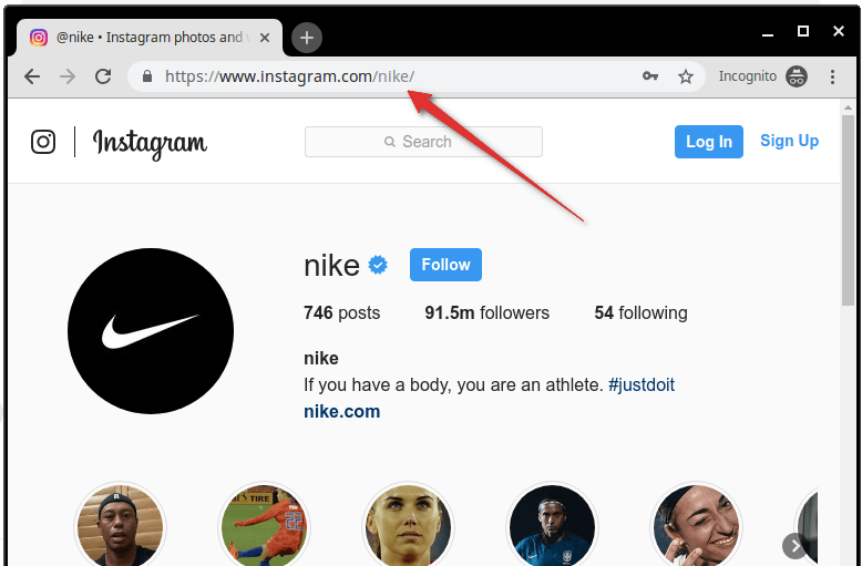
What is my Instagram URL? How to Find & Copy Address [Guide on Desktop or Mobile]

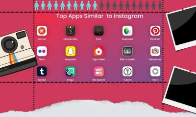
Best Instagram-like Apps and their Features
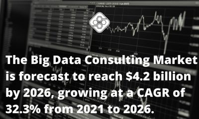
B2B Instagram Statistics in 2024

How to Unlist your Phone Number from GetContact

About Apple Employee and Friends&Family Discount in 2024
What is my Instagram URL? How to Find & Copy Address [Guide on Desktop or Mobile]

Applob.com Download APK – Tweak your device Safe
About Apple Employee and Friends&Family Discount in 2024
How to Translate more 5,000 characters limit by Google
How to Unlist your Phone Number from GetContact
-
Marketing Tips2 days ago
What is my Instagram URL? How to Find & Copy Address [Guide on Desktop or Mobile]
-
 Business Imprint4 days ago
About Apple Employee and Friends&Family Discount in 2024
-
 App Development3 days ago
How to Unlist your Phone Number from GetContact
-

 News5 days ago
Open-Source GPT-3/4 LLM Alternatives to Try in 2024
-
 Crawling and Scraping5 days ago
Comparison of Open Source Web Crawlers for Data Mining and Web Scraping: Pros&Cons
-
 Grow Your Business2 days ago
Best Instagram-like Apps and their Features
-

 Grow Your Business5 days ago
How to Become a Prompt Engineer in 2024
-
Marketing Tips2 days ago
B2B Instagram Statistics in 2024