UI Design
Checklist for Designing a Good Hookup Website
The online dating industry is growing like a mushroom by the forest creek. New hookup platforms pop out of nowhere. Everybody thinks building and scaling a dating site for casual hookups is simple, so they start the journey. However, many never get to see their sites shine. The reason for that is either being too general (we’ll explain in a minute). Or having a bad design (we’ll explain in 3 minutes).
The Importance of Picking a Niche in 2022 and Beyond
Online dating industry is huge. The majority of single people have looked for dates online at least once. Most are doing it regularly. And while some companies think that targeting everybody makes more sense, that strategy simply doesn’t work. Don’t get us wrong, it can work. But for that to happen, the owner must be ready to invest a lot of money. Not just in the design and features. Marketing is vital. The best platform in the world is useless if no one knows it exists. So, if you don’t want to compete with industry giants, pick a niche.
Do you think singles seeking hookups thrive on a dating platform for serious relationships or the one made only to find a hookup for a couple of nights? Of course, it’s a niche hookup site with decent features, even though some general platforms have more users. Competition isn’t as massive in niche sites.
Now you know why it makes sense to build a site only for singles looking for a hookup. However, don’t stop picking at the wide niche. Go deeper. Decide if you want to focus on straight or gay hookups, adult or senior dating, etc. Do that before you start designing and writing your website. Why? Because your target market and their desires shape your business, not the other way around. Let’s put that into an example.
Clear, Attractive, and Crisp Homepage
The homepage is the icebreaker of your hookup site. If it’s good, singles will join. If your home page isn’t good, visitors bounce back to SERP. And we all know how Google treats pages with a high bounce rate. To prevent that, you need to give the package of info on the homepage. And you must do it in an eye-pleasing way.
Here is the checklist you can use to see if your hookup site homepage (or any other page) has potential:
- does it grab attention
- does it answer what’s in it for me quickly (for your audience)
- does it show pain points and solutions
- is it conversational
- is there a story
- how about a clear CTA
We’ll explain each in a couple of sentences. Nail all of them (by combining design and copy), and you can be sure you have a good homepage.
Attention Grabbing
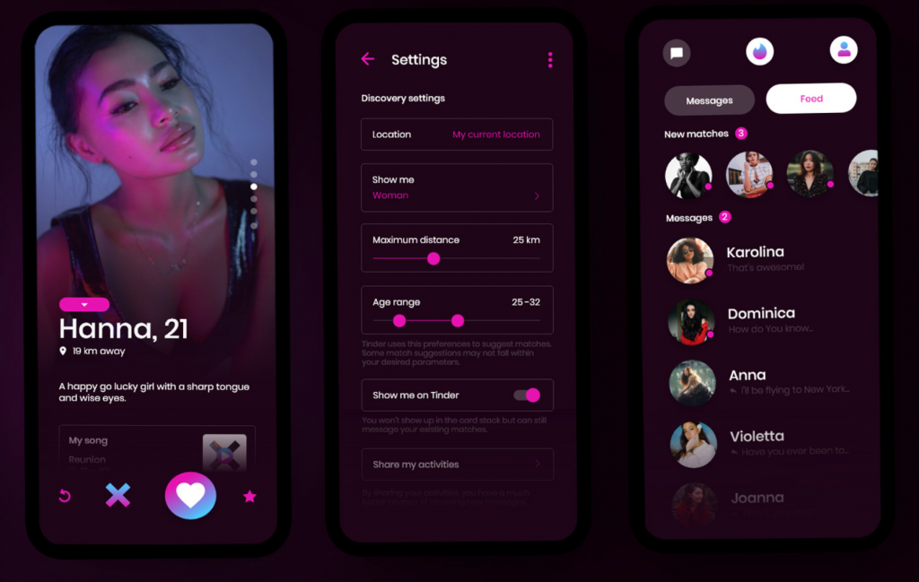
If you build a casual dating site, the best way to grab attention is to include attractive photos. Put them above the fold (the part of your site they see without scrolling). If the first thing they see after landing on your home page is a stunning lady or a flirting couple – you have their attention. Then you need to keep it. And that’s the tricky part.
What’s in It for Me
Your headline, usually next to the attractive photo, is crucial. It must give men and women seeking hookups the reason to join your site. The more specific it is, the more singles it converts. So, if you’re building a hookup site, say they can meet girls seeking casual flings quickly.

Pain Points and Solutions
You can tease this in the headline but focus on it in the body text of your homepage. The more objections you discover and solve, the more members you get. Just don’t forget to think about market saturation. Many sites focus on the wrong pain points. They compare themselves to offline dating. Instead, they should focus on the pain points of online dating and the solutions they offer. When it comes to design, if you can get nice icons that show before and after each pain point and put it under, let’s say, 150 words of body copy… Some might call that art.
Conversational
In other words, does it read like you’re talking to someone? The simplest way to achieve that in your copy is by using contractions (you’re instead of you are).
Story
Storytelling doesn’t fit in the design of the hookup site homepage, but you can still include stories. Use testimonials and reviews from current members. That’s strong social proof and gives a chance to see what happens after they join.
Clear CTA
Clear CTA doesn’t just mean you should use a different color to make the button visible. You should give them clear instructions on what they should do next. If you want X, then do Y now.
When it comes to design, you want to have 2 CTAs. One at the top by the picture and headline. And one at the bottom of the site. You can add one or two in the middle, but most hookup sites don’t have long homepages, so that’s not a must.
Also, remember to keep the same text in every CTA button.
The Tone of Voice (Terms and Language)
Now when you know how the homepage of a hookup site should look, you have to master something else. It’s related more to copywriting, but it affects design too. Nailing the tone on your site makes more impact than people think. Using the correct language is the line between:
- “God, this site must be fake.”
and
- “I have to try this cool site.”
To figure out the language of your audience, research. Become addicted to Quora, Reddit, and reviews on AppStore. Become addicted to anything that gives you insight into the exact words your target audience uses. And then you use those words to show them they can trust you.
Do deep research for design too. If the whole niche uses bright colors and big pictures, do the same. That’s been tested and proven to work. So, save yourself time and money and lean (not plagiarize) on things already crushing it.
Great UX (Easy to Navigate and Use the Site)
We won’t talk about the importance of safety on a hookup site. If you don’t plan to have SSL or email verification, don’t build the site in the first place. But don’t neglect the importance of simplicity. User experience makes the difference when two sites are similar in features.
Ensure that your site is easy to use on the mobile phone too. Some platforms invest a lot in websites only to figure out they’re useless on smartphones. Remember, your goal is to give singles a smooth hookup experience. To achieve that, you should pave as many bumps as possible. If your design confuses them, they fall into the pit. And the only way out is, well, out of your site.
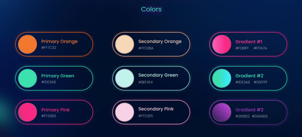
Mild or Vivid Colors
Our senses are receptors through which we feel the world. That means it’s possible to affect how someone feels by tickling their senses. In design, you have only one sense to hit – vision. You do it by using shapes and colors. Different colors spark different emotions, so read about the color you decide to use before you paint the whole site.
Relevant Ads
Hookup sites earn money by selling memberships or advertisement space. Most new and small niche hookup sites can’t afford to follow the first strategy because you need a good reputation. To get a good reputation – you need time (and a good product).
So, most new hookup sites finance themselves by selling ad space. If you’re going to do that, don’t be too aggressive. Don’t include 13 popup ads on every page. And if you don’t want to annoy your members, show them only relevant ads. That directly affects UX, and UX directly affects your reputation.


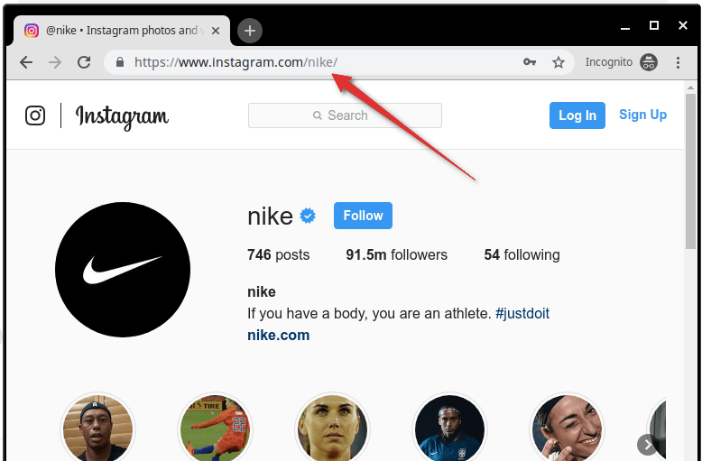
What is my Instagram URL? How to Find & Copy Address [Guide on Desktop or Mobile]

Best Instagram-like Apps and their Features
B2B Instagram Statistics in 2024

How to Unlist your Phone Number from GetContact

About Apple Employee and Friends&Family Discount in 2024
What is my Instagram URL? How to Find & Copy Address [Guide on Desktop or Mobile]

Applob.com Download APK – Tweak your device Safe
About Apple Employee and Friends&Family Discount in 2024
How to Translate more 5,000 characters limit by Google
How to Unlist your Phone Number from GetContact
-
Marketing Tips2 days ago
What is my Instagram URL? How to Find & Copy Address [Guide on Desktop or Mobile]
-
 Business Imprint3 days ago
About Apple Employee and Friends&Family Discount in 2024
-
 App Development3 days ago
How to Unlist your Phone Number from GetContact
-

 News4 days ago
Open-Source GPT-3/4 LLM Alternatives to Try in 2024
-
 Crawling and Scraping4 days ago
Comparison of Open Source Web Crawlers for Data Mining and Web Scraping: Pros&Cons
-
 Grow Your Business2 days ago
Best Instagram-like Apps and their Features
-

 Grow Your Business4 days ago
How to Become a Prompt Engineer in 2024
-
Marketing Tips2 days ago
B2B Instagram Statistics in 2024