Web Development
The 10 Best Tech Websites Engaging Consumers in 2023
Great tech necessitates great tech websites — there’s no getting around it. The best technology websites are insightful, imaginative and compelling. They integrate innovate features, dynamic elements and seamless systems to help navigate users through a fluid and efficient buyer journey.
These tech e-commerce sites need to rise to the occasion and rise above the competition — and they need to include some bells and whistles that most e-commerce sites don’t necessarily need. This is because as an industry, tech brands are in the business of innovation — whether they’re in video streaming, wireless sound systems or automobiles.
The top technology websites, like those you see above, incorporate innovative elements to amaze, inform and enlighten.
These brands are constantly growing and learning, and their website designs need to match that forward-thinking mindset.
Of course, all brands should grow and evolve. They should listen to their audience, learn from their past mistakes and work together to create an identity and a product and gadget suite that their consumers want to buy. But with tech, it’s a little bit different.
Technologies are constantly evolving, with new trends sweeping through, new solutions rising to the top and others falling by the wayside. So in order for tech brands to stay relevant, they need to stay up to date on everything that is happening in the industry.
So, what are the new emerging technologies entering the playing field? For starters, artificial intelligence has blown up, as has machine learning and augmented reality. How can your brand integrate these technologies into your products?
And better yet, how can you integrate those actions into your own web designs to emulate that sophistication and mirror that innovation?
It’s a long process, and it doesn’t ever end. But achieving the end result of a stunning tech website isn’t impossible. You just need to know where to start.
For inspiration of your own, and to get a better understanding as to what it means to operate and construct an exciting and top-notch website design in the tech industry, check out these 10 best tech websites of 2020. You’re sure to be amazed, excited and ready to emulate their talent and expertise
The 10 Best Tech Websites That Reimagine Online Businesses
- Sonos
Sonos is a B2C brand that produces wireless sound systems. It’s a leader in its niche, with a legacy that dates back years and quality products that people swear by. Choosing Sonos over other wireless speakers is just as telling as choosing an iPhone over an Android and vice-versa — the competition is that intense.
So to complement such a stunning brand identity, the team created a website that was equally innovative and exciting.
The Sonos online platform is a clean, visually-driven website that puts an emphasis on products and the buyer journey. High-value messaging, product-focused imagery and stunning motion are just a few of the things that immediately catch your eye when landing on the home page.
But in seconds, you’re perusing the dynamic and engaging site, learning about the products and making purchases.
Clear and direct CTAs, smooth and fluid graphics and a clean layout are all additional aspects of this site that help users on their journey to the checkout page. It’s clear, clean and focused in a way that is equally please and exciting.
This is a tech website that understands its product, understands its audience is ready to connect the two. It’s smart, intuitive and captivating. It simplifies its products and shows users its use with ease and satisfaction.
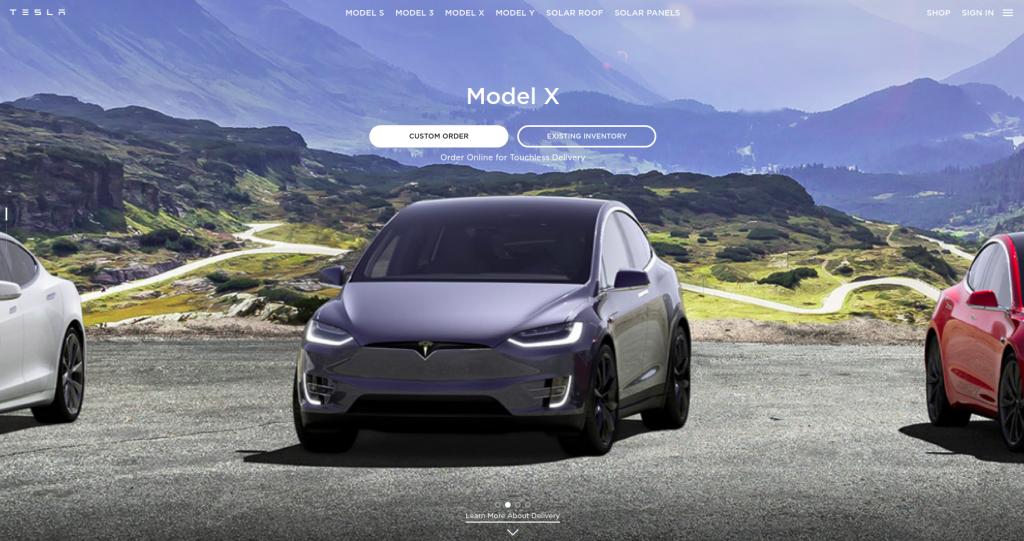
- Tesla
Tesla is an automotive corporation that specializes in electric cars. It’s a brand known for cutting-edge technologies, innovative techniques and forward-thinking features. And to further propel these beliefs and motivations, the Tesla website is a bold, intuitive and highly engaging design that informs, excites and radiates.
The focus of this design is entirely on the products and the features consumers are most anxious to learn about. It doesn’t go to great lengths to promote its innovative, technical excellence right on the man page. No, instead it offers consumers all the bells and whistles they want to hear about.
This website was created with car buyers in mind. Bold imagery, interactive movement and clear CTAs all point users down the right path — where they can learn more about the cars, what goes into them and what features appeal to them. Here is some info on logitech drivers.
This isn’t a website touting its own excellence — although the brand is at the top of its game. There’s no denying that — but consumers already know that. They know about the forward-thinking nature of the brand and its strive towards success.
But they don’t know how many seats come in a certain version, or know what safety features are included. So the website clearly displays this information for consumers to see, absorb and let sway.
The Tesla website is definitely innovative — there are dynamic movement, fluid navigation and breathtaking visuals. But it was created with its customers in mind and that’s key.
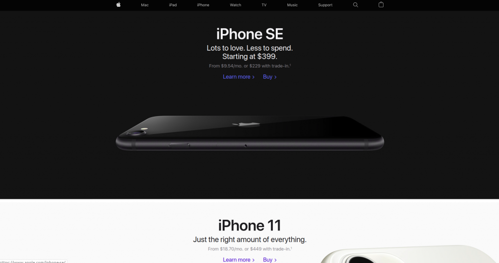
- Apple
We all know Apple — the leading tech brand in smartphones, smartwatches, tablets computers and more. It’s a brand that rose from nothing to become a brand that most people across the globe can’t live without. Apple is iconic. Its products are unmistakable. Its designs are revolutionary.
And its website is no different.
The Apple website is clean, product-focused and demanding. Product images make up most of the design. Apple relies heavily on stunning product images to engage with users and tout its excellence. It doesn’t need words — not when the proof is so evident just by looking at these sleek and sophisticated products.
This organized and efficient website outlines its features in a clean, crisp way in its minimal menu bar. But that’s mainly because when users land on the web page, they already probably know what they’re looking for, so Apple is trying to make the process easy for them going forward.
Apple doesn’t need much explaining — either the brand nor the products — so the company eliminates unnecessary copy in its website design. Images are the focus, and it’s these images that drive sales.
This keeps the website clean and decluttered, easy to use and pleasing to navigate. The Apple website organizes content in a reverse pyramid, keeping this consistent throughout when you do see the copy. But even this is simple, streamlined and minimal.
Amazon’s organization makes buying products from this retailer a dream.
- Amazon
Amazon is a powerhouse retailer that has taken the world by storm in recent years. It’s an online distributor that connects consumers with the products that they want — these products range from books, movies, children’s toys and more.
Considering the comprehensive offering this brand offers, it makes sense that their website is equally comprehensive — but that doesn’t mean it’s cluttered, disorganized or complicated. In fact, Amazon is one of the easiest e-commerce sites to navigate thanks to its open layout, grid structure and thorough categorical breakdown.
Amazon’s clear organizational structure — with products and categories clearly lined along the page, in blocks on the screen and in drop-down menus — lends itself to an intuitive and streamlined design. It’s easy to navigate, fun to explore and exciting to search through.
There is plenty of clean space that excites, bright colors that captivate, vivid images that draw attention and CTAs that encourage action. This seamless user experience makes it simple for consumers to get lost on the site and find the products they’re looking for, and get inspiration for even more options.
This site is clearly laid out, color-coded and easy to peruse. It’s a fun and satisfying website design that puts the shopper experience front and center, while still offering up its own products and services to grab users’ attention.
Though Amazon’s user interface is without a doubt impressive, a critical role is played by the Amazon Affiliate Websites to capture users’ imagination. Websites like Reviewscrush.com work in partnership with Amazon to promote top-notch, quality products, thus making it convenient for buyers to shop online.
BMW captivates with it’s dynamic and engaging website design.
- BMW
BMW is another major car dealer with a drive towards the future. And its website design speaks volumes to that effect.
The BMW website is organized, clean and dynamic. Videos autoplay, images glide and navigation is seamless thanks to the overall layout. Images and video sit in a grid-like structure, each box sitting abstractly in different sizes. This is a very modern and clean layout that has your eyes drawn to each and every corner.
The structure is organized and fun, and the typography is clear. The text is boldly overlaid over images and video making it easier for users to get the aspect of the website they are searching for.
Products are put on clean and clear display in this design, but so is innovation and news. The BMW website makes a point to share with consumers their successes, innovations and projects to spark interest and keep the brand alive in the minds of consumers across the globe.
It’s a brand that wants its accomplishments tracked — partially for the notoriety, but also to let consumers know that the brand isn’t giving up nor stopping its forward motion anytime soon.
The BMW website is cleverly organized, dynamic and fun. It puts an emphasis on automotive innovation to keep consumers, and possible investors interested engaged and ready to interact.
The Sony website is a dark and moody design that attracts.
- Sony
Sony is a global producer of professional and consumer electronics including gaming, entertainment and financial services. They really do it all, but their bread and butter is their entertainment and gaming consoles — and their website promotes that as best it can.
The Sony website is dark, edgy and moody. The main page is made up of a grid of multisized squares each holding a piece of information in them represented by a bold image and subtle text.
News, tweets, innovations and product descriptions litter the homepage in a creative, succinct and technical way. It looks futuristic fun and innovative — the perfect theme for a brand that creates high-quality technical entertainment and gaming systems.
A clean menu bar sits at the top with a comprehensive drop-down menu of options opening when you hover your mouse over. This is clear, cohesive and clean. Product pages match this cleanliness with plenty of open space, a focus on product imagery and minimal text.
This website does a lot and hosts a lot of different products in a lot of different niches. But it doesn’t let itself get too carried away.
That’s the beauty of this design — there is so much going on — so much that has to be included — but users never feel overwhelmed. This design isn’t cluttered or obnoxious. It’s the perfect balance of interesting, enigmatic and thorough.
The Netflix website is a personalized, moody design that sets the tone for binge watching.
- Netflix
We all know Netflix. We all probably love Netflix. It’s the popular video streaming service that, for a monthly subscription, allows us to watch our favorite shoes and movies at length. I can’t even count the number of hours I’ve lost transfixed on a new docuseries.
And that’s due, in part, to its web design.
This dark, moody and seductive website design lulls you into submission. It sets the tone for movie night — even if the sun is out and it’s three in the afternoon. The dark color instantly puts you at ease and gets you into the mindset of watching a movie.
And the navigation is flawless. A handy drop-down menu sits at the top, letting users choose what video category they want. Similarly, the organization of content is a breeze. A horizontal grid lists titles and genres which are condensed into handy and vivid blocks.
Do you these websites give you design inspiration? If you want more, sign up for the DesignRush Daily Dose!
There’s a personal and intuitive quality to this site as well. It recommends titles based on past watch history and offers them to you front and center. This makes the overall experience even simpler, with the website telling you what to watch instead of making you spend hours searching.
This personalized, intuitive and engaging website just can’t be beaten.
Paypal went with a web design that was simple, efficient and intuitive.
- Paypal
Paypal is a simple, modern and efficient website design that helps users send and receive money across the world. This service aims to simplify money transfers, and does so with a comprehensive online presence and simple navigation.
The website opens up with interactive and engaging imagery, overlaid with simple text. People can choose to use the service for personal or business needs and the service diverges from there.
But the main theme of the Paypal website is simplicity, with a focus on simple, minimal copy and semi-transparent images.
Clever illustrations add context to the service and its usage, and clear CTAs make it easy for users to navigate the site and get to the money transfer portal or the account page to send and receive money.
PayPal wants to make the process simple. It wants to eliminate the guesswork that goes into figuring out how to get money where and what conversion rates might be involved. Finances are tough enough as it is.
Pair this simple navigation with a blue color scheme and users are put immediately at ease to enjoy the service without any stress or anxiety.
This website is clean, seamless and straight to the point — exactly what a money transfer service should be.
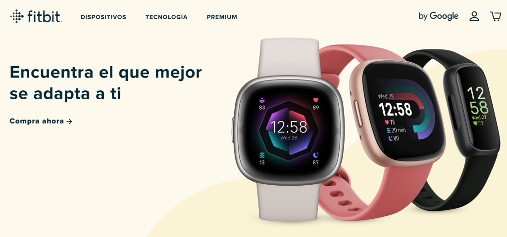
Fitbit makes fitness easy with its seamless web design.
- Fitbit
Fitbit is a fitness tracker — it tracks calorie intake and expenditure, steps, heart rate, progress and more. It’s an innovative product that connects with an app on your phones so you can track your progress wherever you go. Fitbit is a brand that encourages users to live their best life and to do that, Fitbit created a website that makes fitness fun — at least online.
The website is bright, clean and visually stunning. Bold product shots set against colorful backgrounds, with simple, clear CTAs leading users to products, informational pages and more.
The website overall is simple and fun. Blocks of images and text provide users with valuable information about their Fitbits as well as the multiple services the brand provides. It offers insights, innovations and news about the brand as well.
This is a very approachable and friendly website. It doesn’t get too technical or in-depth, instead, walking users fluidly throughout its design in a determined, creative and orderly fashion. Using color, clever illustrations and an approachable tone, the Fitbit website makes it easy for users to start taking fitness more seriously.
Nest Best Tech Website Design
The Nest website is bright, bold and fun.
- Nest
Nest is a brand that creates smart home products — anything from doorbells, to heating and cooling systems and more. If you want to control your home from your handy smartphone device, Nest is the leader in this niche and you should be learning more.
Nest is a brand that caters to consumers, so their B2C website is geared towards everyday people. And to reach these people, Nest went with a colorful and playful design that is innately engaging, clever and fun.
Nest plays with popular culture, brand representatives and cool colors to excite, amaze and entertain. It’s a website that knows its audience wants quick, cool and easy, so they play with design elements that lighten the mood, inform and lead users quickly and efficiently throughout the site.
A slideshow of images and text give users brief news updates so they can understand what’s going on with the brand, the products and possible updates that will affect them — giving users one interface to interact with to stay up-to-date and in touch with the company.
Typography and images are also bold, leading users throughout the site and giving them context to product usage. Similarly, products are seen in real use and real situations. This adds an approachability to the product and its use. If people weren’t familiar or didn’t understand the product before, now that they can see it being used in real-life situations, they can understand it better than reading lengthy bodies of text or seeing a lengthy video.
This site aims to make the product easy and compel users to use and understand it with ease and efficiency.
Top Website Design Agencies For Technology Companies


What is my Instagram URL? How to Find & Copy Address [Guide on Desktop or Mobile]

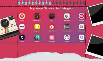
Best Instagram-like Apps and their Features
B2B Instagram Statistics in 2024

How to Unlist your Phone Number from GetContact

About Apple Employee and Friends&Family Discount in 2024
What is my Instagram URL? How to Find & Copy Address [Guide on Desktop or Mobile]

Applob.com Download APK – Tweak your device Safe
About Apple Employee and Friends&Family Discount in 2024
How to Translate more 5,000 characters limit by Google
How to Unlist your Phone Number from GetContact
-
Marketing Tips2 days ago
What is my Instagram URL? How to Find & Copy Address [Guide on Desktop or Mobile]
-
 Business Imprint4 days ago
About Apple Employee and Friends&Family Discount in 2024
-
 App Development4 days ago
How to Unlist your Phone Number from GetContact
-

 News5 days ago
Open-Source GPT-3/4 LLM Alternatives to Try in 2024
-
 Crawling and Scraping5 days ago
Comparison of Open Source Web Crawlers for Data Mining and Web Scraping: Pros&Cons
-
 Grow Your Business2 days ago
Best Instagram-like Apps and their Features
-

 Grow Your Business5 days ago
How to Become a Prompt Engineer in 2024
-
Marketing Tips2 days ago
B2B Instagram Statistics in 2024